About
Randy Krum
President of InfoNewt.
Data Visualization and Infographic Design

Infographic Design

Infographics Design | Presentations
Consulting | Data Visualizations

DFW DataViz Meetup

Join the DFW Data Visualization and Infographics Meetup Group if you're in the Dallas/Fort Worth area!

Search the Cool Infographics site

Custom Search

Subscriptions:


Feedburner

The Cool Infographics® Gallery:

How to add the
Cool Infographics button to your:

Cool Infographics iOS icon

- iPhone
- iPad
- iPod Touch


Read on Flipboard for iPad and iPhone

Featured in the Tech & Science category

Flipboard icon

Twitter Feed
From the Bookstore

Caffeine Poster

The Caffeine Poster infographic

Entries in chart (27)

Friday
Jan172014

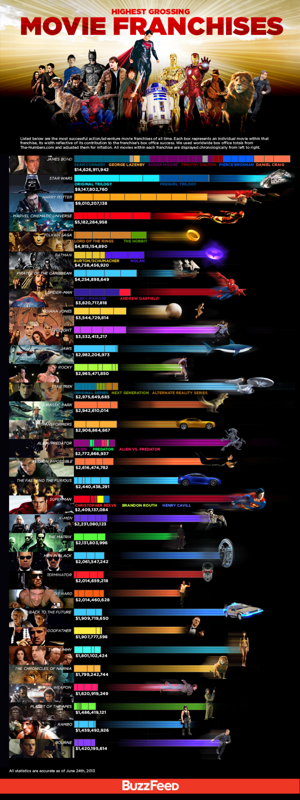
Where in the World are the Best Schools and the Happiest Kids?

The Best Schools and the Happiest Kids infographic

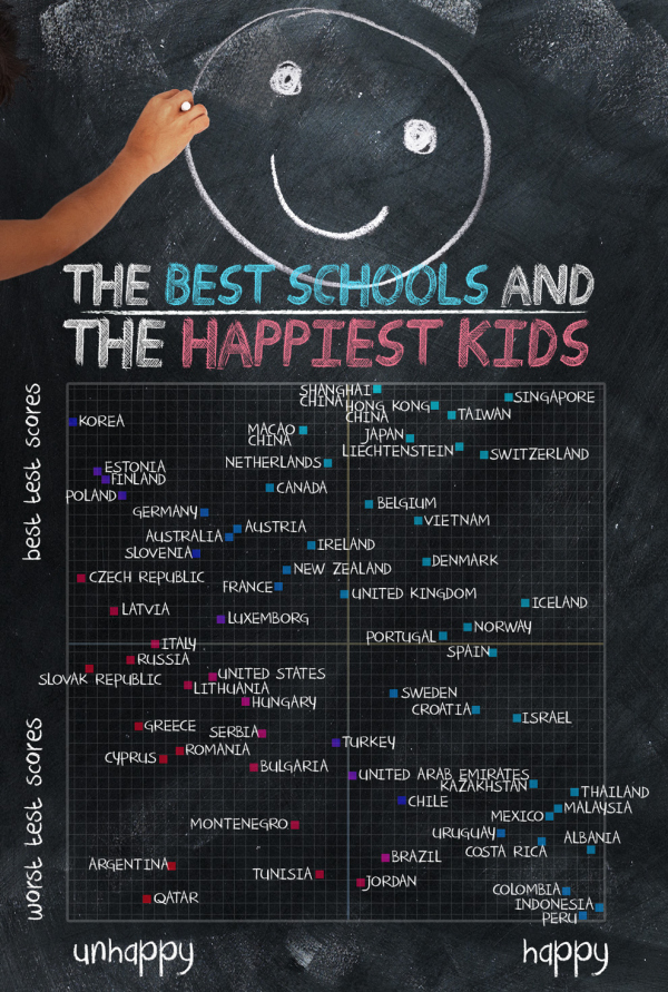
The best test scores don’t always mean the happiest kids at school.  The Best Schools and the Happiest Kids visualizes the results from a worldwide survey of over 500,000 15-year-olds globally.

The Organisation for Economic Co-operation and Development’s triennial international survey compared test scores from 65 countries. Happiness was ranked based on the percentage of students who agreed or disagreed with the statement “I feel happy at school.” Test scores were ranked based on the combined individual rankings of the students’ math, reading, and science scores.

I can’t tell for sure, but it appears that Jake Levy, Data Analyst at BuzzFeed created this data visualization based on the data from OECD survey results.  Infographics like these often get shared without the rest of the article, so it’s important to include all of the necessary framing information in the graphics itself.  Title, descriptive text, sources, URL, publishing company, copyright, etc.

Thanks to Ron Krate on Google+ for posting

Wednesday
Jan082014

The Charted Cheese Wheel

The Charted Cheese Wheel infographic

The Charted Cheese Wheel infographic poster is your cheese cheat sheet to success. The infographic can be found at popchartlab.com in poster form for purchase at $28.

A charting of 65 delightful cheeses from around the world, assembled into one wondrous wheel. The cheeses are broken down by the animal that produced the luscious milk, and then by the texture of the resultant cheese, forming a cornucopia of cheese that range from the mild to the stinky and from the rock hard to the silky smooth. The chart includes all-time greats like Cheddar, Brie, and Mozzarella as well as foodie faves like Stinking Bishop and Humboldt Fog.

18” x 24”

Each print is signed and numbered by the artists, and comes packaged in a Pop Chart Lab Test Tube. See below for finishing options, and note that framed prints require an additional 3-4 business days of processing time.

Using 100 lb. archival recycled stock certified by The Forest Stewardship Council, this poster is pressed on an offset lithographic press with vegetable-based inks in Flatlands, Brooklyn.

The infographic is organized well. There is a lot of cheese out there and Pop Chart Lab was able to organize 66 different varieties of cheese into easily-understood categories.

Found on visual.ly and www.fastcodesign.com

Thursday
Oct312013

Highest Grossing Movie Franchises

Highest Grossing Movie Franchises infographic

The Highest Grossing Movie Franchises infographic from Buzzfeed makes good use of a stacked bar chart to put the various movie series into perspective. Design by John Gara.

Listed below are the most successful action/adventure movie franchises of all time. Each box represents an individual movie within that franchise, its width reflective of its contribution to the franchise’s box office success. We used worldwide box office totals from The-Numbers. com and adjusted them for inflation. All movies within each franchise are displayed chronologically from left to right.

Great design that really does a fantastic job of comparing the franchises.  I’m especially impressed that they took the time to adjust the data for inflation, a step that designers normally forget.  The color coding within each franchise is also easily explained with colored text under the stacked bars.  No need for a chart legend!

The franchises are sorted in descending order as shown by the bars, but the extra graphic design to the right of each bar is visually misleading.  To some, this will look like an extension of the data, but it’s just artistic, with the images spaced out so they don’t overlap.

The footer should have included both a copyright statement, and the URL link back to the original landing page so readers can find the original full-size version.

Found on GeekTyrant

Monday
Aug262013

Where Does the Money Go?

Where Does the Money Go? infographic

Where Does the Money Go? from LifeHacker breaks down the average spending habits of U.S. consumers.

The graphic above breaks down how the average US household spends their paycheck, according to the US Department of Labor. As you can see, housing, transportation, and food are the biggest costs. Because they take so much out of our paychecks, it makes sense to concentrate on reducing spending in these areas.

Designed as a infographic piece of a larger article, the design does a good job of focusing on one data visualization.  It also has minimal text because the additional details are all included in the text of the article.

Because the graphic can be shared separately from the article, the infographic should include a mention of the article, LifeHacker’s logo, and the URL back to the original.

Tuesday
May212013

Speed Comparison Chart

Speed Comparison Chart infographic

The Speed Comparison Chart, from the Guardian Digital Agency on Tumblr, compares the speeds of different vehicles, from cars to planes to spaceships.

Cool infographic design that tells one story really well.

Tuesday
Apr302013

White House will be Posting More Infographics

White House Infographics

The White House has just started posting on Tumblr, and released the White House on Tumblr infographic you see above to kickoff the blog.  I’m pleased to see infographics as a large section of the content they are planning, but also a little bit worried.

We see some great things here at the White House every day, and sharing that stuff with you is one of the best parts of our jobs. That’s why we’re launching a Tumblr. We’ll post things like the best quotes from President Obama, or video of young scientists visiting the White House for the science fair, or photos of adorable moments with Bo. We’ve got some wonky charts, too. Because to us, those are actually kind of exciting.

They’re not kidding about the “Wonky charts!”  I look at this design and think “Huh?”  The infographic appears to be a stylized form of a coxcomb chart or rose diagram, but not really.  It’s definitely an aesthetic design all about style without substance.  The design is just supposed to imply the different types (and maybe the amounts) of content they intend to publish.  There isn’t any real data or numbers behind the chart, and the hand-drawn aspect reinforces that this is just suggestive of what we should expect to see in the future.  

Visually, I guess it also suggests that the content might cover multiple categories.  So posts about the FLOTUS (First Lady of the United States) might include photos, behind-the-scenes information and posts about Bo, the First Dog.

No real chart would have overlapping pie slices.  Slices of a true Rose Diagram (credited to Florence Nightingale) would have equal angles that add up to 360° or 100%, and with varying radii, the area of each slice would represent the value of each section.

The staff at the White House has posted infographics on the official White House blog before (which I critiqued here and here).  I love that this helps raise the awareness and credibility of infographics aas a whole!

Tuesday
Feb262013

Manhattan Building Heights as Land Value

Manhattan Building Heights infographic

Manhattan Building Hieghts by radicalcartography.net is an indirect measure of land value based on building height. The infographic is shaped like Manhattan itself, and the actual building’s color darkness shows their heights in their correct locations.

You can also see an alternate design using assessed tax value as the data set, and how that maps out land value differently.  

Found on http://visual.ly


Tuesday
Feb122013

Visualizing AOL's Return to Growth after 8 Years

Visualizing AOL's Return to Growth after 8 Years infographic


Sometimes you only need one data visualization or chart to tell your story.  Statista recently published the infographic AOL Returns to Growth After 8 Years with only this bar chart of year-over-year revenue since Q1 2008, which clearly shows the last five years of quarterly losses.

This chart shows AOL’s revenue growth since the first quarter of 2008. In the fourth quarter of 2012, the former internet heavyweight returned to positive growth after 8 years of declining revenues.

The latest results mark a milestone in CEO Tim Armstrong’s quest to transform his company from an internet service provider into a digital media company. Since AOL’s spin-off from Time Warner in 2009, the company had acquired TechCrunch and The Huffington Post to re-position itself as an ad-selling provider of premium online content.

The above chart nicely illustrates the slow progress AOL has made in the past 2 years.

Not an infographic in the modern online interpretation of telling complete stories in one image file, but more in-line with the definition of infographics simply as “information graphics”.

I’m not sure why they didn’t show the complete 8 years of data in the chart.  By only showing 5 years of data in the chart, they really didn’t support their claim that it has been 8 years of losses for AOL.

Found on Visual Loop.

Tuesday
Nov272012

Sheldon's T-Shirts of The Big Bang Theory

Sheldon's T-Shirts of The Big Bang Theory infographic

If you have seen the comedy show The Big Bang Theory, then you know Sheldon…. If you haven’t seen it, go watch it and get back to us.  Have you ever noticed his wardrobe?  The Sheldon’s T-Shirts infographic from fibers.com tells you his favorite shirts, how often he wears his shirts, and even what colors he wears the most! 

Graphs, Charts and illustrated T-Shirts with correlating sizes to wearing frequency - would there be any other way to visualize Sheldon Cooper’s t-shirt collection from The Big Bang Theory? We think not.

Big thanks to Sheldon’s Shirts where we got most of the data for this graphic. You can find a lot of Sheldon’s Shirts for purchase on the following websites:

This is just a fun infographic that uses some data visualization to appeal to fans of the show.  Good design using publicly available data that has been complied in an engaging way.

The charts actually very well done.  Charts are color-coded to match the data.  Icons are included on the bars or in the pie slices, so no chart legends are needed.  This makes the data faster and easier to understand.

Found on Fibers.com

Tuesday
Nov062012

Daylight Savings Time Explained

Daylight Savings Time Explained infographic

Daylight Savings Time Explained designed by a Visual.ly member under the name Germanium, visually explains the end result of recognizing Daylight Savings Time.  DST is used mostly in North America and Europe, while most of the world does not change their clocks.

I tried to come up with the reason for the daylight saving time change by just looking at the data for sunset and sunrise times. The figure represents sunset and sunrise times thought the year. It shows that the daylight saving time change marked by the lines (DLS) is keeping the sunrise time pretty much constant throughout the whole year, while making the sunset time change a lot. The spread of sunrise times as measured by the standard deviation is 42 minutes, which means that the sunrise time changes within that range the whole year, while the standard deviation for the sunset times is 1:30 hours. Whatever the argument for doing this is, it’s pretty clear that reason is to keep the sunrise time constant.

By visualizing the daylight hours, the reader can see the pattern.  Both the change in total hours, and the impact of daylight hours on their normal day.

The reasoning for DST is very controversial, but now we can see the impact clearly.