About
Randy Krum
President of InfoNewt.
Data Visualization and Infographic Design

Infographic Design

Infographics Design | Presentations
Consulting | Data Visualizations

DFW DataViz Meetup

Join the DFW Data Visualization and Infographics Meetup Group if you're in the Dallas/Fort Worth area!

Search the Cool Infographics site

Custom Search

Subscriptions:


Feedburner

The Cool Infographics® Gallery:

How to add the
Cool Infographics button to your:

Cool Infographics iOS icon

- iPhone
- iPad
- iPod Touch


Read on Flipboard for iPad and iPhone

Featured in the Tech & Science category

Flipboard icon

Twitter Feed
From the Bookstore

Caffeine Poster

The Caffeine Poster infographic

Entries in survey (12)

Tuesday
Sep272011

Client Infographic: The Hotel Price Index

Hotels.com The Hotel Price Index infographic

Twice-a-year, Hotels.com updates their Hotel Price Index, and this year I was contacted to design some new infographics to go along with the report.  InfoNewt worked with designer Jeremy Yingling to create two infographics for the current set of data from the first half of 2011.  Since the research is global, we created one infographic based on American travelers and one based on Canadian travellers.

The hotels.com® Hotel Price Index™ (HPI™) is a regular survey of hotel prices in major city destinations across the world. The HPI is based on bookings made on hotels.com and prices shown are those actually paid by customers (rather than advertised rates) for the first half of 2011. The report largely compares prices paid in 2010 with prices paid in 2011.

The research is extensive, so we had to keep the information shared in the infographics fairly focused on only a few categories.  This keeps the design clean and easy to read, but also whets the reader’s appetite for more.

We varied the visual designs for each category.  The monument silhouettes attached to locations on the globe was a unique way to show map data and not look like a standard map.  The silhouettes also help the reader recognize the cities faster than reading the text.  It’s subtle, but the lines are color-coded by continent as well.

The Canadian data was a little bit different, so the design had to adapt:

Hotels.com The Hotel Price Index Canadian infographic

You can see the complete report data on The Hotels.com Hotel Price Index page.

Wednesday
Nov102010

Client Infographic: What Consumers Think About Concrete

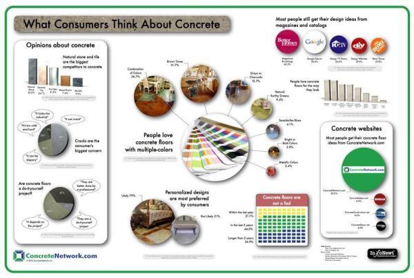
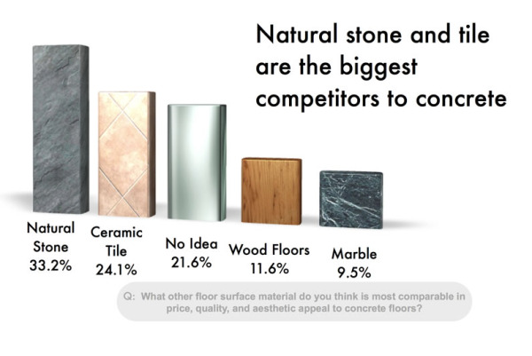
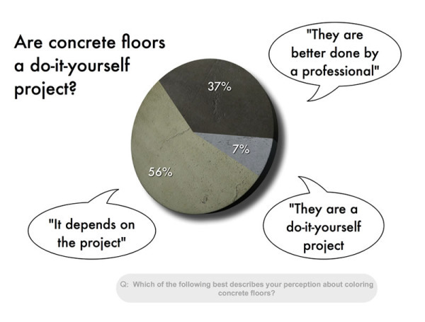
A project I did recently for The Concrete Network visualizes the results of their 2010 Concrete Floor Survey.  They have some exclusive research data from consumers, and What Consumers Think About Concrete explores the consumer perceptions of concrete floors and uses visuals to make the information interesting and relevant.

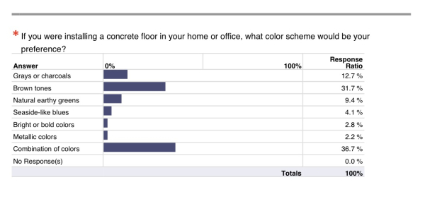
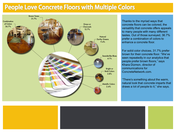
The team at Concrete Network did a great job of taking a boring report filled with bar chart after bar chart, converting that data into an appealing infographic and then integrating those visuals into the report they distribute publicly.

Original survey report:

Infographic Design:

Public Survey Report PDF:

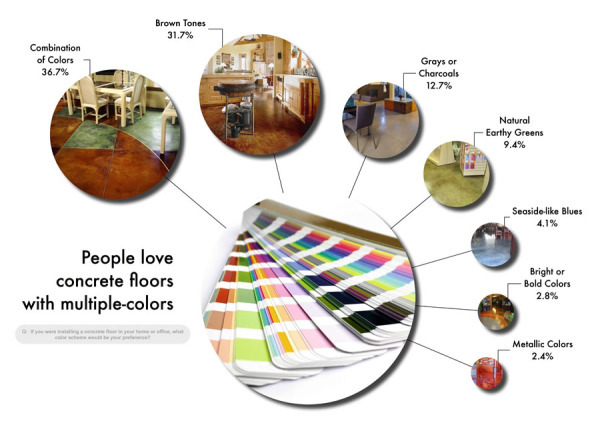
Images of actual projects were very important to make the concrete floor color choices relevant and understandable.  

I also made this project somewhat interactive.  Instead of zooming in and moving around a large infographic image, each of the separate data visuals is clickable to view that section in detail.  Using textures relevant to the data also makes the resulting visuals interesting and quick to comprehend.

Thanks to Khara and the team at The Concrete Network!

Page 1 2