About
Randy Krum
President of InfoNewt.
Data Visualization and Infographic Design

Infographic Design

Infographics Design | Presentations
Consulting | Data Visualizations

DFW DataViz Meetup

Join the DFW Data Visualization and Infographics Meetup Group if you're in the Dallas/Fort Worth area!

Search the Cool Infographics site

Custom Search

Subscriptions:


Feedburner

The Cool Infographics® Gallery:

How to add the
Cool Infographics button to your:

Cool Infographics iOS icon

- iPhone
- iPad
- iPod Touch


Read on Flipboard for iPad and iPhone

Featured in the Tech & Science category

Flipboard icon

Twitter Feed
From the Bookstore

Caffeine Poster

The Caffeine Poster infographic

Entries in Android (4)

Thursday
Aug132015

Android Fragmentation Visualized

Android Fragmentation Visualized

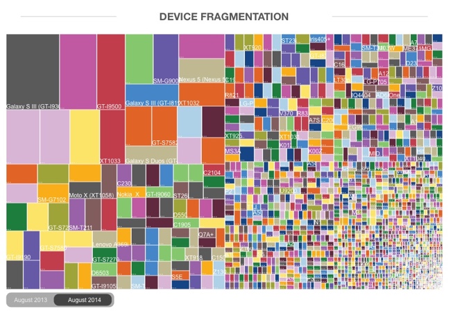
This one data visualization can demonstrate why mobile responsive web design is important: Android Fragmentation Visualized. OpenSource published a number of data visualizations, both static and interactive, that show the tremendous market fragmentation in the market of Android phones and devices. This treemap shows market share by device.

Fragmentation is both a strength and weakness of the Android ecosystem, a headache for developers that also provides the basis for Android’s global reach. Android devices come in all shapes and sizes, with vastly different performance levels and screen sizes. Furthermore, there are many different versions of Android that are concurrently active at any one time, adding another level of fragmentation. What this means is that developing apps that work across the whole range of Android devices can be extremely challenging and time-consuming.

Despite the problems, fragmentation also has a great number of benefits – for both developers and users. The availability of cheap Android phones (rarely running the most recent version) means that they have a much greater global reach than iOS, so app developers have a wider audience to build for. Android is successfully filling the gap left behind by the decline of Nokia’s Symbian – and in this report we look at the different shape of fragmentation in countries from different economic positions, as a way of showing that fragmentation benefits Android much more than it hurts it. Android is now the dominant mobile operating system and this is because of fragmentation, not in spite of it.

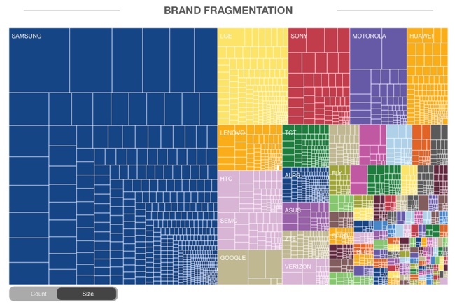
Here you can see the same treemap reorganized into brand clusters, still sized by market share:

Android Fragmentation Visualized

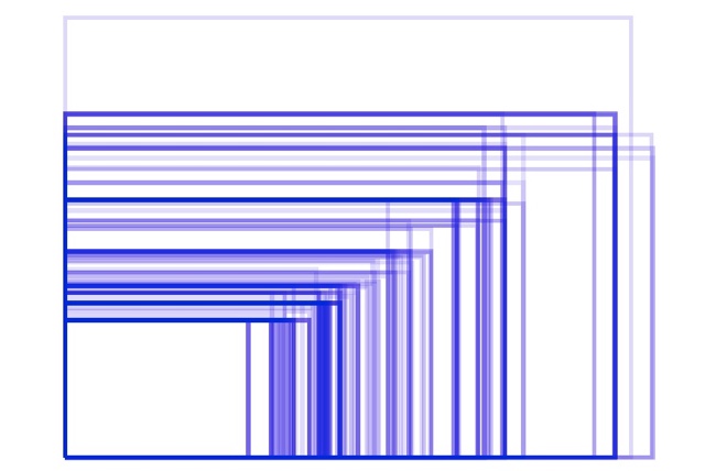
The hundreds of different Android screen sizes can be seen in this visualization:

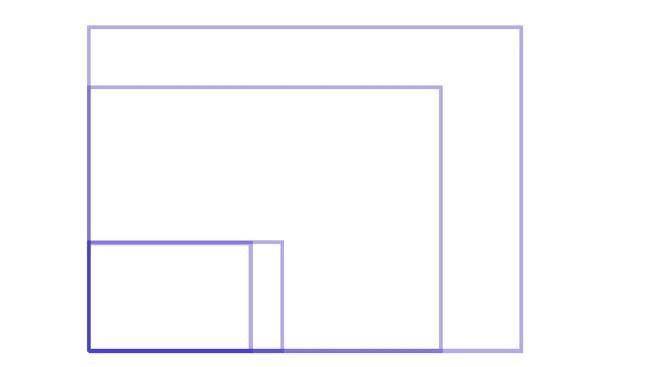
In contrast, Apple currently only has FIVE devices and screen sizes for phone and tablets, but uses the same screen resolution on a couple of them:

Found on Business Insider

Tuesday
May012012

Following The White Rabbit

Following the White Rabbit Android Developer infographic

Who is the mastermind behind your favorite android application? Do you wonder what kind of music they like? The Following the White Rabbit infographic from Startapp.com gives us the low down on what kinds of people are behind Android applications based on a survey they did in March 2012.

Have you ever wondered what kind of people make Android applications? Well wonder no more! We at StartApp decided to investigate this in depth by creating a special Android developer survey which we sent out to all of our Android developers who kindly participated in the survey! Therefore, we are now very proud to present our first infographic that explores everything from the companies Android developers work for to the music they listen to and everything in between. Let us know what you think!

This is a cool infographic that does a good job with the visualizations.  With survey data, it’s a challenge to visualize the results correctly.  Some survey answers add up to 100%, but some questions are asked where the respondent can “check all that apply” so these answers are separate.  The pie charts in the coffee cups, the doughnut charts  and the stacked bar are examples of survey questions that add up to 100% (except the stacked bar adds up to 101% due to rounding, so they should have displayed the tens decimal place).

“What App Markets do you use?” and “What OS’s Do You Develop Apps for?” are some of the multiple answer questions, so the answers are displayed as separate bars or doughnut charts with the appropriate logos.  A couple results are displayed with the wrong type of graphic.  “How Many Apps Have You Published so far?” and “What Would Be Your Preferred Pastime” should both be shown adding up to 100%.

The overall design is a bit crowded with a lot of visual noise, but the statistics are easy to understand.  The coffee-brown color and the overlapping visualizations give the visual impression of working late nights and juggling many details, just like an app coder does.

At the bottom, there should be a copyright statement and the URL to find the original infographic landing page.

Found on Infographic Journal

Tuesday
Jan172012

Tablet Adoption at Work

The State of Tablet Adoption at Work is a new infographic from VentureBeat.com.  It’s interesting that the infographic itself was sponsored by Lenovo and Qualcomm, but included as part of a VentureBeat article.  You can find the original version here at TabletsAtWork.com

Since the debut of Apple’s iPad in Jan. 2010, the integration of tablet devices into our lives and work has progressed rapidly — so fast that it’s sometimes hard to put in perspective how quickly got here.  The exclusively obtained infographic below breaks down how far workforce adoption of tablet technology has come — and where it’s headed. (The graphic was sponsored by Lenovo and Qualcomm.)

I love the clean, professional design look.  I really like the color scheme and the mixed bag of visualization styles; grid of icons, treemap, stacked bar, line chart, etc.

Only a couple of design issues about this one I would improve.

  • I’m willing to let 16 tablet icons represent 16.1 Million tablets shipped in 2010 (rounding), but why only 144 tablets shown to represent 147.2 Million?  That was just the designer wanting a clean, square visual that breaks the actual data visualization.
  • The line chart showing 134% increase in shipments powered by Android and Windows is way out of scale.  It’s visualizing something close to a 900% increase.
  • At the bottom there should be a copyright statement and the URL to the original infographic landing page so people can find the full high-resolution version.

Found on the Inside Flipboard feed in Flipboard for iPad.

Monday
Sep262011

App Store Wars infographic


The App Store Wars infographic comes to us from WebpageFX.com and shows us a comparison between smartphone app stores available today.

We compared the Apple App Store, Android Market, Blackberry App World, and the Nokia, Palm and Windows Phone 7 application directories. Statistics include OS distribution, percentage of paid vs. free apps in each directory, average apps downloaded by device, average app cost, and total 2010 revenue from all apps sold.

A couple things I like and don’t like about thius design.  Of course, I like the Star Wars reference in the design, and the timeline is simple and easy to comprehend. 

I like the appropriate phone icons lined up to show the Smartphone Distribution, but it’s hard for the reader to understand when you line them up 18 across.  We all think in base-10, so they should be 10 across, or even 20 if you want to make it that wide.  Not 18.

I do think they missed a number of opportunities to visualize the comparisons when they only used numbers.  Big numbers don’t qualify as a data visualization in a good infographic.  How many apps used per phone?  Average price paid per app on each phone platform?  The total 2010 Mobile App Revunue comparisons to provide scale are lost without visualizations.

Thanks to Trevin for sending in the link.  Also found on MacTrast!