Android Fragmentation Visualized
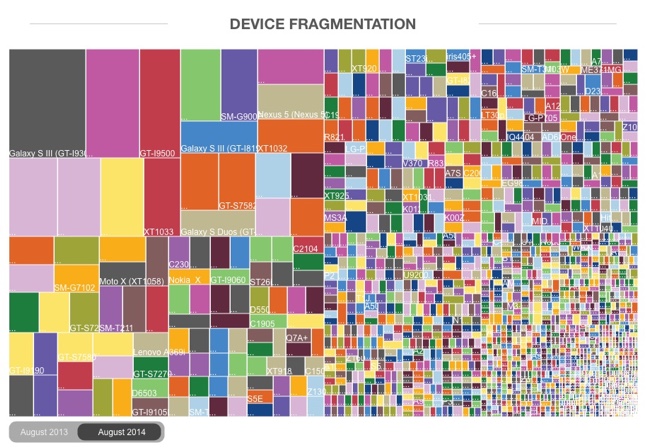
This one data visualization can demonstrate why mobile responsive web design is important: Android Fragmentation Visualized. OpenSource published a number of data visualizations, both static and interactive, that show the tremendous market fragmentation in the market of Android phones and devices. This treemap shows market share by device.
Fragmentation is both a strength and weakness of the Android ecosystem, a headache for developers that also provides the basis for Android’s global reach. Android devices come in all shapes and sizes, with vastly different performance levels and screen sizes. Furthermore, there are many different versions of Android that are concurrently active at any one time, adding another level of fragmentation. What this means is that developing apps that work across the whole range of Android devices can be extremely challenging and time-consuming.
Despite the problems, fragmentation also has a great number of benefits – for both developers and users. The availability of cheap Android phones (rarely running the most recent version) means that they have a much greater global reach than iOS, so app developers have a wider audience to build for. Android is successfully filling the gap left behind by the decline of Nokia’s Symbian – and in this report we look at the different shape of fragmentation in countries from different economic positions, as a way of showing that fragmentation benefits Android much more than it hurts it. Android is now the dominant mobile operating system and this is because of fragmentation, not in spite of it.
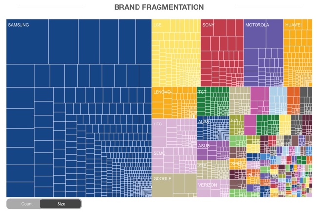
Here you can see the same treemap reorganized into brand clusters, still sized by market share:
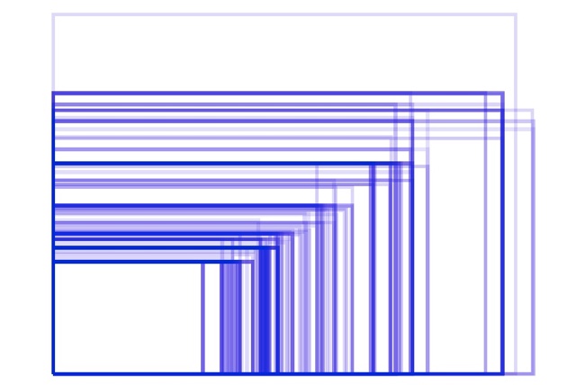
The hundreds of different Android screen sizes can be seen in this visualization:
In contrast, Apple currently only has FIVE devices and screen sizes for phone and tablets, but uses the same screen resolution on a couple of them:
Found on Business Insider


 Randy
Randy


Reader Comments