About
Randy Krum
President of InfoNewt.
Data Visualization and Infographic Design

Infographic Design

Infographics Design | Presentations
Consulting | Data Visualizations

DFW DataViz Meetup

Join the DFW Data Visualization and Infographics Meetup Group if you're in the Dallas/Fort Worth area!

Search the Cool Infographics site

Custom Search

Subscriptions:


Feedburner

The Cool Infographics® Gallery:

How to add the
Cool Infographics button to your:

Cool Infographics iOS icon

- iPhone
- iPad
- iPod Touch


Read on Flipboard for iPad and iPhone

Featured in the Tech & Science category

Flipboard icon

Twitter Feed
From the Bookstore

Caffeine Poster

The Caffeine Poster infographic

Entries in release (3)

Thursday
Aug112016

Predicting iPhone Release Date With DataViz

Predicting iPhone Release Date With DataViz

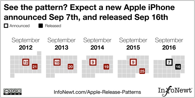
With no inside knowledge, I predict the new Apple iPhone announcement on September 7th, with an actual release on the Friday of the following week, on September 16th.

How do I know this? I fully expect Apple to stay true to their pattern for releasing iPhones every September. They have consistently had an announcement on a Tuesday or Wednesday early in September, followed by the actual release on the following Friday. (I think 2015 was an anomaly with an extra week before shipments)

We humans are still the best visual pattern recognition machines on the planet. Visual patterns are also one of the best ways to communicate an insight or a finding from within the data. In this visual, I've visualized just the important dates that show a clear pattern, and simplified the design to just the relevant information. You don't need the whole calendar or all of Apple's products to communicate this one insight about iPhones.

Check out all of my visualization of all of Apple's Release Patterns!

Monday
Jul282014

Viral Sharing Tactics of an Infographic

  Viral Sharing Tactics of an Infographic infographic

Making a cool infographic is one thing, sharing it and making it go viral is another. Luckily, the Viral Sharing Tactics of an Infographic infographic published by Piktochart gives some tips on how to make your cool infographic a hit!

Making your carefully crafted infographic go viral isn’t a dark science. It doesn’t just happen miraculously. You have to make it happen.

The key to a successful viral infographic lies not just in the content. Apart from designing a very good infographic, what you do with it after that plays a big role in making it go viral. You have to go the extra mile to publicize and enable others to publicize your infographic for you. There are many available platforms and tools to accelerate your viral campaign.

There’s some really good information included in here, and many of the tactics listed here are included in my Infographic Release Strategy from the Cool Infographics book.  Designing a good infographic isn’t enough.  You need to publicize and promote your design so people can find it and share it.

I would have liked to see more statistics behind their recommendations.  The only data included in the design is the Google Trends chart of searches for the word ”infographic”, which is a very impressive trend!  The design should have also included a copyright, and the URL to the infographic landing page on the Piktochart site.  I love the “Click to Tweet” pre-written sharing element on the landing page!

Piktochart is an online infographic design tool, similar to a vector graphics software application.  You can find this tool listed along with others on the Cool Infographics Tools page.  I love to see that they used their own tool to design this infographic!

Thanks to Rachel for sending in the link! 

Friday
Nov082013

Apple Release Patterns

Apple Total Release Patterns infographic

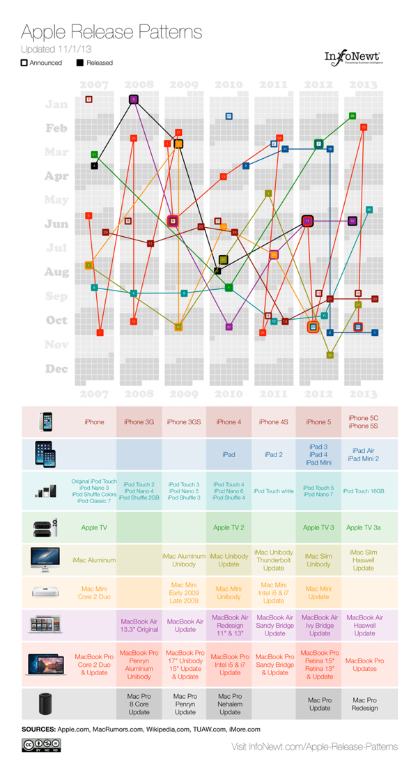
Apple Release Patterns is a new personal project of mine, and you can find the full-size original versions on a new, dedicated landing page on the InfoNewt.com site.  Every few months Apple releases a new product update or redesign, and the rumors start flying about what the upcoming product will be during the preceding weeks.  For better or worse, those speculations are often based on what was released in the same timeframe the prior year.

This data visualization lines up vertical columns for each year, starting with 2007.  I decided that anything further back wasn’t really relevant to Apple’s current practices.  Each product release is then mapped onto the calendar, showing a pattern (or lack of pattern) to the product releases.  If the product announcement was separate from the actual release date, I mapped that date as well.

This data was ripe for a visualization.  When I tried to look at the historical dates of product releases, the information was scattered across multiple sites, confusing and difficult to gather.  Some information was contradictory, which required further investigation.  So, the data topic itself was a good target for a clear, easy-to-understand visualization.  However, the design with all of the products was too complicated visually to perceive any defining patterns.  So, I created separate versions that break out the products into 3 categories, and those are much easier for readers to see the patterns.
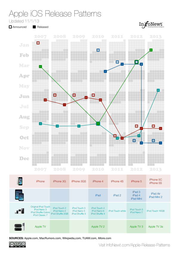
Apple iOS Release Patterns infographic

For iOS devices (iPod, iPad, iPhone and AppleTV) you can see the pattern shift in 2011 for most of the products to a Fall timeframe.  You can also see a recently consistent announcement date with the product release the following Friday.
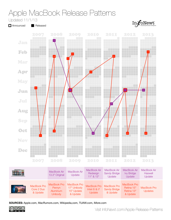
Apple MacBook Release Patterns infographic

For Apple’s laptop line, the MacBooks, you can see the MacBook Air has become a regular release during the Worldwide Developers Conference (WWDC) in June, and the MacBook Pro gets fairly regular updates twice a year, usually just to update the internal specifications.
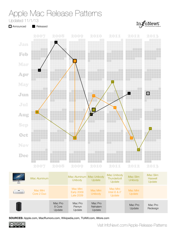
Apple Desktop Mac Release Patterns infographic

The desktop Mac line doesn’t seem to show much pattern at all.  They might get an update each year, but the timing is erratic.  Sometimes they are part of WWDC, sometimes part of the Fall iOS events, and sometimes completely on their own.

I’m going to keep updating these on the landing page as Apple releases new products in the future (upcoming iPad Mini 2 Retina and Mac Pro still need to start shipping this year).  I want these to become a valuable resource every time the Apple rumor mill heats up about the next product announcement.  If you use the embed code on the Apple Release Patterns landing page, your site will also display the updates automatically as they become available.

This is version 1.0.  I have some ideas and improvements I want to make in future versions, but I would love to hear your thoughts as well.  Post any suggestions or feedback in the comments below.