Nichloas Felton's 2007 Annual Report

Nicholas Felton has published his new 2007 Annual Report. I love the way he breaks down his own personal life into maps and charts. I had just posted about his 2006 Annual Report last month.
Join the DFW Data Visualization and Infographics Meetup Group if you're in the Dallas/Fort Worth area!

The Cool Infographics® Gallery:
How to add the
Cool Infographics button to your:
- iPhone
- iPad
- iPod Touch
Read on Flipboard for iPad and iPhone
Featured in the Tech & Science category

Nicholas Felton has published his new 2007 Annual Report. I love the way he breaks down his own personal life into maps and charts. I had just posted about his 2006 Annual Report last month.

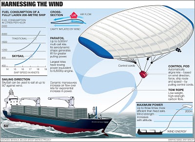
From the Telegraph in the UK, the idea is to use a kite to help pull a ship across the ocean. by using the wind power at high altitudes the ship would save on energy consumption.
Its inventor, Stephan Wrage, a 34-year-old German engineer, claims the kite will significantly reduce carbon emissions, cutting diesel consumption by up to 20 per cent and saving £800 a day in fuel costs.Found on digg.com
 corporations,
  emissions,
  environment,
  oil,
oil,  process,
  spending,
  travel
Cool poster I found over at historyshots.com shows the altitudes reached by all of the U.S. and Russian launches leading up to the 1969 moon landing. From 1961 to 1969 the USSR and the United States were locked in a history-making race to land the first person on the moon. This detailed map explains the story of this titanic contest in a clear and informative manner.

This is a great map, found on Photobucket.com uploaded by the user pizzler. In the U.S. we understand that other countries sometimes speak foreign languages, but we have the advantage that all 50 states speak the same language (or at least a similar version of the same language). So it's somewhat of an abstract concept to most Americans. And European geography isn't exactly a major topic in the U.S. school system, so most people don't understand how many countries there are, and especially how small some of them are.
This visual map really helps convey the diversity within the EU. It maps 46 languages across the European continent, and I know there are more. I can't imagine how difficult it must be for the EU to actually get anything done between countries.
 This image was real popular on Digg.com this week. It's hosted on tinypic.com, but there's no author listed.
I love simple infographics like this that use a visual metaphor to instantly get the point across. You can tell someone that the price of gas is comparable with Coke, but putting gas in the Coke signature bottle will get more people to understand the message.
My own reaction was probably the opposite of what the author intended. My first thought is "Coke costs how much?!?" I know there is a lot more expense in producing gasoline than there is in producing Coke. They must really be marking the price up a lot for brown sugar-water.
There is a similar analogy in the U.S. regarding bottled water. Some bottled water brands are now more expensive than gasoline! How is that possible?!?

I found reference to this graphic by Zohar Manor-Abel on smashingmagazine.com.
What is the connection between 3 celebrities, 35 corporations, 40 subsidiaries and more than 300 brands? Global business interests make up a complex network of connections between corporations from around the world. Corporate Connection, intends to shed light on 'who owns what' in the lobal marketplace and on the intricate nature of the world wide "business" web.

Really cool new feature over on Digg.com. Back in late 2007, they added an Images category so users could digg their favorite pictures. Now they've added an interactive image viewer in the Digg Labs that lets you see new images and pictures being dugg in real-time.
The only thing I don't like is that it doesn't let you add any search terms. You have to see all of the activity, and can't narrow it down it all.

New infographic from nytimes.com depicting the 2,592 deaths in Iraq over the course of the entire year of 2007. The graphic is credited to Alicia Cheng, a graphic designer at mgmt. design in Brooklyn.The chart below — compiled from data provided by the American and Iraqi governments and news media organizations (the independent Coalition Casualty Count in particular) — gives information on the type and location of each attack responsible for the 2,592 recorded deaths among American and other coalition troops, Iraqi security forces and members of the peshmerga militias controlled by the Kurdish government.
I think this is an improvement over the "31 Days in Iraq" graphic because the new graphic identifies every death as a separate figure instead of grouping some together. There are also some differences in data, as the new graph doesn't include the Iraqi civilian deaths. So the "31 Days in Iraq" graphic showed over 1,900 deaths in January 2007, this new graphic only shows 163 deaths in January.And, sadly, civilian fatalities in Iraq last year were simply too numerous to represent on a single newspaper page.
I'll keep an eye out in early February to see if they publish one for the month of January as they have the last couple of years.
Found originally on Digg Images, this one is hosted on Steven Hilton's website (the author).
I guess you could call this a Mind Map style, but it's more like a Battlefield style infographic. I really like how it shows the products that multiple competitors are challenging Microsoft with and the associated product on the Microsoft side that is being challenged.