About
Randy Krum
President of InfoNewt.
Data Visualization and Infographic Design

Infographic Design

Infographics Design | Presentations
Consulting | Data Visualizations

DFW DataViz Meetup

Join the DFW Data Visualization and Infographics Meetup Group if you're in the Dallas/Fort Worth area!

Search the Cool Infographics site

Custom Search

Subscriptions:


Feedburner

The Cool Infographics® Gallery:

How to add the
Cool Infographics button to your:

Cool Infographics iOS icon

- iPhone
- iPad
- iPod Touch


Read on Flipboard for iPad and iPhone

Featured in the Tech & Science category

Flipboard icon

Twitter Feed
From the Bookstore

Caffeine Poster

The Caffeine Poster infographic

Entries in time (40)

Friday
Jul312009

Roomba path long exposure photo


Paul Mathew at SignalTheorist.com attached an LED to the top of his Roobma and took a long exposure photograph to document the path the Roomba takes.  iRobot can tell you the Roomba gets into every corner, but it takes a visual like this to really prove it.
"Now here’s something interesting, I set up a photo camera in my room, turned out all the lights and took a long-exposure shot of my roomba doing it’s thing for about 30 minutes. The result is a picture that shows the path of the roomba through it’s cleaning cycle, it looks like a flight map or something. It really hits every spot!"
Thanks to Tyler at RoboticVacParts.com for the link!

Tuesday
Apr142009

Apple's 1 Billion Apps live countdown


Apple is using a live countdown timer for is 1 Billion App Countdown promotion.  It's almost real-time, and is a step better than when they did the 1 Billion Song Download a few years ago.

At the rate its going, they'll reach a billion before the end of the week!

Download an app and you’ll automatically get the chance to win a $10,000 iTunes Gift Card, an iPod touch, a Time Capsule, and a MacBook Pro.
 Also, there a link to enter the contest without buying an App.  You can enter 25 times a day.

Tuesday
Mar032009

TimeSpace - World


From The Washington Post, TimeSpace-World is an experiment in a visual way to see news stories from around the world.  You can specify the time period during a day that you want to see with the slider, and then click the stories to zoom into the map.  You can also enter search terms to view a smaller set of relevant stories.

TimeSpace is an interactive map that allows you to navigate articles, photos, video and commentary from around the globe. Discover news hot-spots where coverage is clustered. Use the timeline to illustrate peaks in coverage, and customize your news searches to a particular day or specific hour. (Many Washington Post stories appear at midnight; others are published throughout the day as news happens). Click the ? In the upper right for help.

 Link found from Mitul69 on Twitter

Friday
Jan162009

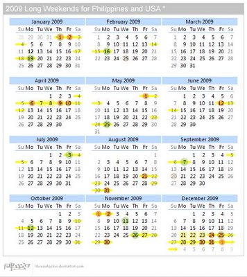
Long Weekends Calendar


The Long Weekends Calendar was created by thenonhacker (Alwyn Balingit) and posted on DeviantArt.com.  By plotting the holidays in both the U.S. and the Philippines, he has mapped out all the long weekends that need to be considered when creating project timelines involving people in both countries.

It's also good to plan vacation time...

Great job Alwyn!

Wednesday
Dec032008

The "Super" Family Tree of Dinosaurs


Recently published in the Proceedings of The Royal Society, Biological Sciences, Volume 275 Number 1650 on November 7, 2008.

This is over my head, but this radial family tree shows the diversity of dinosaur species.  It's used in the article to help challenge the theory that dinosaurs went through a rapid decline during the Cretaceous period.  A brief summary is online over at The New Scientist.

Furthermore, we conclude that dinosaurs did not experience a progressive decline at the end of the Cretaceous, nor was their evolution driven directly by the Cretaceous Terrestrial Revolution (KTR).
Thanks for the link Michael!

Friday
Oct032008

The Age of Pop

From verysmallarray.com, the Age of Pop visualizes the #1 songs every week from 1960-1969.  You can see that Pop ruled the decade.  Check out their home page to see how other decades sounded.

Wednesday
Aug202008

Olympics Schedule Tracker


The Olympics Tracker is an interactive schedule of the events.  It now only shows which events are scheduled each day and hour, but you can drag them to rearrange your favorites to the top.  Clicking on past events shows the results, and clicking on future events shows the upcoming event details.  Medal awarding events marked with a small medal icon.  You can even download a desktop version for Mac or Windows.

Tuesday
Aug192008

Olympic History of World Records


The History of World Records from NYTimes.com shows how the world record in a number of Summer Olympic events has progressively been beaten over the last 100 years.  In this chart, the Men's 100m Freestyle record was beaten three times this year improving the world record by 0.45 seconds.  Similar events are all charted together, so you can see other freestyle events on the same chart.

Friday
Jun202008

Gerd Arntz


Gerd Arntz (1900-1988) was a German artist with a political activist focus. Many of his infographics, as well as his Isotype project to create a universal set of icons for signs, are available at www.gerdarntz.org. This infographic poster shows the New York City population explosion from 25,000 in 1767 to 9.5 million in 1930.

Monday
Jun162008

The Cost of Gadgets


From Wired.com, this is really a 3-dimensional chart. I liked it because there are very few 3D charts that actually portray 3 dimensions of data. (This is actually 4D if you include the different products as a dimension) Usually 3D charts are just bad use of chart styles from PowerPoint. I also like the perspective from above. Although unusual, it helps to see the whole chart.