About
Randy Krum
President of InfoNewt.
Data Visualization and Infographic Design

Infographic Design

Infographics Design | Presentations
Consulting | Data Visualizations

DFW DataViz Meetup

Join the DFW Data Visualization and Infographics Meetup Group if you're in the Dallas/Fort Worth area!

Search the Cool Infographics site

Custom Search

Subscriptions:


Feedburner

The Cool Infographics® Gallery:

How to add the
Cool Infographics button to your:

Cool Infographics iOS icon

- iPhone
- iPad
- iPod Touch


Read on Flipboard for iPad and iPhone

Featured in the Tech & Science category

Flipboard icon

Twitter Feed
From the Bookstore

Caffeine Poster

The Caffeine Poster infographic

« Brand Ad Agencies infographic | Main | My Digital Life 2.0: A Consumer Gadget Map »
Wednesday
Feb172010

CD Laddering Investment infographic

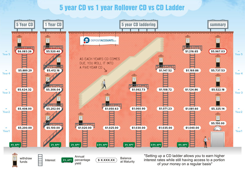
Designed by Derri Hasmi for DepositAccounts.com, this CD Laddering infographic does a great job helping to explain the investment theory of CD laddering as compared to investing in standard CDs.

CD laddering is a strategy that allows you to take advantage of the higher cash rates offered by CDs, while at the same time ensuring that you have access to your money regularly. The most common type of CD ladder is the five year ladder. In this scenario, you open five different CDs. Let’s say that you check your savings account, and you have $15,000. You want to keep $5,000 for emergency purposes (move it to a high-yield savings account if it isn’t in one already), but use the remaining $10,000 to get your CD ladder started.

Thanks Jeremy!

PrintView Printer Friendly Version

EmailEmail Article to Friend

Reader Comments (5)

You need to look at the variability of returns compared with their mean returns over various time scales.
If you look at the distribution of day-to-day returns for the S&P 500, it’s very wide compared to it’s mean. If you look at year-to-year returns, it’s much, much narrower. If you stretch the period to 3 or 4 years, it looks fairly safe to me. And for retirement savings, you’re usually looking at decades.
If you fix the standard deviation of the final result, the mean return rises with the time horizon.
How far you push towards that 12% depends completely on your time horizon.
http://investmentsupport.co.uk
Investment Support

July 2, 2010 | Unregistered CommenterSmart Brains

Cool infographic! Here's another one I really liked. Hope you like it too!

July 14, 2010 | Unregistered CommenterCredit Girl
I have seen the show and the information here is great! I think many people would enjoy the show and gain some great insight regarding presenting a business to potential investors. These people take no prisoners, they really let people know what they think and often give them very good advice. Thanks for putting this blog up and I hope lots of people read it. Well presented!!
October 25, 2010 | Unregistered CommenterNCDEX Tips
Excellent post.I want to thank you for this informative read, I really appreciate sharing this great post. Keep up your work.
This is so complex! The idea itself is already complex enough. Why try to illustrate it with a complex graphic? I can't imagine anyone who isn't already initimately familiar with the laddering concpt making heads or tails of it. I simply don't think you can get all the info you want about a ladder in just 1 picture.
February 23, 2012 | Unregistered Commentercliff
Editor Permission Required
While we are migrating to a new site design, you must have editing permission for this entry in order to post comments.