About
Randy Krum
President of InfoNewt.
Data Visualization and Infographic Design

Infographic Design

Infographics Design | Presentations
Consulting | Data Visualizations

DFW DataViz Meetup

Join the DFW Data Visualization and Infographics Meetup Group if you're in the Dallas/Fort Worth area!

Search the Cool Infographics site

Custom Search

Subscriptions:


Feedburner

The Cool Infographics® Gallery:

How to add the
Cool Infographics button to your:

Cool Infographics iOS icon

- iPhone
- iPad
- iPod Touch


Read on Flipboard for iPad and iPhone

Featured in the Tech & Science category

Flipboard icon

Twitter Feed
From the Bookstore

Caffeine Poster

The Caffeine Poster infographic

« An Infographic Evolution of the Bra | Main | Diving the Depths - a really deep infographic »
Monday
Apr122010

Social Media Demographics - infographic

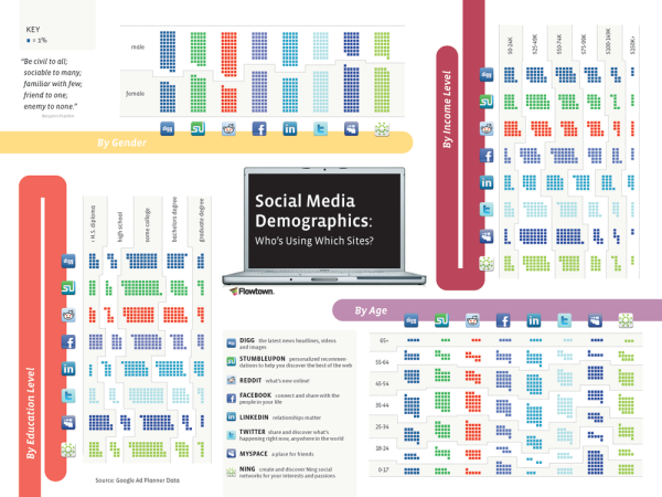
I like the “small squares” style used in Social Media Demographics for displaying demographic data.  The “by age” section is hard to read because it lines up so nicely with the site legend.  It’s also a little confusing to have the sites change axes for the different sections.


Numerous social media sites have witnessed explosive growth of their user bases in the last several years, but it’s a known fact that the type of user a site attracts varies greatly. Have you ever wondered which sites attract the most educated of social media users, or those that pull in the highest income? Below we map the demographics of the world’s most popular social media sites.


Is MySpace really that popular with the 0-17 crowd?  What year is the data from?

Found on Flowtown.com

PrintView Printer Friendly Version

EmailEmail Article to Friend

Reader Comments

There are no comments for this journal entry. To create a new comment, use the form below.
Editor Permission Required
While we are migrating to a new site design, you must have editing permission for this entry in order to post comments.