About
Randy Krum
President of InfoNewt.
Data Visualization and Infographic Design

Infographic Design

Infographics Design | Presentations
Consulting | Data Visualizations

DFW DataViz Meetup

Join the DFW Data Visualization and Infographics Meetup Group if you're in the Dallas/Fort Worth area!

Search the Cool Infographics site

Custom Search

Subscriptions:


Feedburner

The Cool Infographics® Gallery:

How to add the
Cool Infographics button to your:

Cool Infographics iOS icon

- iPhone
- iPad
- iPod Touch


Read on Flipboard for iPad and iPhone

Featured in the Tech & Science category

Flipboard icon

Twitter Feed
From the Bookstore

Caffeine Poster

The Caffeine Poster infographic

« The Apple Field Guide | Main | 10 Tips for (journalists) Designing Infographics »
Tuesday
Apr272010

The Color of Twitter

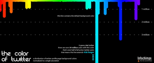
I really like The Color of Twitter from InfoChimps.org that plots the background colors used by all 40 million of the Twitter.com users.  I do think the infographic would be better if they had actually extended out the default light blue color instead of just noting that it extends 4.8x longer.  They also don’t account for background images that cover the background color, which would account for a large number of people not changing their colors.

As part of the release of a number of new, free Twitter data sets, Infochimps created the following beautiful infographic showing just what color Twitter really is.

The data for the infographic comes from the just-launched Histograms dataset that aggregates anonymous data about Twitter users such as how many users have x number of friends or followers, or how many users are in x location. The company also released new data sets (paid) about stock tickers, hashtags and URLs on Twitter.

Found on Mashable.com

PrintView Printer Friendly Version

EmailEmail Article to Friend

Reader Comments (3)

Sure looks like a lot of folks keep the default background instead of changing it up. Cool graphic.
August 19, 2010 | Unregistered CommenterFrederico
This is cool. I'll share this to my friends.
November 20, 2010 | Unregistered Commenterbankruptcy
That cyan color is one of the most effective colors going, even if it is not the most attractive-looking color. Twitter got it right. The color is easy on the eyes (less fatiguing than white) and blends well with other colors, so it makes for a good background color. Not surprising to see most don't customize beyond the default Twitter color.
http://this1that1whatever.com/blog/2010/12/08-twitter-usage.php
December 13, 2010 | Unregistered CommenterDavid
Editor Permission Required
While we are migrating to a new site design, you must have editing permission for this entry in order to post comments.