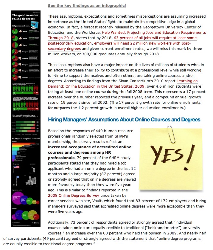
Client Infographic: The Good News for Online Degrees
Good News for Online Degrees is a recent project InfoNewt (my company) designed for elearners.com to visualize the results of a survey of Human Resources professionals worldwide.
The results are good, as online degrees continue to gain credibility and popularity. Designed as a companion infographic to the article “How Employers View Online Degrees” on the elearners.com website, the visual not only supports the article, but also stands on its own for posting on blogs.
I used a blend of pie charts, bar charts, circles and images to tell a story as you move down the visual. The different visuals help separate the different questions that were asked in the survey, but always include the actual numbers as well. For survey results, you want to be as transparent as possible by citing the source material, repeating the questions that were asked and using specific numbers to validate your visuals.
Personally, the most interesting results are in the stacked bar chart in the middle. Online degrees have dramatically different levels of acceptance based on what level of role the applicant is applying for.
Available as a high-resolution GIF and PDF from the elearners.com site.
Cheers to Helen and everyone at elearners.com!


 Randy
Randy


Reader Comments (5)