The Money Chart
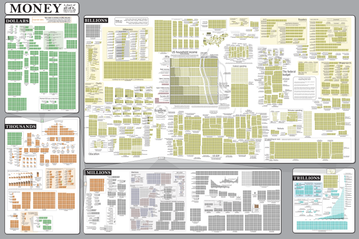
The Money Chart from Randall Munroe’s webcomic xkcd.com is a huge poster showing the scope and scale of money flowing all over the world. In a great move for transparency, the entire list of over 200 sources is also online.
You can view it through the online, zoomable viewer OR get the super high-resolution image file! The 36”x24” printed poster version will be available starting in December for $15.00.
This is the poster version of comic #980, which is a guide to money. It started as a project to understand taxes and government spending, and turned into a rather extensive research project. With upwards of 200 sources and 150,000 tiny boxes, it’s best appreciated in poster form. The 36”x24” high-quality poster print allows you to stand back and, all at once, take in the entire world economy.
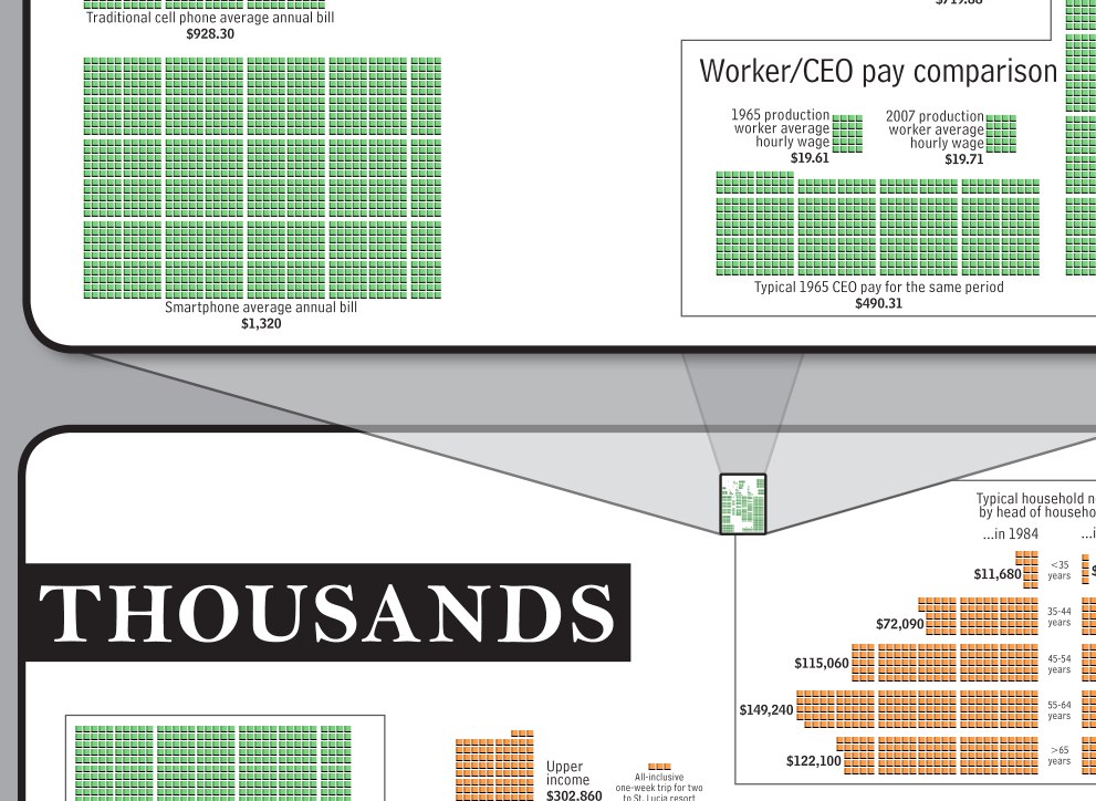
Each square represents one unit of the specific section it’s in. One dollar, One million dollars, One trillion dollars, etc. To provide some scale, each section is then visualized to scale in the next higher section. Here’s the transition from dollars to thousands.
Found on Infosthetics, ChartPorn and FlowingData


 Randy
Randy


Reader Comments (1)
Your blog is very Informative.