Client Infographics: Wine iPhone Apps
Two infographics InfoNewt (my company) designed recently for the great folks at VinTank.com, a think tank for the wine industry. Are There Any Good Wine Apps for the iPhone? summarizes the highlights of the data that VinTank gathered from the iTunes Store. Sorting through 452 wine apps is a lot for a consumer to figure out (intimidating!), so they broke them up by price, rating, business model and type of app.
We took it upon ourselves to evaluate all 452 wine related application available for the iPhone. That is more than six times the amount of wine related applications that was available on our last iPhone Report over a year ago. Each application went through an expansive 20-point inspection that surfaced strengths and weaknesses of their model, UEX, innovation, consumer value, winery value and much more.
You will also notice that we chose do a visual representation of all the data collected, because let’s face it, not only is our attention spans less with amount of content that requires our attention but also because infographics are pretty cool and definitely the trend to display deep rich amounts of numbers, information and data!
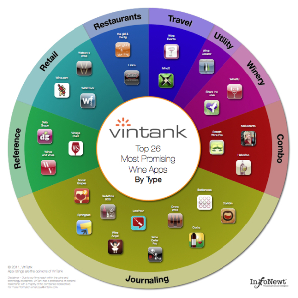
The second infographic displays the Top 26 Most Promising Wine Apps, as judged by VinTank. These are grouped by type of app, and if you view the larger version you can click on any of the icons to be taken to the iTunes page to learn more about the app.
The team at VinTank obviously put a ton of effort into gathering data and evaluating all 452 apps so they could share this information with the public.
After all that analysis it was clear to us that there were definitely leaders in the mobile space that showed the most promise. It is important to note that some of due to our deep reach within the wine and technology ecosphere, we have professional or personal relationships with a majority of the Top 26 that have been outlined. This however, does not change our view about how exciting it will be to see how all of them continue to improve their platforms and in fact, we excluded many other app companies that we also work with.
The Top 26 spectrum chart is an interactive version where you can learn more about each application and download their app directly should you choose to do so, or if you don’t already have it. Go ahead give it a try!
Even for data very limited to a specific target audience, an infographic is a fantastic tool to make the information interesting and easy to comprehend by the readers.


 Randy
Randy


Reader Comments (5)