The Reality Behind Social Location Apps #infographic
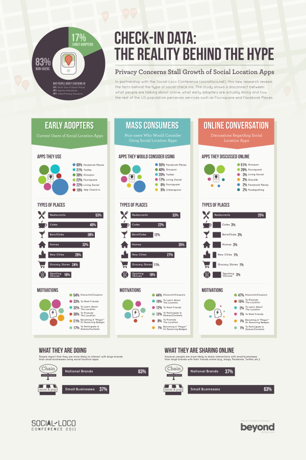
Digital services company Beyond compiled the results of their research into location-based apps, and designed this infographic summarizing the results; Check-In Data: The Reality Behind the Hype. Released in conjuction with the Social-Loco conference in San Francisco, CA on May 5th.
As part of our involvement in the Social-Loco conference we have done some research to try to understand the difference between what people are saying online compared to the actions of early adopters and the views of the rest of the US population when it comes to their mobile check-in habits.
The results give us a clear understanding of who the winners and losers are likely to be, as well as the types of things that will motivate the mass consumer to adopt location-based apps. They also highlight some of the real challenges there are to consumers embracing this technology.
The data is very interesting. Personally, I continue to use Foursquare, but find myself checking in less and less because I don’t get any direct benefits out of it.
From a design standpoint, I like the circle clusters, but I don’t like data separate in a legend on the side. I appreciate that the color-coding remains the same, so Twitter is the same color in each visualization. I would have included the logo images for the social location-based apps, and connected the data directly to the circles. Data legends like this make your readers work harder to understand the information.
I also think that the most interesting learning from the study is the comparison between how people interact with national brands and small, local businesses. However, this is the last visualization at the bottom, and gets lost.
Found on Mashable!


 Randy
Randy

Reader Comments (1)