Nobel Prizes and Laureates Timeline Visualization
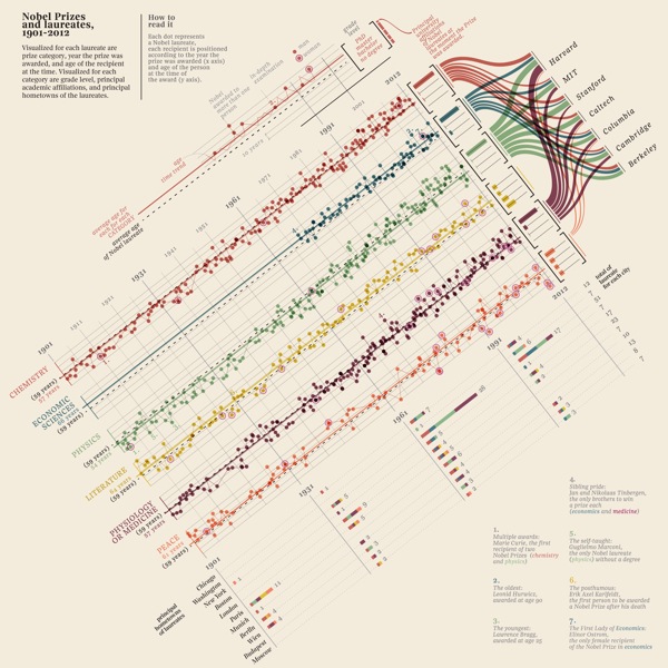
Nobel Prizes and Laureates is great visualization from the Milanese design firm Accurat. From 1901-2012 this information design breaks down the winners by category, age, principal university affiliates and even hometowns.
The high-resolution version is available on Visualizing.org
The visualization explores Nobel Prizes and Laureates from 1901 to 2012 analyzing the age of recipients at the time prices were awarded, average age evolution through time and distribution among categories, grade level, main affiliation universities and principal hometowns of the laureates.
Designed as a part of an ongoing series for the Milanese newspaper Corrierre della Sera, La Lettura is a culture supplement. You can see this design and the rest of the series in the collection on Visualizing.org.
The timeline takes a lot of information, and makes it easy to understand for the readers. I especially appreciate the transition from line chart of ages to the bar chart of education grade levels to the sankey diagram of universities at the right end of the timeline. Beautifully done.
Each dot represents a Nobel laureate, each recipient is positioned according to the year the prize was awarded (x axis) and age of the person at the time of the award (y axis).
Found on FastCoDesign


 Randy
Randy

Reader Comments (1)