About
Randy Krum
President of InfoNewt.
Data Visualization and Infographic Design

Infographic Design

Infographics Design | Presentations
Consulting | Data Visualizations

DFW DataViz Meetup

Join the DFW Data Visualization and Infographics Meetup Group if you're in the Dallas/Fort Worth area!

Search the Cool Infographics site

Custom Search

Subscriptions:


Feedburner

The Cool Infographics® Gallery:

How to add the
Cool Infographics button to your:

Cool Infographics iOS icon

- iPhone
- iPad
- iPod Touch


Read on Flipboard for iPad and iPhone

Featured in the Tech & Science category

Flipboard icon

Twitter Feed
From the Bookstore

Caffeine Poster

The Caffeine Poster infographic

« What's In Your Trash? | Main | Client Infographic: Hotels.com Romance Survey »
Thursday
Feb092012

The Definitive Cocktails Poster


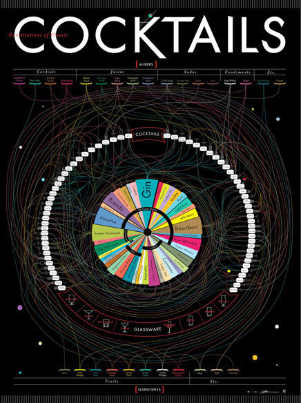
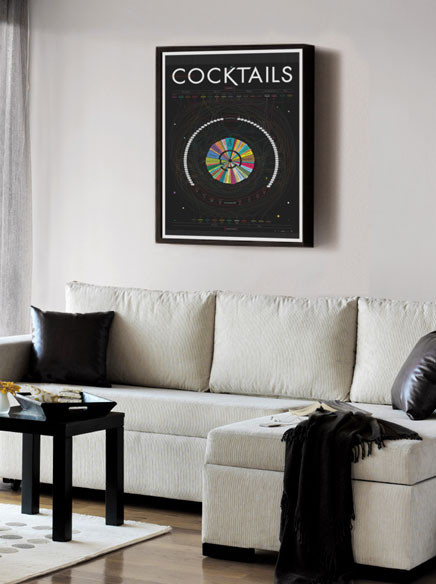
The Constitution of Classic Cocktails is a cool new poster from Pop Chart Lab.  Available in print for $36, this is a 27”x39” poster.

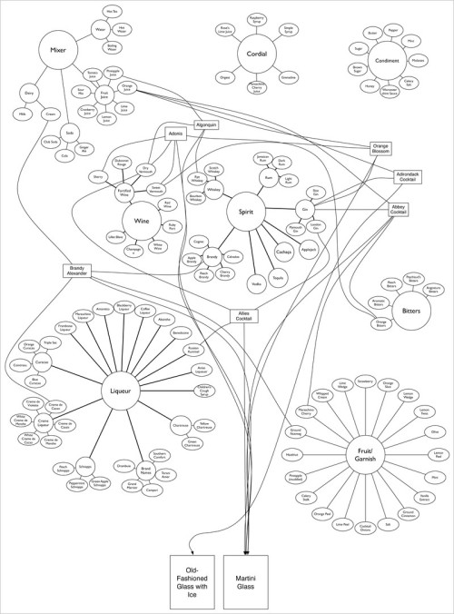
This definitive guide to classic cocktails breaks down 68 drinks into their constituent parts. Follow the lines to see where spirits, mixers, and garnishes intersect to form delightful concoctions. This massive movie poster-sized print contains over 40 types of alcohol (from distilled spirits to bitters), mixers from raspberry syrup to egg white, and garnishes from the classic olive to a salted rim. This obsessively detailed chart also includes the ratios for each drink, as well as the proper serving glass, making it as functional as it is beautiful. Over a year in the making, this is Pop Chart Lab’s most elaborate chart ever.


I love the circular design, with radial connections between the different alcohol types in the center and the mixed drinks around the perimeter.  I find it easier to start in the center, and figure out which drinks you can make with that alcohol.  They show the different shapes of glassware for cocktails across the bottom, and use those icons to show which glass should be used with each drink.

Pop Chart Lab also posted a fabulous, behind-the-scenes article on FastCoDesign about the process they went through during the design development.  Check out The Only Chart You Need To Mix A Proper Cocktail to see the early concepts and the different stages the design went through.

Found on Chart Porn.

PrintView Printer Friendly Version

EmailEmail Article to Friend

Reader Comments (5)

The purpose of infographics is to make large sets of data EASIER to understand, yes? No offense to the maker of this Pop Chart Lab poster, but it's much too tangled to be of any use. It's only conceivable use is to look pretty.
February 9, 2012 | Unregistered Commentertechnomancer
It looks great but at first glance, you won't understand the concept immediately.
February 9, 2012 | Unregistered CommenterAshley @ Poster Printing
Looks nice, but as said, that's not the point of information architecture diagrams. The content is supposed to be rendered easier to understand by viewing it. Impossible here.
February 11, 2012 | Unregistered CommenterAeralure
This post is both informative and interesting
October 26, 2014 | Unregistered CommenterAlex Mercer Clothing
You have done a fantastic job, thanks for the information t
January 11, 2015 | Unregistered CommenterShearling Coat
Editor Permission Required
While we are migrating to a new site design, you must have editing permission for this entry in order to post comments.