


What About Me? - Intel's Infographic Generator
 Randy
Randy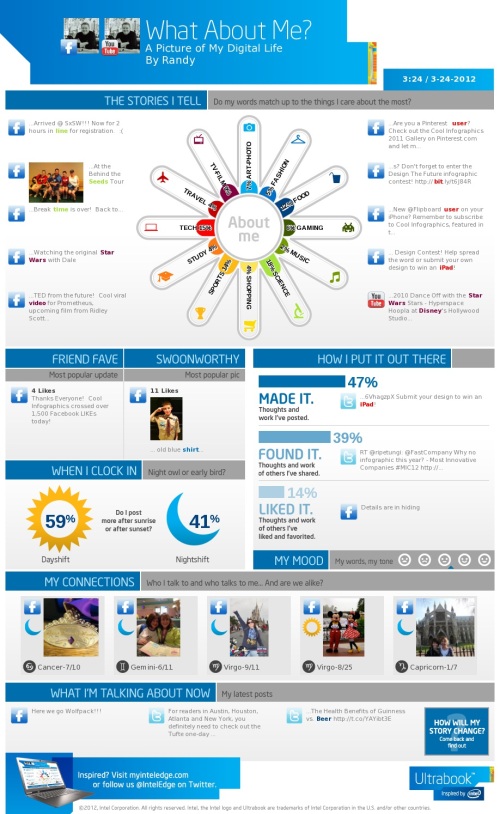
Intel has released What About Me?, an automatic infographic generator that connects to your own Twitter, Facebook and YouTube accounts to create a profile infographic about you.
Social media users know that discovery is half the fun. With What about Me? you can capture a snapshot of your social media life and create your own colorful image, full of clues and facts about one of the most fascinating subjects in the world — YOU!
In general, I’m not a fan of automatically generated infographics. I find them repetitive, like PowerPoint templates, and that makes everyone’s information look the same. This one at least incorporates a few photos of your own to give a little personal touch, but not much.
From a design perspective, the “About Me” section is the big central visual element. I like the color spectrum and the simple icons used for the dominant categories. It may be just my own data, but all of the percentages are small and fairly close to each other, so visually you don’t see much difference at all. Am I really that well balanced???
In the “How I put it out there” section, the bars are all portions of the total 100%, so a pie chart or a stacked bar would have been a better chart style to use in the design. Again, in the “When I clock in” section, these two values are portions of the total 100%, so some type of visualization that shows that would have been helpful to the reader.
I really like the simplicity of the “My Mood” section, and I think they actually made it too small in this design. As a completely visual element it could reall be much larger and more prominent. I would really like to have some type of editing capability, like choosing which images are included.
I think they setup the sharing function poorly. You can save a JPG file of your own design (like mine above) to your own computer. If you share on Facebook or Twitter it will post the infographic as a photo in your account, but the link it generates will just take someone else back to the front page to design their own. That’s confusing because the link should be sharing your own design with others, so they would have the option to like or share your design.
If you create your own design, share post the link to your image in the comments!
Found on Mashable

Reader Comments (2)
http://www.flickr.com/photos/stevenljohnson/6896379238/
http://visual.ly/think-you-post
Anything would be appreciated!