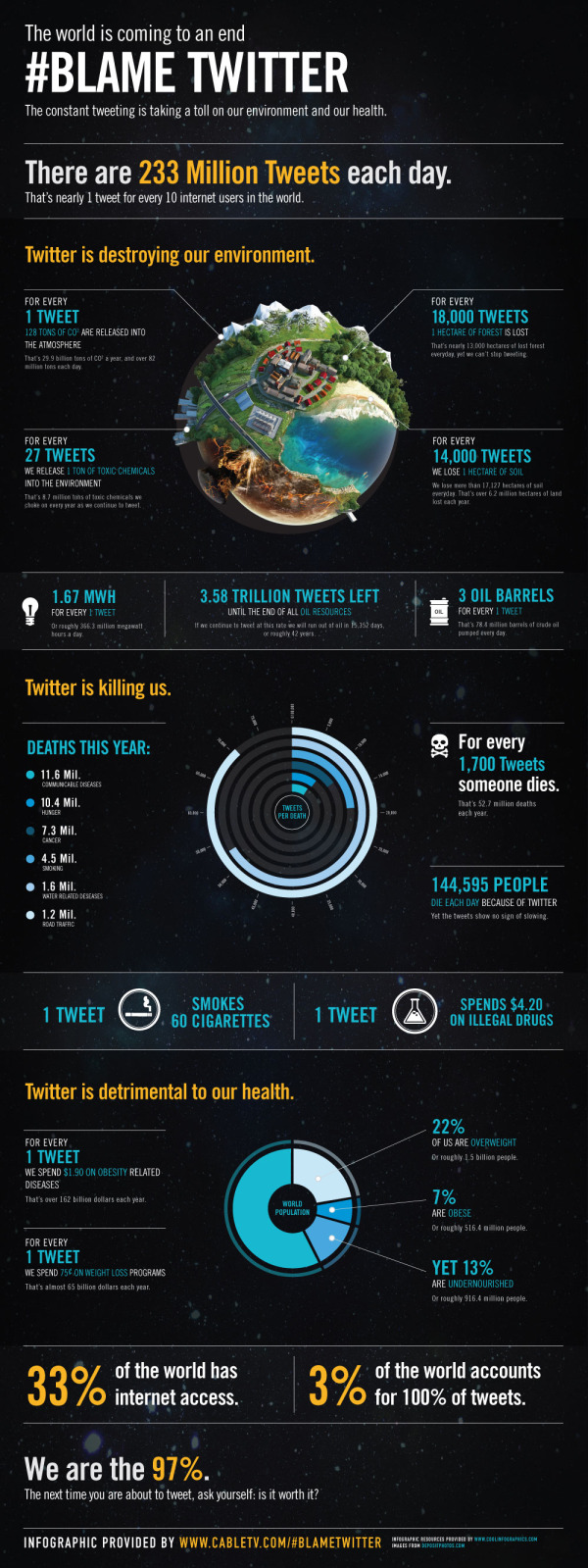
Infographic Contest Winner: #Blame Twitter
A big congratulations to Tim Cooley! Tim won the PosterBrain Design the Future contest with the entry above called #Blame Twitter, which is essentially a parody infographic.
From Tim:
All claims in this infographic are obviously false in nature and are solely intended for the comedic entertainment of readers. We <3 Twitter.
From PosterBrain:
We are sending a HUGE shout out to Tim Cooley for winning our Design the Future Infographic Contest! His infographic, #Blame Twitter, is very creative, informative, visually pleasing, and incredibly well done! We will definitely think twice about what, and how often, we tweet! Congrats again Tim, and thanks to everyone who participated!
Tim took the real data provided for the contest, but fictitiously correlated it to Twitter statistics. In a classic example that “Correlation does not imply causation”, Tim visualized the real-world statistics as if they were caused by Twitter. For example, it is true in the real-world that nearly 13,000 hectares of forest is lost every day, but it has nothing to do with the 233,370,615 Tweets every day.
Tim won an iPad2 for his winning infographic! You can see all of the contest entries on the PosterBrain Facebook Contest Photo Album.
Please fell free to retweet this post without harming the environment…
 Data,
Data,  Infographic,
  contest,
  design,
  twitter


Reader Comments (2)
Although to be fair, I don't think it actually correlates the data to Twitter. To correlate the data to twitter, you would have to show that all of these bad effects started when Twitter was founded and have grown in proportion to Twitter's growth.
~Adam
Cheers