5 Great Online Tools for Creating Infographics
Professional infographic designers rely primarily on a core vector graphics software program to create their infographics designs. The main advantage is that all the icons, charts, images, illustrations, and data visualizations are treated as separate objects that can be easily moved, resized, overlapped, and rotated. No matter where you create the individual design elements, the final infographic design is usually put together in a vector graphics program.
Creating infographics using online tools has never been easier. In the last few years a number of online tools have emerged that allow anyone to create great visual content. Whether you are working on a project for work, personal use, or social media, each new project starts with a template. With the dimensions laid out for you, you can focus your attention on quickly creating effective designs. Search, drag, and publish - it can be that simple.
These new tools are vector graphics applications that run in your browser as a replacement for using an expensive professional desktop application like Adobe Illustrator to put your infographic design together. Each one offers different tools, image libraries, charts, fonts and templates as a starting point. None of these have the full capabilities of a professional desktop application, but you probably don’t need that much power to create a simple infographic.
In this article, we take a quick look at 5 of the best online tools for creating infographics: Visme, Canva, Easel.ly, Piktochart, and Infogr.am. All of these tools are evolving quickly, and this is just a snapshot of their current capabilities.
1) Visme (visme.co)
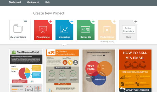
Visme allows you to create interactive presentations, infographics and other engaging content. With tons of templates, and huge library of free shapes & icons to choose from, Visme has you creating awesome visual content right away.
The templates are set up simply and beautifully. If you wanted, you could just edit the placeholder text, insert your own, and publish your infographic.
One of the greatest aspects of this service is changing percentages within the charts. All you have to do is click on the graphic you would like to change, enter a new number, and the chart changes to reflect the new information automatically. Saving you hours of frustration trying to do it on your own.
Pros:
-
Creates infographics, presentation, animations, ad banners, and custom layouts.
-
Insert and edit chart objects directly by changing the data values.
-
Large library of icons and images.
-
Embed YouTube videos directly into designs.
-
Special pricing for students & teachers.
Cons:
-
The basic free version is limited.
-
Only 3 projects.
-
Must include the Visme logo.
-
Limited access to charts and infograph widgets.
-
-
JPG download is still in Beta, with a few bugs.
Price: Basic version is free with pricing plans available
2) Canva (canva.com)
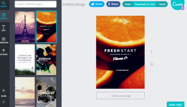
Canva just celebrated their 1-year anniversary last month, and has made a big splash in the online design space. Your experience kicks off with a great "23 Second Guide to Beautiful Design," where they walk you through a brief introduction to their design program.
After finishing the brief tutorial, you can start a new design. Canva is filled with options, whether you are working on a project for work, personal, or social media. Each new project comes with a template for the project you choose to work on. With the dimensions done for you, you can focus your attention on creating beautiful designs in seconds.
Pros
-
Excellent (and short) intro tutorial to get you started, and many more on advanced concepts.
-
Templates for social media, blogs, presentations, posters, business cards, invitations, and more.
-
Easy and intuitive to use.
-
Large library of images to choose from.
Cons
-
No editable chart objects. You need to import your own data visualizations as images.
-
Have to pay for different image assets individually, instead of a monthly subscription.
Price: Free, but you have to pay for Pro quality design assets individually
3) Easel.ly (www.easel.ly)
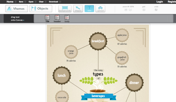
Easel.ly is a great program, but lacks some of the guidance, and features, that come standard in other programs.
Easel.ly lacks a "How-To" introduction section to their program, and just kind of throws you into the design process right away. Their focus seems to be primarily based on infographic design. Whereas other programs offer a plethora of design project options.
If you're just looking to design an infographic, this program will work well. If you want more variety, you'll have to utilize one of the other programs in this list.
Pros:
-
Free.
-
Very basic design layouts and assets.
-
New charts feature allows some basic editable charts in your design.
-
Easy downloads for JPG and PDF versions.
Cons:
-
Not a very large selection of themes, called “Vhemes”.
-
Small library of image assets. You’ll want to upload your own images and icons.
Price: Free
4) Piktochart (piktochart.com)
Piktochart is one of the best looking programs on this list. All the information you need to get started is provided in their tour.
Their program is easy to use, and offers tons of freedom in building and editing your infographic using their simple graphic tools. They have categorized icons, resizable canvas, design-driven charts, and interactive maps to utilize.
Their intuitive user interface is where Piktochart truly excels. All the tools you need to create are laid out intelligently, making your new job as a "designer" so much easier.
One of the coolest aspects of this program is that they show how versatile infographics are for different projects. Whether you're creating for a classroom, office, website, or social media setting - Piktochart gives you the heads up on how to use infographics effectively.
Pros:
-
Themes and templates are of high design quality.
-
Intuitive. Allows you to edit anything and everything with ease.
-
Create infographics, reports, banners and presentations.
-
Embed videos from Youtube and Vimeo in your design.
Cons:
-
Limited selection of free templates. Higher quality templates are available with a Pro account.
-
$29 per month is a high subscription price compared to the others.
Price: Start for free with pricing packages available
5) Infogr.am (infogr.am)
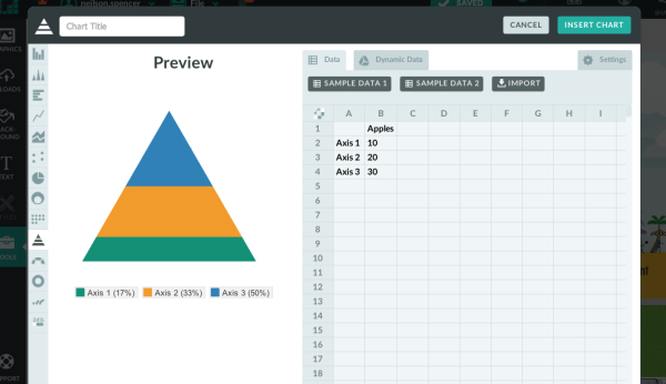
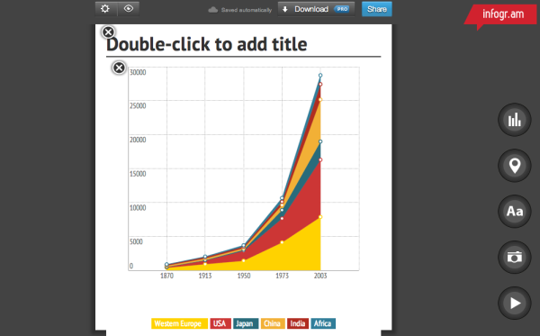
Infogr.am has got the best charts. For illustrating data, there are more than 30 different types of charts to choose from. Anything from bubble charts and tree maps to simple pie charts.
Editing data can be easily done in Infogr.am's built-in spreadsheet, or you can import your own XLS, XLXS and CSV files. Once your infographic has been edited and beautifully designed, you can save it to your computer as a PNG or PDF file with a paid subscription.
Pros:
-
Ability to create and edit great charts by changing data
-
Built-in Spreadsheet. Can also import your XLS, XLXS and CSV files
-
Widest variety of available chart types
-
Educational and Non-profit pricing plans available
-
Embed videos from Youtube and Vimeo in your design.
Cons:
-
Only creates infographics and charts
-
Small selection of infographic templates
-
No image library, you must upload your own image assets
-
Download options require paid subscription
-
The White Label subscription service is the most expensive options of the group
Price: Basic version is free with pricing plans available
Which design sites have you tried? Which tools are your favorites? Post in the comments.
 Visualization,
  charts,
  design,
  infographics,
  internet,
  software,
  web
web 



Reader Comments (58)
On Easelly's front page, the first handful are their templates, but the rest are actual public projects from users that you can duplicate as a starting point for your own designs. There are currently only 15 built-in "Vhemes" to choose from when starting a design.
This is very simple in operation.
www.picstouch.com
Visme on another hand is more heavily concentrated on Presentations and Infographics. And it lets you add pretty much
anything to make it engaging.
A quick example checkout this infographic we just did in-house using our own tool.
https://my.visme.co/projects/techday-infographic-17c7e1
There is button there and in mobile or non mobile you can click on it.
There is even video embed to it
There is also google map there too.
And of course regular stuff like shapes, icons, etc..
All you have to do is create it in Visme, publish it and no need to download or anything; just share the link on social media, etc.. or embed to her site and links will remain active when visme is visited. thanks!
thanks
Why Genial.ly isn't include here? I really think it should because when it comes to infographics, there's no better tool to me.
Here's the link if you want to try it: https://www.genial.ly/
Cheers!
Thank you.
Genially should be included. I don't get why people don't use it as much as other tools as Easel.ly
In my opinion, it's way better. Try it!!!
Connect and visualize data from apps you are using (Jira, GitHub, Google, Dropbox, Trello and others).
It takes no effort and it is free.
I really recommend it, to everyone.
Bye! :)
http://mindthegraph.com/
Have you heard about Rawpixel.com?
You’ve probably seen our images all over the place. We’re the leading free design resource company in the world. Our new site has just been launched where we give away the finest free stock images on the planet.
We’d be over the moon if you would consider writing about us and what we do. Sharing is caring, and the world of creatives are always on the look out for inspirational and truly authentic images.
Come on in and join our community. Drop us a note at contact@rawpixel.com.
BE INSPIRED. BE RAW.
Nica
thanks for sharing this post you are a life saver i have tried to many tools but these tool are the best tool i have seen ever thanks for sharing :)
Blog: http://www.sitefinity.com/blogs/austin-hellman-blog/2016/10/05/5-free-ways-to-enhance-your-content-with-data-visualization