The State of Infographics at SxSW 2014
I post all types of infographics and data visualizations from designers all over the world here on Cool Infographics, and as a recap, I wanted to take stock of the state of infographics and data visualization at this year’s SxSW Interactive conference in Austin, TX.
I’ve been going to SxSW for a few years now, and infographics have been a growing presence in the Interactive portion of the conference every year. You can find hidden sessions about data visualization, visual communication and infographics in different portions of the conference like the new SXsports, Health and Business sessions.
Check the links and search the presentation hashtags on Twitter to find more information and audience comments from each event. I know I didn’t catch everything, so send me links to anything (Events, notes, slides, etc) I missed through the Contact page or the comments and I’ll add appropriate ones into the post!
*Sessions I was able to attend
Official Events:
- The Onions of Interactive Infographic Design (#adobesxsw)
- Sarah Hunt, Product Manager, Adobe Systems @sarahwhatsup
- This session covered the value of creating animated, interactive infographics with HTML your readers care about using Adobe Edge Animate.
- Presentation online: http://sarahjustine.com/sneakyfolder/pres
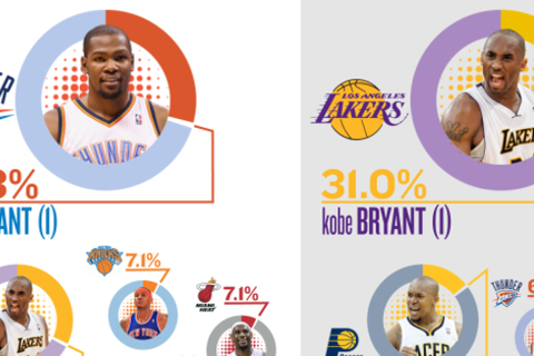
- Sports Don’t Look the Same Anymore* (#sportsviz)
- John Meyer, Founder, Statographics and CEO, Lemonly @johntmeyer
- Meyer examined how infographics, data visualizations, and interactive pieces have changed the landscape for scouts, managers and marketers inside of the game, as well as fans and fantasy players outside the game.
- Slides available online at bit.ly/sportsviz
- Truth Will Set You Free but Data Will Piss You Off* (#dataethics)
- Grace Rodriguez, Founder/President, C2 Create @gracerodriguez
- Jake Porway, Executive Director, DataKind @jakeporway @DataKind
- Jonathan Schwabish, Government Economist, PolicyViz @jschwabish
- Kim Rees, Co-Founder, Periscopic @krees @Periscopic
- This session explored the issues and ethics around data visualization—a subject of recent debate in the data visualization community—and suggest how we can use data in tandem with social responsibility.
- Storify notes: http://storify.com/gracerodriguez/sxsw-panel-the-truth-may-set-you-free-but-data-wil
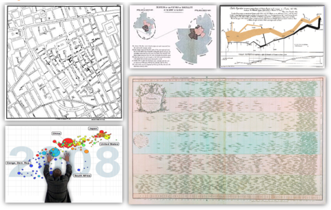
- The Most Influential Visualizations of All Time (#5vizzes)
- Andy Cotgreave, Social Content Mgr, Tableau Software @acotgreave
- We’ve chosen the 5 most influential visualizations of all time. Each of the charts in this list instigated change: one helped eradicate cholera, another revolutionized nursing.
- Presentation slides: http://www.slideshare.net/TableauSoftware/the-most-influential-vizzes-of-all-time-sxsw
- Andy’s summary blog post: http://gravyanecdote.com/uncategorized/sxsw-the-most-influential-visualisations-of-all-time/
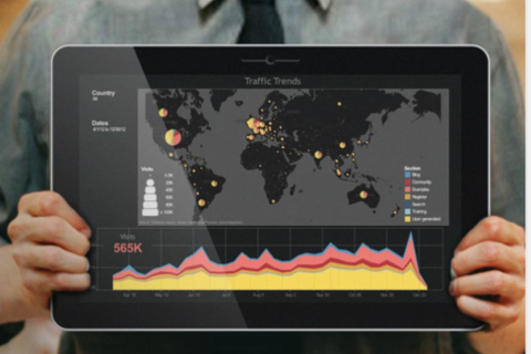
- Actively Participating in the Big Data Revolution (#DataRev)
- Elissa Fink, CMO, Tableau Software @elissafink
- In this talk, Elissa will share their stories and offer insights into how we can all become more data-driven, every day
- HighOnData Dashboard: http://www.tableausoftware.com/public/highondata
- The Tyranny of Edward Tufte* (#tuftyranny)
- Gabriel Schaffzin, Researcher & Designer & Builder, Skeptic @gabischaffzin
- When Edward Tufte tweets mockingly of the leaked NSA slides, he does so as the self-anointed king of presenting evidence. Empiricism’s head cheerleader, he has built an empire on telling everyone—lowly marketer to NASA bigwig—what Truth looks like. And we eat it up.
- Presentation slides: http://utopia-dystopia.com/blog/2014/3/8/sxsw-interactive-2014-austin-tx
- Scientist to Storyteller: How to Narrate Data (#Sci2Story)
- Eric Swayne, Prod Mgr/Analytics Dir, BuzzShift @eswayne
- Storify: http://storify.com/40deuce/scientist-to-storyteller-how-to-narrate-data-sci2s
- Prezi presentation: https://prezi.com/xkqdi1lq8iix/scientist-to-storyteller-how-to-narrate-your-data/

- Visually Turning Complexity into Clarity* (#clarity)
- Fernanda Viégas, Research Scientist, Google @viegasf
- Graham Roberts, Graphics/Multimedia Editor, The New York Times @Grahaphics
- Karl Gude, Graphics Editor in Residence, School of Journalism at Michigan State University @karlgude
- Ronnie Lipton, Info Design Author, Trainer, Consult @ronnielipton
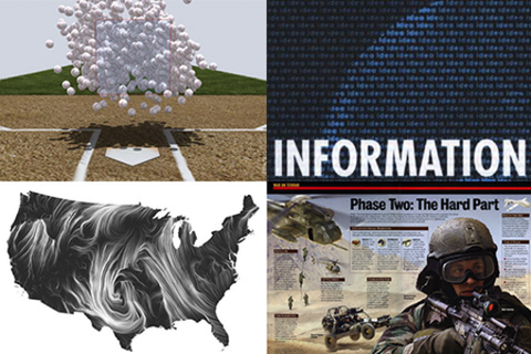
- We are a unique gathering of professional visual communicators who employ a wide variety of storytelling platforms (print, interactive and motion graphics) and visual tools (maps, graphs, diagrams, video, etc.) to do our jobs. We will explain our process for finding visual stories in the data, discuss the best technologies for doing what we do and illustrate how we build, plan and execute graphics.
- Wind Maps: http://hint.fm/wind/
- Sketchnotes: https://twitter.com/KKellyMSU/status/443484058043944960/photo/1
- Show & Tell: How to Present, Extraordinarily (#ShowTell)
- Dan Roam, President, Digital Roam Inc @dan_roam
- Mentor Session: Brian Wallace (#infographs)
- Brian Wallace @nowsourcing is the founder of NowSourcing, Inc., a infographic design and social media agency since 2005 serving everyone from startups to the Fortune 500 and everything in between.
- Workshop: Pimp Your Pitch: Learn Visual Storytelling (#pitchfix)
- Nancy Duarte, Principal, Duarte @nancyduarte
- Paul Brown, VP, Duarte @Duarte
- Mike Pacchione, Facilitator, Duarte @mpacc
- Ryan Orcutt, Assoc Creative Dir, Duarte
- This Visual Storytelling workshop will teach you how to create audience empathy, address resistance, heighten emotional appeal, and strengthen your story structure to persuade your audience.
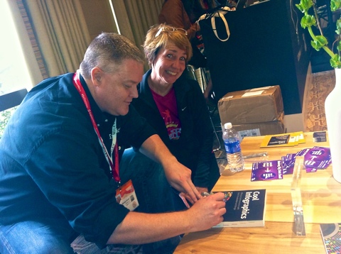
- Book Signing, Randy Krum, Cool Infographics* - that’s me! (#coolinfobook)
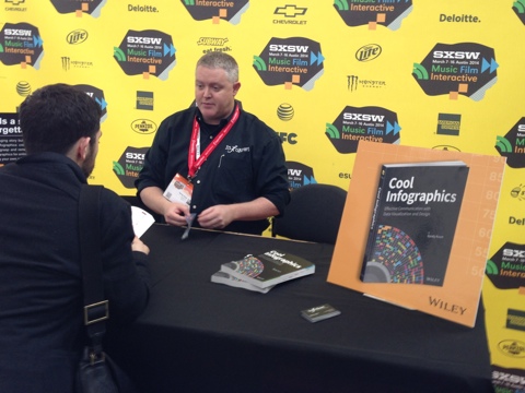
- Randy Krum @rtkrum @Coolinfographic appeared at the SX Bookstore to sign copies of “Cool Infographics: Effective Communication with Data Visualization and Design”
- Book Signing, Nate Silver, The Signal and the Noise (#ESPNbrand)
- Nate Silver @NateSilver538 appeared at the SX Bookstore to sign copies of “The Signal and the Noise: Why So Many Predictions Fail — but Some Don’t”
- Book Signing, Dan Roam, Show & Tell (#ShowTell)
- Dan Roam @dan_roam appeared at the SX Bookstore to sign copies of “The Back of the Napkin” and his new book launched at SxSW this year “Show & Tell!”
- Book Signing, Nancy Duarte, Resonate* (#pitchfix)
- Nancy Duarte @nancyduarte appeared at the SX Bookstore to sign copies of “Resonate: Present Visual Stories that Transform Audiences”.
- The SxSW Trade Show Floor
- I found three trade show booths this year related to infographics:
- Tableau Software booth
- Visual.ly booth*
- Now Sourcing booth*
- Graphic Recordings of SxSW Interactive Events
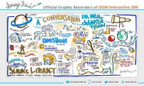
- ImageThink @ImageThink created a bunch of LIVE graphic recordings from prominent sessions and made them available for everyone to see across from Ballroom A in the Austin Convention Center and online.
- Full SxSW gallery online: http://imagethink.smugmug.com/Conferences/2014/SXSWi-2014/37565133_dFJ2tf
- http://sxsw.com/interactive/news/2014/graphic-recordings-2014-sxsw-interactive-content-march-15-update
Unofficial Sessions:
- The Attention Economy with Walter, book signing by Ekaterina Walter @Ekaterina, co-author of The Power of Visual Storytelling
- “Attention is the new commodity. Visual storytelling is the new currency,” say co-authors Ekaterina Walter and Jessica Gioglio in their new book The Power of Visual Storytelling. The first 100 attendees for Ekaterina’s signing will get a copy of her book. Come chat with Ekaterina about the visualization revolution and her thoughts about SxSW Interactive 2014.
- Hosted by Vocus @Vocus
- http://www.eventbrite.com/e/wtf-sxsw-visualize-a-powerful-future-tickets-10822280733
- FH Black Box lounge at the Four Seasons (#FHBlackBox)
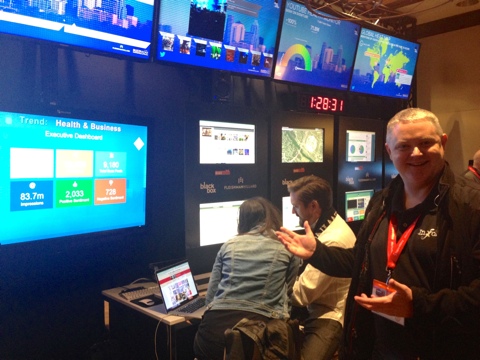
- Fleishman Hillard @Fleishman hosted the Black Box Lounge throughout SxSW Interactive with a massive Social Media Control Center that was visualizing millions of data points and mentions online about SxSW.
- http://fleishmanhillard.com/
- Column Five announced the release of Visage
- Column Five @columnfive announced their new interactive data visualization tool, Visage at SxSW.
- “Visage is a new Web-based platform that transforms the uninspired data in your reports into beautiful, branded visualizations that make your message more impactful—and make your work look good. The easy-to-use software helps you create high-quality, professional visualizations that are accurate, effective and elegant.”
- http://www.columnfivemedia.com/blog/introducing-visage-our-new-visualization-platform

- Cool Infographics Meetup
- Special thanks to the team at the Fleishman Hillard Black Box Lounge! They allowed me to host the Cool Infographics @Coolinfographic meetup event after my book signing on Monday for anyone that wanted to hang out. It was also an opportunity to meet fans and sign books for people that didn’t have official SxSW badges.
 Randy
Randy
A modified version of this post was featured on The Huffington Post: http://www.huffingtonpost.com/randy-krum/infographics-at-sxsw_b_5001070.html
 Data,
Data,  Huffington Post,
  SxSW,
SxSW,  Visualization,
  conference,
  infographics





Reader Comments (2)