About
Randy Krum
President of InfoNewt.
Data Visualization and Infographic Design

Infographic Design

Infographics Design | Presentations
Consulting | Data Visualizations

DFW DataViz Meetup

Join the DFW Data Visualization and Infographics Meetup Group if you're in the Dallas/Fort Worth area!

Search the Cool Infographics site

Custom Search

Subscriptions:


Feedburner

The Cool Infographics® Gallery:

How to add the
Cool Infographics button to your:

Cool Infographics iOS icon

- iPhone
- iPad
- iPod Touch


Read on Flipboard for iPad and iPhone

Featured in the Tech & Science category

Flipboard icon

Twitter Feed
From the Bookstore

Caffeine Poster

The Caffeine Poster infographic

« Designing Infographics That Last | Main | The Logistics of Santa Claus »
Tuesday
Dec292015

Where The USA Gets Its Oil

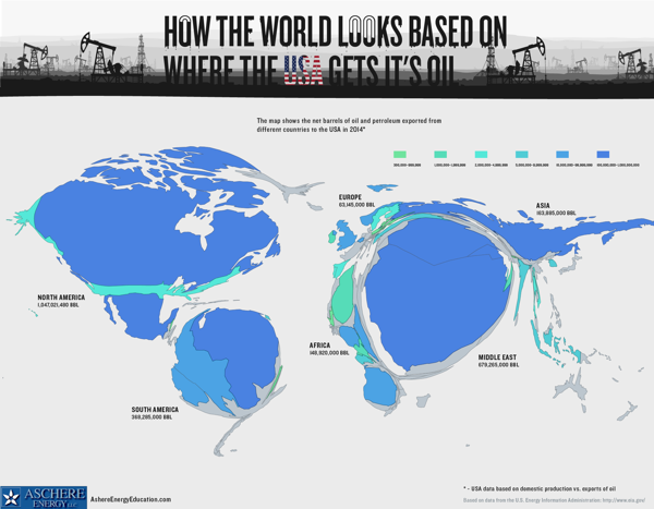
Where The USA Gets Its Oil infographic

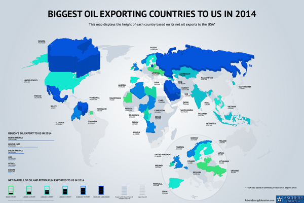
Two data visualization maps from Aschere Energy Education that show Where The USA Gets Its Oil.

The area cartogram created with a Gastner-Newman diffusion based algorithm is used to resize the countries above. It's a fun and unusual visualization method that stands out and gets attention because it breaks our usual understanding of the world map.

The second map uses the 3D heights of the countries and color-coding to represent the oil & petroleum exports to the U.S.

Thanks to Joe for sending in the link!

PrintView Printer Friendly Version

EmailEmail Article to Friend

Reader Comments (1)

The most economical prices to and in tandem to the needs and requirements of the clients.
January 6, 2016 | Unregistered CommenterNakul
Editor Permission Required
While we are migrating to a new site design, you must have editing permission for this entry in order to post comments.