


 Randy
Randy

Microsoft HealthVault Xplaned

Microsoft enlisted our friends from Xplane to help visualize the theory behind the HealthVault system.
I would almost call this a 3D mind map the way it’s laid out.
Where Does the Money Go?

From the nytimes.com, this graphic visually represents how average consumer spending breaks down, and the color code shows how much spending in that category has changed in the last year. For example, Gasoline is 5.2% of an average consumer's spending, and it has risen 26% from 2007 to 2008.
As far as I can tell, this is actually a treemap, but in a new shape. More details pop-up when you mouse over each of the individual shapes.
Thanks to Tony, for sending in the link.
Fostering Innovation at Pixar

Only a little bit off-topic. This is a great interview with Brad Bird from Pixar on how they build an environment for innovation. The lessons apply to movies, product development, design and of course designing infographics. Lesson Six is my personal favorite!
Found on Daringfireball.net
Google PageRank Explained

Another good infographic from Elliance.com.
Google assigns a numeric weighting from 0-10 for each webpage on the Internet; this PageRank denotes your site’s importance in the eyes of Google.
Who Owns the Car Companies? (UPDATE)
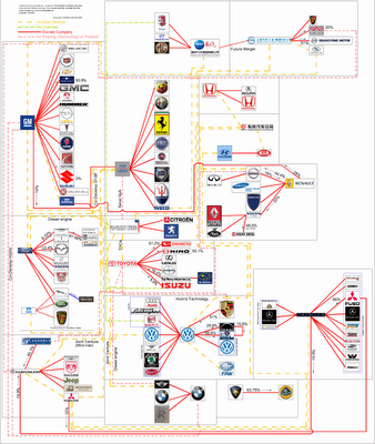
TooManyCars.com has updated their family tree style poster of how all of the car companies are related. The latest updates were as of 4/1/08. They have also changed to better software used to zoom into the poster. Each of rectangles you see on the images will zoom in close so you can read the details about the connections.
They've really done a good job tracking down the specific types of relationships and the ownership portions between the companies. High-res PNG or PDF files are also available.
Kapitaal
What if the only things you could see in the world around you were brands and advertising? No walls, no people, no sidewalks...just ads. Apparently it would be more than enough to get around in the world.
This is an awesome video! Thanks to pascal for submitting the link in the comments to an earlier video post: See The World in Words
Visualizing Carbon Dioxide Emissions
This is a great way to visualize gas emissions which are normally invisible. That's why most people don't have any real sense how much is produced by the things you do in everyday life like running your washing machine or refrigerator.
The black balloons really work, with the black color implying "bad" and they're actually filled with a lighter than air gas that rises into the atmosphere. I'm assuming that the size of the balloons actually represents the 50 grams of greenhouse gas discussed in the ad.
Found on infosthetics.com and radar.oreilly.com and the original is at www.saveenergy.vic.gov.au from the Australian government.
Know your State Flag Infographics


From calorielab.com, is a humorous take-off of the flag infographics from Icaro Doria (Meet the World, Infographic Flags). These infographics based on U.S. state flags, although probably politically incorrect, are very funny.
Thanks to Mark from calorielab.com for sending in the link.
One Day Poem Pavilion


Sort of crossing the line between infographics and art. A very cool project called the One Day Poem, from Experimental Typography. The geodesic structure is aligned to the sun, and perforated in a very specific pattern to show different parts of the poem over the course of a day, and even a different poem at different times of the year. The specific arrangements of the perforations reveal different poems according to the solar calendar: a theme of new-life during the summer solstice. During summer solstice, the poem will contain the theme of “new life”. During winter solstice, the poem will be on “reflection and the passing of time.”
Found on digg.com