About
Randy Krum
President of InfoNewt.
Data Visualization and Infographic Design

Infographic Design

Infographics Design | Presentations
Consulting | Data Visualizations

DFW DataViz Meetup

Join the DFW Data Visualization and Infographics Meetup Group if you're in the Dallas/Fort Worth area!

Search the Cool Infographics site

Custom Search

Subscriptions:


Feedburner

The Cool Infographics® Gallery:

How to add the
Cool Infographics button to your:

Cool Infographics iOS icon

- iPhone
- iPad
- iPod Touch


Read on Flipboard for iPad and iPhone

Featured in the Tech & Science category

Flipboard icon

Twitter Feed
From the Bookstore

Caffeine Poster

The Caffeine Poster infographic

Entries in ad (56)

Friday
Dec172010

FREE Infographic Holiday Cards!!!


Once again this year, FUNNEL, Inc. is offering FREE 4-pack mixed sets of Infographic Holiday Cards, but quantities are limited (US & Canada only).  You won’t find them on the main site, because they’re only available on this secret page of their site for Cool Infographics readers.  When you enter your address, make sure you choose “Cool Infographics Blog” in the How did you hear about us? question.  There are 50 packs of cards reserved just for Cool Infographics readers!

This year brings a new infographic called “Delivery” to the mix:


Also on the page are seven infographic holiday desktop backgrounds available for free download.  They have multiple screen resolutions, and the new one even has iPhone versions.


Thanks to Lin and Lori at FUNNEL for this special treat just for Cool Infographics readers!

Tuesday
Sep282010

The Display Ad Tech Landscape


Developed by Terence Kawaja of LUMA Partners, the Display Advertising Technology Landscape makes an attempt to map out the companies involved in this ever-changing business.  This is his latest version, but even he admits that his chart is far from perfect.

By definition the chart will never be final since the space is so dynamic. I am still discovering companies.

A few things to bear in mind. This chart is far from perfect. Organization of such a fragmented and dynamic industry is flawed by its very nature. Many companies operate across several categories and there are distinctions within categories. This chart does not include many of the search players which are increasingly overlapping with display nor does it reflect whole categories such as lead generation and ecommerce which likewise utilize display advertising in their funnel, not to mention international companies which are barely reflected. At some point in the future I may construct an uber landscape which captures these and other players.

I believe we are in for some interesting times as the space rationalizes and consolidates along with the advent of new strategic entrants.

I applaud Terence in his attempt to visualize this complicated business environment that he works with.  Even if it’s not perfect, it certainly helps readers understand this business better by making it visual.  You certainly don’t have to be a graphic artist to make useful infographic, and I think Terrance has made a step in the right direction.  I look forward to seeing future versions.

Found on AllThingsD.com and AdExchanger.com

Thursday
Apr082010

The Ford Fusion 41 Competition infographic

As part of the advertising behind the Ford Fusion, Ford held a contest with eight teams to break some wacky world records.  Tapping into the public interest in infographics, they worked with designer Thomas Porostocky to develop a visual design they could publish.

The Fusion 41 competition amassed a wealth of raw data generated from all of the teams and activities. To bring these numbers to life we handed the database over to designer Thomas Porostocky who spun it into some amazing poster size visuals. Download the PDF to check out the Fusion 41 stats in their full glory.

This infographic has received some criticism on the web, so I thought I would add a few more comments.  I love the idea that Ford has taken some wacky, strange and funny statistics and visualized them to make them interesting and approachable by viewers.  The results from competitions like “Fastest time to plant a tree”, “Most ‘backseat driving’ comments in 10 seconds” and “Refrigerator magnets stuck to a Ford Fusion” help support the idea that it’s not all serious and the Fusion can be a fun car.  I think the statistics behind the competition are very well focused to be humorous and entertaining to the customer profile that Ford is trying to reach.  I like the grid and speedometer design portions of the poster a lot.

We’ve told the world that the Ford Fusion is up to and up for any challenge. So we chose eight Fusion drivers and their friends to put the Fusion to the test. Every 41 hours for three weeks we tasked these teams to rack up the most points by completing activities with a 2010 Fusion. During those 3 weeks the teams strove to out-score each other across 12 separate activities.  In the end, the team leading in the most Activities walked away with the title of Fusion 41 winner and a Ford Fusion of their own.

I only have two complaints about the infographic myself.  First, I don’t like the over-use of bar charts.  It reminds me of the pages of bar charts that many corporate reports have that could be replaced by a good infographic.  Second, the bright colors used are harsh to the eyes and hard to read.

In December, Ford teamed up with 8 loyal Fusion owners and 4 of their friends to compete in relay challenges that set world records in the 2010 Ford Fusion. Fusion 41 activities included the most turkeys donated to a food bank, most clothes donated to a shelter and most people dancing to the Fusion’s stereo to name a few. The teams had a blast participating in the Fusion 41 program and the results were remarkable!

Take a look and post your thoughts in the comments.  What do you think?

Wednesday
Feb172010

Brand Ad Agencies infographic

Shane Keaney and Andrew Nicholas at CityPoolDesign.com created this great infographic called BrandAddies that analyzes and compares the top 13 brand advertising firms.  There’s a high-resolution PDF available from the CityPoolDesign.com site, from The Think Tank page.


For ourselves and others we’ve made a little compendium as an entry point into the world of branding via some basic info about of the best know firms. We chose the following 13 firms: Arnell group, The Brand Union, Chermayeff & Geismar, Futurebrand, Interbrand, Landor, Lippincott, Minale Tattersfield, Sterling Brands, Saffron Consultants, Siegel+Gale, vsa Partners, Wolff Olins, and compared the basic facts of: 

1. When they were started and by whom. 

2. How many people they employ. 

3. How many locations they have. 

For each firm we also included a great sample identity, and a sample identity that we feel is not so great.

Thanks for the link Shane!


Wednesday
Dec162009

FREE Infographic Holiday Cards!


Once again this year, Funnel Inc. is offereing a free set of Holiday Infographic Cards to anyone who registers on their mailing list "while supplies last!"  You won't find the link on the main website, but here is the link for readers of Cool Infographics.


Also, there are four FREE Holiday desktop infographic images available on the same page at various resolutions.


Thanks to Lin at Funnel Inc. for keeping the link up for my readers!

Thursday
Nov052009

Verizon 3G Infographic Commercial Causes Lawsuit

Verizon's new "There's a Map for That" television commercial uses these floating maps to compare their coverage area for the high-speed 3G network to AT&T's 3G coverage area.

From what I can tell, the maps are in fact accurate in representing the 3G network coverage; however, AT&T has now sued Verizon because the ad misleads customers to believe that AT&T doesn't have coverage in the blank areas.  AT&T does have coverage in most of the blank areas, but it's the slower 2.5G/EDGE network.

Even if the graphics are completely accurate, infographics can definitely be used to lead the viewer to an incorrect conclusion that the author wants to communicate.

Found on Infothetics.

Tuesday
Oct272009

Eye Tracking Infographic Plots


Eye tracking is used is a number of different fields of study; consumer interaction design, advertisements, product packaging, website/software usability, store shelf merchandising design and many more.  The results are plotted visually as an infographic, because it instantly makes the data understandable to the researchers.

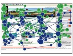
In the fixation map image above, a participant's focal points on a website are tracked and the points are numbered in sequential order (like connect-the-dots).  The dots are also each sized based on "Gaze Duration", the amount of time the participant spent looking at that particular point.  In the example above, it took the participant 90 fixations to find the information they were looking for...not a good site design.


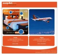
Of course, you can narrow down the fixation points and only see the first few points that attracted the participant's attention.  Answering the question "What does the user see first?"  In this example, the participant looking at the flight website saw the hotel ad first.


It's not just for websites.  When you use this method for product packaging, you can tell what the consumer sees in the store during the first few seconds, and the popular understanding is that you only have 3 seconds of the consumer's attention in the store.  The use of the infographic fixation map instantly conveys to the packaging designers what the consumer sees, and what parts of the design are ignored.


The fixation maps are converted into heat maps to aggregate many participant results together.  You can see here that participants aren't seeing the "Diesel for Successful Living" message.

Thanks to Colin from IDG Consulting for providing the images!  I have used IDG for consumer research projects in the past, and I highly recommend them.

Monday
May042009

50 Cars or 1 Bus? Infographic Advertising!

Great visual ad by Flygbussarna in Sweden!  Combining a physical construction of a bus made out of cars on the side of the road, a live webcam, and live infographic information on the website!

Every day thousands of cars are driven to and from Swedish airports. Every car holds only 1,2 persons on average which is to be compared with the Airport Coach that takes over 50. Needless to say, this makes no sense whatsoever from an environmental standpoint. To highlight this, an enormous bus was built out of 50 cars on the side of the highway to the airport. On the website, a live camera not only shows the installation 24/7 but also analyses the image and tracks each and every car going by. This data is then being used to highlight just how much emission we could save just by going by bus instead.

 Thanks to @yplim on Twitter!


Monday
Apr202009

Honda Ad: Keep Doing

Not sure if this Honda Ad is truly "infographics", but it's close.  It sounds like Garrison Keillor from "A Prairie Home Companion" doing the narration.

Thanks Paulo.

Wednesday
Apr152009

GE: Plug into the Smart Grid


Great interactive infographic website from GE for their Plug Into The Smart Grid ad campaign.  Beautiful graphics, fast, clean interface and all-around good job.  The viewer can change the setting, and see the infographic results change in response.

My son loves the Augmented Reality part!  Not really infographic, but fun.