About
Randy Krum
President of InfoNewt.
Data Visualization and Infographic Design

Infographic Design

Infographics Design | Presentations
Consulting | Data Visualizations

DFW DataViz Meetup

Join the DFW Data Visualization and Infographics Meetup Group if you're in the Dallas/Fort Worth area!

Search the Cool Infographics site

Custom Search

Subscriptions:


Feedburner

The Cool Infographics® Gallery:

How to add the
Cool Infographics button to your:

Cool Infographics iOS icon

- iPhone
- iPad
- iPod Touch


Read on Flipboard for iPad and iPhone

Featured in the Tech & Science category

Flipboard icon

Twitter Feed
From the Bookstore

Caffeine Poster

The Caffeine Poster infographic

Entries in ad (56)

Tuesday
May272008

Approach to Creating Experiences


Found on Think>Draw>Make, the Approach to Creating Experiences is from David Armano from the very influential Logic + Emotion.

It’s a high-level attempt to document an approach to designing an interactive experience within an agency setting.

Saturday
May242008

Sprint AAA ad video infographic


Why not? One more infographic video Sprint ad for weekend. This features Sprint's relationship with AAA to help stranded motorists.

Friday
May232008

Sprint Katrina ad infographic video


Another Sprint ad using infographics showing how Sprint responded to Hurricane Katrina. From Superbad, the "brand-driven design and live action production company."

Thursday
May222008

Sprint Ad infographic video


Great infographic video ad for Sprint Nextel by Superfad.

What to do when you are stranded in the woods with the eminent danger of a bear just around the corner? Just use your Sprint Nextel phone to call for help. Superfad brought this case study and others to life. Watch how real people use the Sprint Nextel Direct Connect system to get the job done right.
Found on See What You Mean, an infographic blog I just learned about. Thanks Richard!

Tuesday
May132008

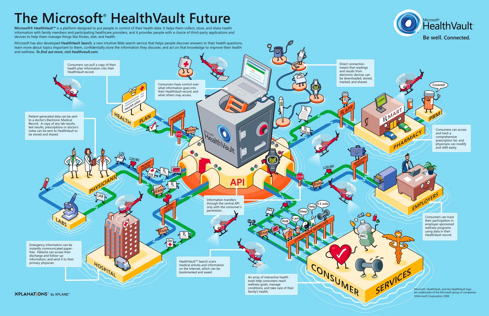
Microsoft HealthVault Xplaned


Microsoft enlisted our friends from Xplane to help visualize the theory behind the HealthVault system.

I would almost call this a 3D mind map the way it’s laid out.

Friday
Apr252008

Kapitaal

What if the only things you could see in the world around you were brands and advertising? No walls, no people, no sidewalks...just ads. Apparently it would be more than enough to get around in the world.

This is an awesome video! Thanks to pascal for submitting the link in the comments to an earlier video post: See The World in Words

Thursday
Apr242008

Visualizing Carbon Dioxide Emissions

This is a great way to visualize gas emissions which are normally invisible. That's why most people don't have any real sense how much is produced by the things you do in everyday life like running your washing machine or refrigerator.

The black balloons really work, with the black color implying "bad" and they're actually filled with a lighter than air gas that rises into the atmosphere. I'm assuming that the size of the balloons actually represents the 50 grams of greenhouse gas discussed in the ad.

Found on infosthetics.com and radar.oreilly.com and the original is at www.saveenergy.vic.gov.au from the Australian government.

Friday
Feb222008

National Gruntledness Index


New interactive map on CareerBuilder.com charts the results of user survey data on how gruntled (or disgruntled) people are with their jobs across the country. You can even narrow the map results to a particular industry.

The map doesn't change that often, but when you roll your mouse over the map, it highlights the cities where the score has changed.

Thanks Kevin for the email.

Monday
Feb182008

GE Ecomagination Blueprint Ads

GE is running The Blueprint Series of five print ads combining photos with an overlay of infographics. This works really nicely because they kept the infographics relatively simple.

Found on notcot.com.

Wednesday
Feb132008

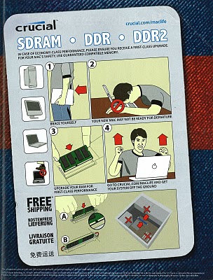
Crucial Memory Ad


Crucial Memory, has this ad running in Mac magazines right now. It's amusing, but not actually informative. The infographics aren't the real directions to install memory. Instead, its an infographic style that tells the consumer they will be happier if they install more memory. I like it because the infographic style adds credibility.