About
Randy Krum
President of InfoNewt.
Data Visualization and Infographic Design

Infographic Design

Infographics Design | Presentations
Consulting | Data Visualizations

DFW DataViz Meetup

Join the DFW Data Visualization and Infographics Meetup Group if you're in the Dallas/Fort Worth area!

Search the Cool Infographics site

Custom Search

Subscriptions:


Feedburner

The Cool Infographics® Gallery:

How to add the
Cool Infographics button to your:

Cool Infographics iOS icon

- iPhone
- iPad
- iPod Touch


Read on Flipboard for iPad and iPhone

Featured in the Tech & Science category

Flipboard icon

Twitter Feed
From the Bookstore

Caffeine Poster

The Caffeine Poster infographic

Entries in body (15)

Saturday
Nov242007

Visualizing the Aging Process
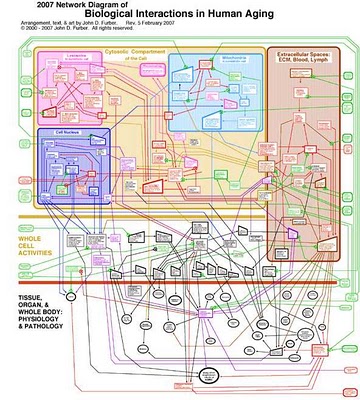

Created by John D. Furber at Legendary Pharmaceuticals, this is a visual representation of the biology behind aging using a network diagram. A large format image is available for printing here.

From VisualComplexity:

John D. Furber of Legendary Pharmaceuticals has put together a visual model of aging referred to as 'The 2007 Network of Biological Interactions in Human Aging' that shows the interactions between various subcellular, cellular, extracellular matrix and organ system. This is a great representation of aging as it demonstrates no root cause but rather a network of problem areas that are interlinked. The goal of systems biology would be to flush this out in great detail allowing one to zoom in down to the specific genomic and proteomic components of aging. Systems biology would also pursue such a model to have a functional runtime component to it such that variables could be tweaked and changes introduced to predict impact elsewhere in the various biological networks.

Friday
Oct192007

The Flu Virus


Flu season is coming soon, so its about time to know your enemy. Graphic of the Flu virus from newscientist.com.

Kinda looks like a big squishy ball doesn't it?

Sunday
Oct142007

Nip and Tuck


From Many Eyes, this bubble chart shows the number of plastic surgery procedures per 100 people, by nation. Let's just say, the U.S. is one of the smaller countries measured this way.

Monday
Sep242007

31 Days in Iraq

This map of Iraq from the NYTimes.com visually shows the over 1,900 people killed in Iraq during the month of January 2007.

"The map, based on data from the American, British and Iraqi governments and from news reports, shows the dates, locations and circumstances of deaths."
The number has doubled since they did this for January 2006 which had around 800 deaths. Each figure represents an individual of the American forces, coalition forces, Iraqi forces, police officers or civilian death. The larger figures have numbers showing how many people they represent (which I think diminishes the visual impact). A smaller icon shows the cause of death. All the figures are connected to a location in the country.

I would have added some color coding too, but I'm guessing the NY Times had to keep it in black & white to print it in the newspaper.

Monday
Aug272007

The Price of Piercing


The risks associated with body piercing from the Washington Post in November 2006. The information goes as far as male and female genitalia, but they wisely decided not to include those in the image. Why would you pierce those voluntarily?!?

The image shows obvious placement on the body. The number of squares represents the healing time necessary with the dark color representing the minimum time, and the lighter color showing the potential longer time to heal. I would have also showed the price to have each area pierced, but they neglected to include that.

Who would have thought that a pierced nipple could cause a "breast-feeding impairment"? Let's hope the baby doesn't confuse the nipple ring for a teething ring!

Page 1 2