About
Randy Krum
President of InfoNewt.
Data Visualization and Infographic Design

Infographic Design

Infographics Design | Presentations
Consulting | Data Visualizations

DFW DataViz Meetup

Join the DFW Data Visualization and Infographics Meetup Group if you're in the Dallas/Fort Worth area!

Search the Cool Infographics site

Custom Search

Subscriptions:


Feedburner

The Cool Infographics® Gallery:

How to add the
Cool Infographics button to your:

Cool Infographics iOS icon

- iPhone
- iPad
- iPod Touch


Read on Flipboard for iPad and iPhone

Featured in the Tech & Science category

Flipboard icon

Twitter Feed
From the Bookstore

Caffeine Poster

The Caffeine Poster infographic

Entries in Characters (12)

Tuesday
Jan032012

The Timeline of Doctor Who

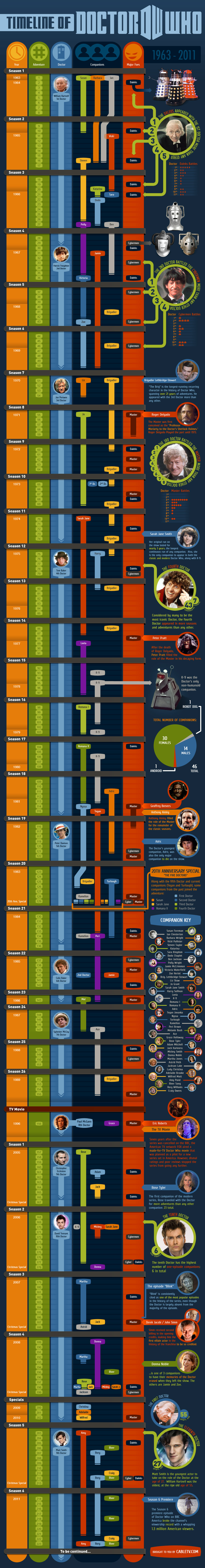
A highly detailed historical Timeline of Doctor Who from Cabletv.com!

Check out this complete timeline of Doctor Who from 1963 to present, including episodes, seasons, companions, villains, and more. Scroll down to follow all the Doctor’s adventures through time. A Fantastic resource for any Doctor Who fan.

First and formost it’s a timeline of the Doctor Who episodes from 1963-2011.  I’ve posted earlier Doctor Who related infograpics here before (The Doctor Who infographic), but none that contained this level of detail.  From left-to-right you have seasons, episodes, which Doctor, which companions, key villains and additional facts.  When you view the timeline on the original page, the episode titles are also listed on the left side and aligned with the infographic.

There are a couple design changes I would propose that would have made the data easier to understand.  One of the things I love is that there is no legend, or any need for one.  All of the descriptions for the color-coding and data visualizations is included in the visual designs.  However, some of the color-coding is inconsistent.  The color for Rose Tyler as the first of the modern companions is green in the timeline, but then additional facts about Rose are colored blue in the last column.  This is also true about the character of the The Master, and other companions, where a consistent color-coding would have made the connections easier for the reader to understand.

Thanks to James for sending in the link!

Wednesday
Feb092011

The Doctor Who Infographic

Very cool overview Infographic History of Doctor Who, with some fantastic illustrations, by Bob Canada (@bob_canada on Twitter).  The world of Doctor Who is incredibly complex, but this infographic gives new viewers the basics.


Here’s everything you’ve ever wanted to know about the Doctor, but were afraid to ask. Click here to see a super-sized version so you can better read the text.

This piece took quite a while to finish. I worked on it a little at a time over several days. There was a lot of moving around of elements and a lot of text editing to get everything to fit in an efficient manner. Hopefully there aren’t any glaring errors in the information.

Laid out entirely in InDesign. All the Doctors, the Sonics and the TARDIS were drawn in InDesign as well.


You can tell from the illustrations that the hair was iconic for each Doctor.  You could probably identify each doctor in silhouette by the hair alone!

Page 1 2