About
Randy Krum
President of InfoNewt.
Data Visualization and Infographic Design

Infographic Design

Infographics Design | Presentations
Consulting | Data Visualizations

DFW DataViz Meetup

Join the DFW Data Visualization and Infographics Meetup Group if you're in the Dallas/Fort Worth area!

Search the Cool Infographics site

Custom Search

Subscriptions:


Feedburner

The Cool Infographics® Gallery:

How to add the
Cool Infographics button to your:

Cool Infographics iOS icon

- iPhone
- iPad
- iPod Touch


Read on Flipboard for iPad and iPhone

Featured in the Tech & Science category

Flipboard icon

Twitter Feed
From the Bookstore

Caffeine Poster

The Caffeine Poster infographic

Entries in China (2)

Monday
Apr242017

Cool Infographics Book in Chinese!

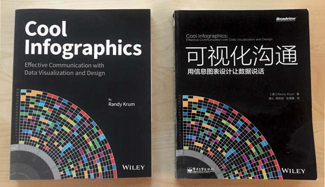
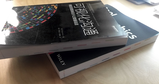
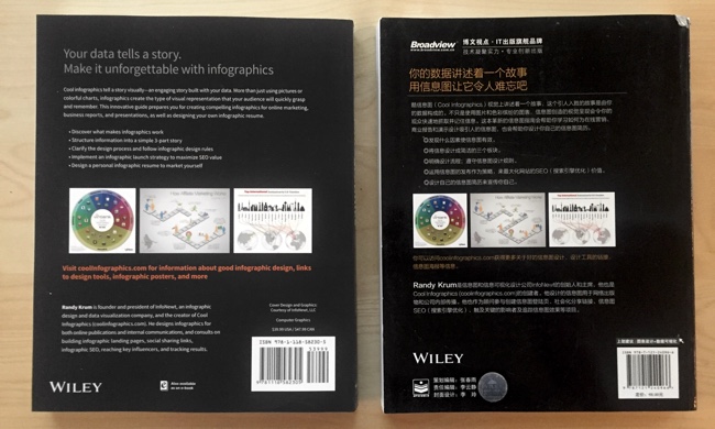
I was finally able to get my own printed copy of the Chinese translated version of the Cool Infographics book! According to my publisher, Wiley, it has been translated into Simplified Chinese, and Orthodox Chinese, Korean and Russian versions are still in the works. The Chinese version is available in the US through Amazon.

Of course, the only way I can tell what the Chinese translation says is to translate it back into English with the Google Translate app. They translated the title "Cool Infographics" into 可视化沟通, which translates back to English as "Visual Communication". I know the app isn't perfect, but you can get the general meaning.
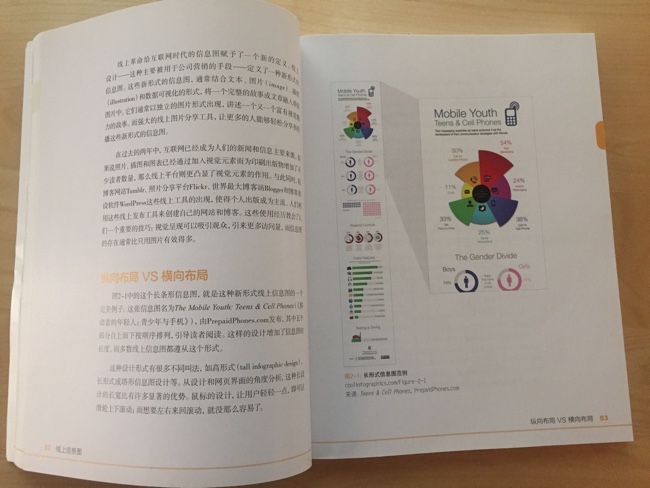
Just under 5% of the Cool Infographics web traffic comes from China, so I know there are a lot of fans there.


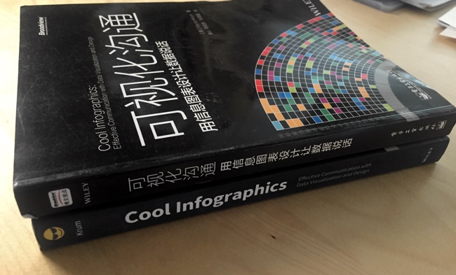
I had to work with the Wiley editors to get the chapter colors to show up along the page edges. My thoughts were that it's a visual communication book, and you should be able to find the chapters visually! The translated version got that right too:


Monday
Sep192011

US/China Trade Infographic [Making-of Video]


Back in 2009 Jess Bachman designed the Visualizing the US/China Trade infographic for Mint.com.  This design uses a sankey diagram visual that has line widths representing the relative size of all the country values.

Like it or not, the US and China have a trading relationship that has global repercussions. The plastic US flags that say Made in China don’t tell the whole story. No, not everything is made in China. In fact the US manufactures and exports almost as much as China but it consumes a great deal more. Hence, the trade imbalance. What’s interesting is exactly what the US imports, stuff like machinery and toys and as much steel and iron as it does shoes. And what we export — high-tech stuff like airplanes and medical equipment and, for some reason, 7 billion dollars worth of oleaginous fruit which is used to make cooking oil, presumably for Chinese food.

A cool infographic all by itself, but even better is that Jess captured screen shots every 10 seconds automatically using Snagit (a process he calls flowcapping), and recently put them together into a behind-the-scenes video and blog post showing his design process.  10-hours of design work, compressed down into a couple minutes.  View the high-resolution version if you can so you can actually read what’s on the screen.  This is the short version.

And the longer, 7-minute version let’s you see even more details behind his process.

Jess (ByJess.net) is best known for his annual Death & Taxes infographic poster of the U.S. Federal Budget, and recently joined the team at Visual.ly as Creative Director.  Great job Jess, and thanks for sharing your process with the world!