About
Randy Krum
President of InfoNewt.
Data Visualization and Infographic Design

Infographic Design

Infographics Design | Presentations
Consulting | Data Visualizations

DFW DataViz Meetup

Join the DFW Data Visualization and Infographics Meetup Group if you're in the Dallas/Fort Worth area!

Search the Cool Infographics site

Custom Search

Subscriptions:


Feedburner

The Cool Infographics® Gallery:

How to add the
Cool Infographics button to your:

Cool Infographics iOS icon

- iPhone
- iPad
- iPod Touch


Read on Flipboard for iPad and iPhone

Featured in the Tech & Science category

Flipboard icon

Twitter Feed
From the Bookstore

Caffeine Poster

The Caffeine Poster infographic

Entries in design (479)

Monday
Apr142008

Treemaps for drive space

I don't think I've posted much about specific software programs, but there are a number of infographic programs that anyone can use. These two are programs that analyze what's on your hard drive, and show it you in a treemap display.

The one above is Disk Inventory X for the Mac (which I use), and the one below is WinDirStat for Windows. Both are free, and are real-life examples of how you can use infographics in your life. So take a minute, and clean off some of that old junk taking up space on your hard drive.

Tuesday
Apr082008

On The Map


Found on notcot.com, On The Map is a cool project by Stefanie Posavec that maps the rhythm and flow of literary works into some stunning visual posters. Breaking a story down into chapters, paragraphs, sentences and finally individual words. Then color coded to capture the topics as they reappear throughout the story. The level of detail is really impressive. Click the images to see the high-resolution images from notcot.com.

Thanks Jonathon and Jason for sending the link.

Stefanie also created a number of additional visualizations of the same story.


Sunday
Apr062008

A Brief Guide About Bridesmaids

Cool infographic video about (you guessed it) bridesmaids. Created by Yaniv Fridman, Nicolas Alexander and Amber MacKay for Motion Design Class at Vancouver Film School. Here's a link to the High Quality version of the video.

Their blog discusses the creative process and the tools they used to create the video.

Found on infosthetics.com

Friday
Mar282008

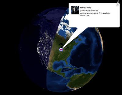
17 Ways to Visualize Twitter


Also from FlowingData.com, this post about the many ways to visualize the Twitter universe is really cool. Twitter has really been gaining some momentum lately, but I keep looking for better ways to follow the posts.

Wednesday
Mar262008

21 Ways to Visualize Your Email Inbox


FlowingData.com has an entry on the 21 Ways to Visualize and Explore Your Email Inbox, which has some really cool visualizations.

Found on SimpleComplexity.net, thanks guys. I hadn't come across FlowingData.com before.

Sunday
Mar232008

Map of Creativity


Check out the Map of Creativity from the Next Generation Foundation.

The Map of Creativity is a user-friendly, interactive database of innovative educational projects throughout the world.

Wednesday
Mar192008

Name that Color

From blog.doloreslabs.com, they showed 1,300 different colors to people on Mechanical Turk, and asked them to name the color.

The above picture contains about 1,300 colors and the names for them that Turkers gave. Each is printed in its color and positioned on a color wheel. Just looking around, there sure seem to be different regions for different names. But there are also rich sets of modifiers (”light”, “dark”, “sea”), multiword names (”army green”), and fun obscure ones (”cerulean”).
They also created a Color Label Explorer tool to only show those color names that match your search term, but still keep them in place on the color wheel graphic.

Tuesday
Mar182008

New York Talk Exchange


Currently on exhibition at MOMA, The Museum of Modern Art, from Feb 24th - May 12th is an exhibit called "Design and Elastic Mind". New York Talk Exchange is included as part of the exhibition.

New York Talk Exchange illustrates the global exchange of information in real time by visualizing volumes of long distance telephone and IP (Internet Protocol) data flowing between New York and cities around the world.
Thanks Oliver!

Saturday
Mar152008

The Ebb and Flow of Movies

From nytimes.com. This is a very cool way to visualize the spike in movie ticket revenue when movies are released in theaters, and then slow down quickly after the first week. The graphic covers 1986-2007, and when you look back you can only find a few movies that maintained high ticket sales for more than a couple weeks. Star Wars Episode 1 and Titanic both had high sales for almost 6 weeks. Highlight and click any "wave" to see the details for that movie.

Summer blockbusters and holiday hits make up the bulk of box office revenue each year, while contenders for the top Oscar awards tend to attract smaller audiences that build over time. Here's a look at how movies have fared at the box office, after adjusting for inflation.
Thanks for sending in the link Dániel!

Thursday
Mar132008

The Eisenhower Interstate System


What a fantastic way to simplify the U.S. interstate system into an easy to understand graphic. From Chris Yates on chrisyates.net. Style looks like a subway map.

Found on Digg.