


Thursday
Dec042014
The Pianogram
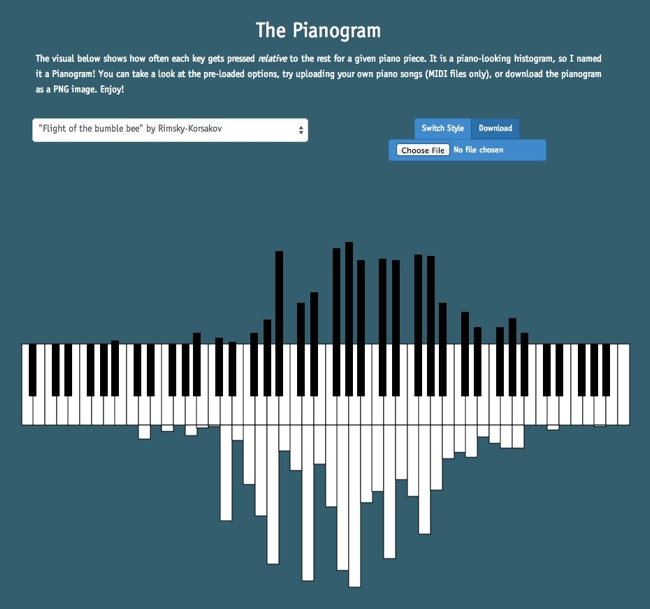
The Pianogram is a histogram using the design style of a piano keyboard to show the frequency of notes in a given song. Designed by software programmer Joey Cloud, the site has a handful of preloaded songs, but you can upload the MIDI file for any song to create a custom pianogram.
The visual below shows how often each key gets pressed relative to the rest for a given piano piece. It is a piano-looking histogram, so I named it a Pianogram! You can take a look at the pre-loaded options, try uploading your own piano songs (MIDI files only), or download the pianogram as a PNG image. Enjoy!
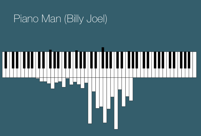
This a fun visualization tool. Here’s Billy Joel’s Piano Man, just because it seemed the most appropriate:
Found on FlowingData and FastCo Design
tagged  Visualization, charts, design, frequency, music
