About
Randy Krum
President of InfoNewt.
Data Visualization and Infographic Design

Infographic Design

Infographics Design | Presentations
Consulting | Data Visualizations

DFW DataViz Meetup

Join the DFW Data Visualization and Infographics Meetup Group if you're in the Dallas/Fort Worth area!

Search the Cool Infographics site

Custom Search

Subscriptions:


Feedburner

The Cool Infographics® Gallery:

How to add the
Cool Infographics button to your:

Cool Infographics iOS icon

- iPhone
- iPad
- iPod Touch


Read on Flipboard for iPad and iPhone

Featured in the Tech & Science category

Flipboard icon

Twitter Feed
From the Bookstore

Caffeine Poster

The Caffeine Poster infographic

Entries in internet (195)

Friday
Feb202009

Google Data Visualization Concepts


Check out GridPlane.com.  JD Hooge has posted images of some data visualization concepts he worked on with Google to look at aggregating social media topics.


I collaborated with Instrument to develop a series of data visualization concepts for Google. These interface sketches are are all based around a concept of aggregating and visualizing online media buzz across various social media outlets.


Thanks Edial for sending in the link!

Wednesday
Feb182009

Mapped Up - Visual News ScreenSaver


From lifehacker.com, MappedUp is a visual RSS Reader/ScreenSaver that displays the location of news stories on a pixel map of the world.  MappedUp is a free download for Windows and Mac OS X.

Sunday
Feb152009

The Browser Wars Infographic


Great timeline infographic depicting the rise and fall of different browsers portrayed as knights marching across a field.  The data set used is available here.

It took me a while to find any information about the author, but I found this description on the Wired.com blog.

Here's a creative look at the history of the browser wars from 2002 through mid-2008. The infographic was submitted to Reddit by a user named BovingdonBug. He says he created it as part of an application for a graphic design job on a newspaper.
 Thanks Alwyn for the link!

Friday
Feb062009

ARRRRR! Where are the Pirates?!?


I had to post this one.  TorrentFreak.com revealed that The Pirate Bay has quietly released a Google powered map site that shows the locations of the bit-torrent clients.  Of course they carefully maintain the anonymity of their users.


You can click on the icon over a particular country to see their statistics.  From everything I hear, I would have thought the U.S. to have more pirates...ARRRRR!

Thanks Alwyn!

Wednesday
Feb042009

One Month of Spam


From TimGraham.net, Tim plotted out some statistics about all of the spam email he received in February 2008. 

Tim, only 208.5 spam emails a day?  You need to get your email address out into more public places!

Thanks for the link Alwyn!

Tuesday
Jan272009

The Life of a Web Article


Great infographic from the team at Eliiance.com showing how web content (articles) gets from publishing to actual consumption by online viewers.

Monday
Jan122009

Halo 3 HeatMaps


A while back Bungie.net, the makers of the Halo series of games, started tracking data on their servers about how their different online multiplayer maps are preforming.  They converted the data on kills and deaths in the multiplayer games into heatmaps, and then started publishing the maps online for everyone to see.

The advantages to players are that you can see places to avoid (areas with the highest deaths), and the locations from where the most kills come from.  The map above shows the total data for the map called The Pit.  But you can narrow down the information based on the type of weapon used.  For example the map below shows the locations of the kills made with the sniper rifle.  Meaning that shooting from these locations have been the most successful.  (Also helpful if you keep getting killed by snipers and can't find them)


"Heatmaps are the Doppler Radar System of Death in Halo 3. We're tracking encounters, weapons used and their results in a given game, collecting that data and sharing it with players visually. The key here is 'the darker the red, the more frequent the deaths (or kills, depending on the parameters)'," Bungie explains in its weekly update.

Thursday
Jan082009

Infographic Video: The Histoy of the Internet


History of the Internet from PICOL on Vimeo.

Cool video created by Melih Bilgil

"History of the internet" is an animated documentary explaining the inventions from time-sharing to file-sharing, from arpanet to internet.  The history is told with help of the PICOL icons, which are also a part of my diploma. The icons are soon available for free on picol.org
Found on Information Aesthetics, and thanks to Ethel for the Tweet.

Wednesday
Oct012008

The influence of Josef Müller-Brockmann Typography

Very cool infographic showing the the influence of Josef Müller-Brockmann.  By Quentin Delobel, it's on his site www.quentindelobel.com.
Josef Müller-Brockmann was a Swiss graphic designer and teacher, mostly recognised for his simple designs and his clean use of typography, notably Helvetica.  This visualization is the result of a personal web research about Josef Müller-Brockmann and the international typographical style. It contains 3 key elements: (1) the research of information on the web, (2) chronological information on Josef Muller-Brockmann's life and links to the last part, and finally the last part (3) is composed of a critical article based on information found online. The project is in french.
Thanks to Filipe for sending in the link!

Wednesday
Jul232008

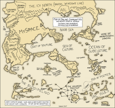
Map of Online Communities

Greetings from the Blogipeligo!

A fun infographic from xkcd.com that uses a map image to communicate the relative sizes of the different types of online communities.  I was impressed that I at least recognized most of them, and actually participate in some of them.