About
Randy Krum
President of InfoNewt.
Data Visualization and Infographic Design

Infographic Design

Infographics Design | Presentations
Consulting | Data Visualizations

DFW DataViz Meetup

Join the DFW Data Visualization and Infographics Meetup Group if you're in the Dallas/Fort Worth area!

Search the Cool Infographics site

Custom Search

Subscriptions:


Feedburner

The Cool Infographics® Gallery:

How to add the
Cool Infographics button to your:

Cool Infographics iOS icon

- iPhone
- iPad
- iPod Touch


Read on Flipboard for iPad and iPhone

Featured in the Tech & Science category

Flipboard icon

Twitter Feed
From the Bookstore

Caffeine Poster

The Caffeine Poster infographic

Entries in internet (195)

Tuesday
Nov172009

Webpages As Graphs - Cool HTML visualizer applet


Marcel Salathe has created Webpages As Graphs, an interactive HTML DOM visualizer applet that will view any http:// website in a graphic form.  The image above is Cool Infographics, but the arrangement comes out a little different every time you run it.

Using Processing, Traer Physics and HTMLParser the site lets you enter the domain and then watch while it works its magic.  He has also made the source code available and instructions to print your graph as a poster.

HTML consists of so-called tags, like the A tag for links, IMG tag for images and so on. Since tags are nested in other tags, they are arranged in a hierarchical manner, and that hierarchy can be represented as a graph. I've written a little app that visualizes such a graph
I ran it for a number of other websites to see the differences, some were inspired by the examples on Marcel's site.

Amazon.com: Pretty complex site with lots of links, images and tables.


Apple.com: Simple design, as you expect from Apple.


Google.com:  Known for their clean front page.


LifeHacker.com:  Great blog with a very complex structure.


Friday
Oct232009

Collaborative, Online Mind Map about Mind Mapping Software


I know, that's a mouthful of a title.  MindMeister is an online, collaborative mind mapping tool that lets multiple users edit a common mind map.  Essentially, its a visual wiki, that allows anyone to makes changes to the data, but you need to be logged in so that it can track who makes the changes.

Andrew Wilcox has created a public mind map with the catchy title "The Strengths and Weaknesses of Mind Mapping Software Applications".  You can see all of the different mind mapping software packages, the pros and cons of each one, and add your own comments.


Your voice can still be heard, a few of the software applications don't have any comments at all yet.  They need people to help add information to the map.

Found on the Mind Mapping Software Blog, by Chuck Frey

Also, MindMeister has an iPhone app that allows you to view and edit online mind maps from your iphone.  It's $6.99US in the iTunes App Store.  MindMeister (mind mapping)

Wednesday
Sep232009

Check Out Your Own Online DNA - Visually


Check out Personas, an interactive, online DNA visualizer.  You enter your own name (or anyone's name for that matter) and watch the system as it categorizes you from online searches.  I've displayed my own DNA above.  The types of attributes it associates with your name are based on the text it finds in the search results.


As you watch Personas analyze the search results you can see that in my case, it doesn't differentiate between me and the other Randy Krums of the world, so our attributes are blended together into one common DNA.


Personas shows you how the Internet sees you.  Upon entering a name, it scours the Internet looking for characterizing statements to use in its analysis.  After suitable information has been found, the viewer watches as the machine tries to make sense of the displayed text.  Once it has reached its final conclusions, the resulting "Personas vector" is displayed and annotated with a minimal legend.
Personas is just one part of the Metropath(ologies) exhibit, now currently on display at the MIT Museum through September 2009 (it needs a new home!).  Metropath(ologies) is a participatory installation about living in a world overflowing with information and non-stop communication, a world in which you are simultaneously the audience and the subject.  It is deliberately ambiguous about the desirability of this communication abundance, riding the line between serene and sinister.
Found on VisualThinkMap.

Wednesday
Sep092009

Balance Your Media Diet (The Media Pyramid Infographic)

From Wired Magazine's "New Rules for Highly Evolved Humans" section of the August 2009 issue.
Practicing good nutrition keeps your mind sharp, your body fit, and your life long. The same could be said for consuming media. (Seriously, knowledge is power.) When you add it all up, the average American spends roughly nine hours a day glued to some kind of screen, and like your diet, quality is as important as quantity. Here areWired's suggested servings for optimal media health.
Found on Nathan's Flowingdata.com

Thursday
Sep032009

reMap: An Amazing Visual Browsing Interface to VisualCompexity.com


Bestario has created reMap, an interactive portal to view all of the infographics posted on VisualComplexity.com, and it's amazing.  They've created semantic connection between the different infographics using tags tat allow for an incredible browsing experience.

An interactive, visual browsing interface to an infographic archive.

reMap displays visualcomplexity.com projects allowing navigation using a semantic approach and depicting relations among them. All images and texts belong to vc portal. Tags are assigned using a semantic engine created by Bestiario.
Thanks Jose!  I love it!

Saturday
Aug222009

Create Your Own Facebook Network Graph


Create a graph of your own network of friends on Facebook with Nexus.  You've seen many visuals of Twitter and Facebook connections, but this one is especially cool because it's your own network.  That's my network chart is above, but you don't care about mine...go create your own!

Found on Twitter

Monday
Jul272009

Amazon Acquisitions infographic


Found on meettheboss.com, a decent infographic of the acquisitions that Amazon.com has made over the years.  Drawn like an org chart, I like that each branch represents another year, so it becomes a timeline.

Tuesday
Jun302009

Skirt Lengths on Flickr + infographic tutorial


Wendy Ding created this infographic in 2007, and recently published a complete tutorial on how she created it on Digital Arts.

After collecting data on skirt lengths and their wearers and locations from flickr.com, this information piece was created to illustrate the statistics. A bar graph, area map with call-outs, and a legend all come together to explain the skirt wearers relationship.

This piece garnered an honourable mention from the 2007 Adobe Design Contest for the digital illustration category.
Thanks for sharing Wendy!

Tuesday
Jun232009

The Story (so far) of Twitter


Graphic designed for Manolith.com, by infoshot.  It’s a reverse timeline of Twitter.

Twitter, Twitter, Twitter. Seems every where you turn these days that little blue bird is staring you right in the face. But how did it all start? Where is it all going? Who’s to say really, except you I suppose, in 140 character bursts. In the meantime let’s take a look back on some milestones of microblogging.  Please do enjoy, The Story (so far) of Twitter. Start at the bottom and work your way up on this one.


Of course, I found this on Twitter!

Tuesday
Jun162009

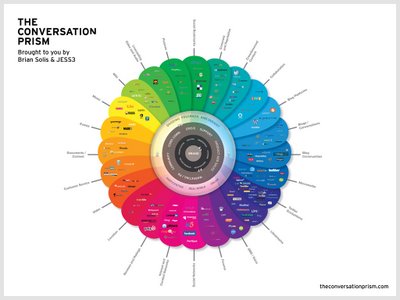
The Conversation Prism 2.0 has been released!


Check out the new version of The Conversation Prism 2.0 by JESS3 and Brian Solis and theconversationprism.com.  Available as a poster for $20 US on thier website, and they also have some high-resolution versions available.

I love the design of this one.  It's seems to be essentially a mind map, but much easier to read and understand.

This is an update to the original Conversation Prism that you can see here on Flickr.

Thanks Dana!  I found the link to the 1.0 version on ON:Digital+Marketing