About
Randy Krum
President of InfoNewt.
Data Visualization and Infographic Design

Infographic Design

Infographics Design | Presentations
Consulting | Data Visualizations

DFW DataViz Meetup

Join the DFW Data Visualization and Infographics Meetup Group if you're in the Dallas/Fort Worth area!

Search the Cool Infographics site

Custom Search

Subscriptions:


Feedburner

The Cool Infographics® Gallery:

How to add the
Cool Infographics button to your:

Cool Infographics iOS icon

- iPhone
- iPad
- iPod Touch


Read on Flipboard for iPad and iPhone

Featured in the Tech & Science category

Flipboard icon

Twitter Feed
From the Bookstore

Caffeine Poster

The Caffeine Poster infographic

Entries in jobs (30)

Tuesday
Jun112013

The Entrepreneurial Mindset

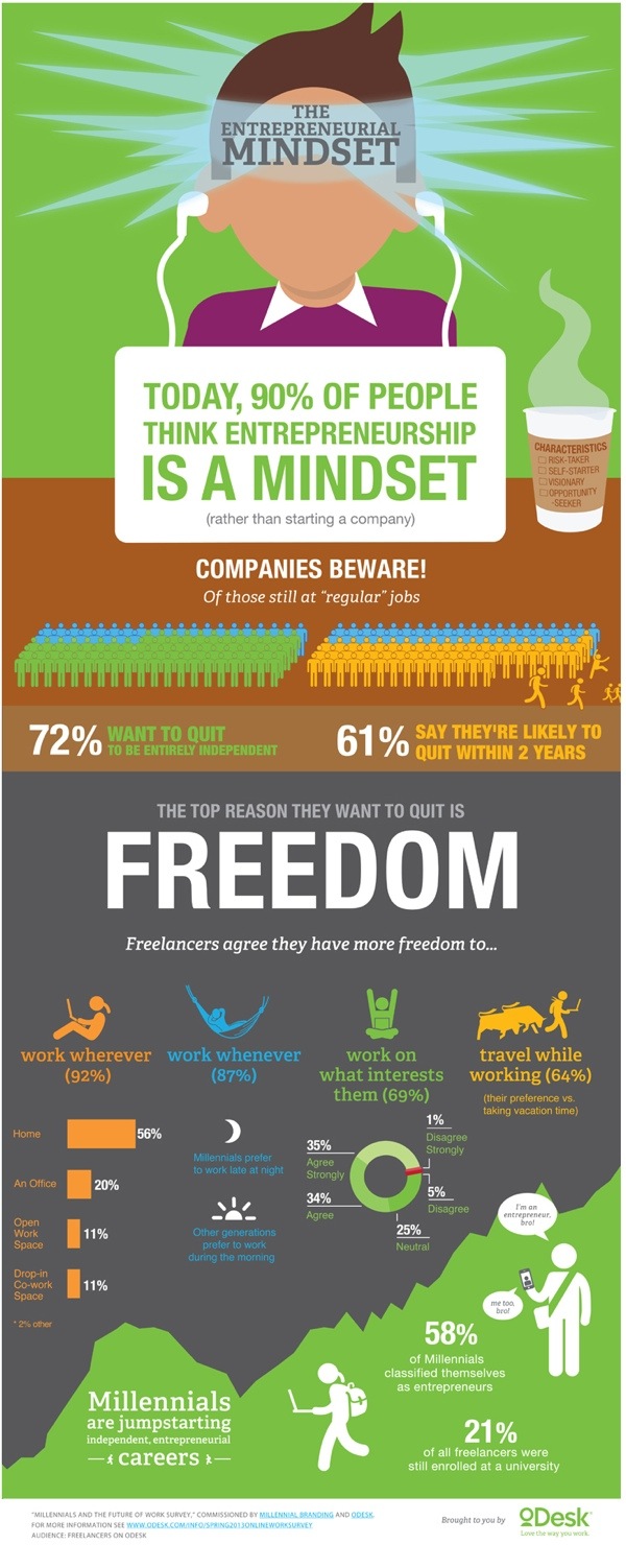
The Entrepreneurial Mindset infographic

The era of “regular” jobs is coming to an end. The Entrepreneurial Midset infographic from oDesk warns us of the changing mindset of workers. They want more freedom and are more likely to quit their current jobs in search of what they want.

Workers want freedom, and this desire is driving them towards independent (and often entrepreneurial) career paths. Following a prior study on disruption of work from the perspective of businesses, this survey examines the future of work as envisioned by professionals. Results found that many are planning their escape from corporate jobs — 72% of freelancers still at “regular” jobs want to quit entirely, and 61% say they are likely to quit within two years.

Millennials in particular are pursuing independent careers that foster faster progression than traditional hierarchical organizations. Of almost 2,000 Millennial respondents, 58% classified themselves as entrepreneurs. These responses (from more than 3,000 freelancers worldwide who have worked online) quantify the mindset of freelancers today, providing a glimpse into the professional landscape of tomorrow.

There are some great statisitics in this design, but it’s disappointing that some of the data near the end is just shown in text instead of visualized.

I really apprecaite the data transparency.  They also published the full results of the survey in a SlideShare presentation.

Thanks to Alexia for sending in the link!

Monday
Jun102013

How to Woo a Designer

How to Woo a Designer infographic

Want to learn how to woo a designer instead of offending them? The How to Woo a Designer infographic from 99designs.com gives us a look into the designers’ world.  Both the best sides and the worst sides. 

The 99designs designer survey was conducted in September and October 2012 and received 2,379 responses. Survey sources include graphic designers active in 99designs’ community and graphic designers not affiliated  with 99designs. 

We asked our survey respondents to list some of the best and worst things a client has ever said to them

Good information whether you’re an inside designer or a design freelancer working for clients!  Some of the data could have been visualized better.  The ranking of misconceptions looks like a bar chart with the colored rectangles behind the text, but they fit the text size and don’t represent the data.

The design should include a clear title in the infographic (not just on the web page), the URL link back to the original infographic, some type of copyright or Creative Commons license statement and credit to the designer.  Come on, it’s an infographic about designers on an online marketplace for graphic designers!  Give the designer some credit!

Thanks to Lauren for sending in the link!

Friday
Jun072013

Job Hunting in 2013

Job Hunting in 2013 infographic

Another social media positive! The Job Hunting in 2013 infographic from Adzuna says that 50% of Britons use social media for job hunting. Also 90% of Big British employers use social media to recruit new workers. 

In the past few months our incredible data nerds at (our snazzy new) Adzuna HQ have been witnessing something special.  So we decided to conduct a little poll, make a little infographic, and help the nation get down with, what we’re coining as, the Social Job Search Revolution. And the results were truly staggering; over 50% of you now turn to Facebook and Linked in to get hired with a little help from their friends. 

Thanks to Christian for sending in the link!

Friday
Jan252013

Philippe Dubost's Amaz'ing Resume

Philippe Dubost's Amaz'ing Resume

Very cool!  You have to check out Philippe Dubost’s (phildub) resume site.  Completely designed to emulate an Amazon product page, down to the smallest details.  Many of the links work nicely, taking you to a contact form or details on his LinkedIN profile page.  Things like his Product Dimensions, Only 1 Available, Star ratings and frustration-free packaging from France.  Even a Google Ad, similar to the ads on actual Amazon pages.

Certainly creative, I wondered if this should be considered an infographic resume.  I ended up convincing myself that “Yes” I do consider it to be infographic because it visualizes Philippe’s information in a way that is recognizable and easier to read and understand to the audience.  Star Ratings, key features, product photos and recommendations.  The visuals do bring meaning to the information, even though it’s done in a fun and amusing way.  It doesn’t have to be a chart of numerical data to be infographic.

What do you think?

Thursday
Nov012012

Finding the Productivity Sweet Spot at Work

Finding the Productivity Sweet Spot infographic


The Finding the Productivity Sweet Spot infographic from NICE.com takes a close look at how employees waste their time online at work, but offers a better solution to manage employee productivity.  Don’t cut off Internet to your employees!  Instead, manage their personal time online to a reasonable level and everyone wins!

Everyone wastes a bit of time at work, and some of the key sources may surprise you. It’s not just the internet that can cost employers time at work. Read our infographic on time wasting at work to understand if fantasy football or facebook causes us to procrastinate more.

There is an ideal balance of non-work activity that keeps people refeshed and employees engaged. It’s just unrealistic to expect 100% efficiency through the day. Distractions at work existed before the Internet. The key for companies is to manage these time wasters at work to an ideal level. 

Designed by InfoNewt, the infographic walks the reader through a 3-part story…


  1. How much time is being wasted at work?
  2. What are employees doing during this wasted time?
  3. What’s the ideal amount of time to let employees have personal time online?


 Big thanks to the team at NICE!

Monday
Sep102012

BYOD: The Good, the Bad and the Ugly

 BYOD: The Good the Bad the Ugly infographic

“BYOD” Bring Your own Device. A great idea that can easily turn messy. Biztech has introduced the BYOD: The Good, the Bad and the Ugly infographic asking you to answer 6 easy but important questions before you launch into a BYOD situation. 

If your company is considering allowing employees to bring their own devices to work, make sure you have a game plan in place.

BYOD has freed up many enterprises from the responsibility of exclusively purchasing and maintaining computing devices, such as notebooks, tablets and smartphones, but companies still need to have policies set in place to make things work.

BizTech magazine has put together an infographic that highlights six core questions every company should consider before moving forward with BYOD:

  1. Who buys the devices?
  2. What’s the right policy?
  3. What’s the employee’s role?
  4. What’s the impact on IT?
  5. How do we tackle security?
  6. How about apps?

For each of these questions, we’ve outlined a good answer, which we’d advise you to follow; a bad answer, which probably isn’t the best way to handle things; and an ugly answer, which should be avoided at all costs. Hopefully, this will help your company remain on the pleasant side of this growing workplace trend.

The organization in this design is really well done.  After explaining the concept of BYOD, the infographic walks the reader through six questions and provides some stats and information about each aspect.  The text is short, the illustrations are relevant and entertaining and the information is valuable to companies.

One of the data visualizations is hard for the readers to understand.  Highlighting 72% of employers as six people icons is very odd (Use 10 icons for percentages), but then they correctly used 10 icons when visualization 70% of Cisco employees.  At the bottom of the infographic image, it’s missing a URL to the original infographic landing lage, and a copyright statement.

Thanks to Ricky for sending in the link!

Monday
Aug062012

New Feature: DataVis & Infographic Designer Job Openings

Infographic Designer Jobs

I recently added a new feature page here on the Cool Infographics blog called Cool Jobs.  The Jobs page is open for anyone to post freelance, part-time and full-time opportunities for data visualization and infographic designers.  Posting an opening on the Jobs page is FREE, and you should include a job description, a link to the opportunity, and contact information in the main body of your post.

Tuesday
Jun192012

11 Steps To Voice-Over Success

11 Steps To Voice-Over Success

Interested in trying to make money as an audio voice-over actor?  Thanks to 11 Steps to Voice-Over Success infographic from Voices.com, now you know how to get started!

Voice over actors give life to animation works, enlighten us through film narration and bring energy to radio commercials. The industry is estimated to be worth $12.3 billion worldwide, and is growing because of new digital mediums such as mobile radio, apps with audio podcasting. If you’re interested in voice acting, learn the 11 steps to voice-over success in this amazing infographic.

This design combines a process flow, some data visualizations, some illustrations and text descriptions in an easy to follow layout.  The large colored blocks for each step resemble following a board game path to make it simple for the reader to follow the process.

I think the design could have reduced the amount text much further.  I think there’s too much detail included to be quick to digest for the readers.  At the bottom there should have been the URL link to the original, full-size infographic (in addition to the Voices.com front page) and a copyright statement.

This design visualizes an 11-step process, and a good comparison would be the 10-step process design for How Affiliate Marketing Works I designed last year.  My approach was to give the reader the basics of the process, and then let them go to the website to get more details.  This design attempts to give the reader more complete information about each step of the process.  What do you think?

Thanks to Ashley for sending in the link!

Wednesday
Apr182012

Where the Startup Jobs are

Where the Startup Jobs are infographic from StartUphire.com aims to help raise awareness of the lack of qualified people filling technical positions in startups.

StartUpHire, with support from the National Venture Capital Association, is releasing a new infographic today depicting 2011 hiring data for startups.  What’s the biggest take away? While most of the country is still sluggish on job creation, startups face the opposite problem- a glut of open technical jobs.

36 percent of all open jobs at startups last year were engineering or technical jobs. However, those two sectors saw only 15 percent of the overall applicant pool trying to fill those positions.  This supports evidence of an ever-tightening market for specific skills out there, and the need to keep developing and attracting qualified talent to young startup companies remains critical.

I think if the country wants to know who holds the best hope for meaningful economic growth, we need look no further than our own home grown, innovative, and passionate startup ecosystem.

This is an interesting story to tell, and an infographic is a great way to do it.  In a down economy with higher unemployment, there are certain job sectors that still aren’t getting enough qualified candidates!

Obviously, everyone assumes there are startup jobs in California (in Silicon Valley), but the map clearly shows startup positions that have been filled across the country.  Visually, the size of the state callout boxes and text seems to imply how big the numbers or for each state; however, that’s not the case and it’s misleading the reader.  Massachusetts had a higher number of job posts than Texas, but the callout text is much smaller.

The circle sizes in Job Posts by Industry appear accurate, which is where many designs make mistakes.  I also like the Areas of Expertise chart, and how the positions are arranged along the X-axis in order of the disparity between open positions and the number of applicants.  That conveys an additional level of information to the reader.

I was disappointed to see the last couple of statistics in the design didn’t get the data visualization treatment.  Show a visualization of 27% and give the 502 number some visual context to show how big that number actually is.  The URL for the original infographic is included at the bottom, but there should also be a copyright statement in the design.

Thanks to Robin for sending in the link!

Thursday
Apr122012

IT Infirmity: What's Ailing Your IT Department on 2012?

Is your IT department feeling a little under the weather? Send it to the IT Infirmity! The What’s Ailing Your IT Department infographic from ViaWest is their first infographic!

What do CIOs rank as their biggest IT aches and pains? What are the average salaries of employees within IT departments? What is the impact of ITtention Deficit - the inability to focus on your core business?  Find out in this infographic from ViaWest.

I really like this design, but the data visualizations need help.  It’s obviously a promotional piece for ViaWest, but there’s nothing wrong with using an infographic that way.  They have also made a high-resolution PDF available.

The story reads very easily from top-to-bottom with clearly separated sections. The icons for each sections are also amusing and keep the overall tone light-hearted.

The only issues I have with the design are the data visualizations. 

  • Don’t put 51% on top of a bunch of people icons, and not highlight 51% of the icons to go along with the numerical value. 
  • The two bars showing the data created before and after 2009 are actually two parts of the whole 100%, so this should be shown as a stacked bar.  Why is this shown as two separate bars?
  • Both of the office tower icon visuals in ITrauma would be easier to understand if they were a single row of building icons.  The 93% is hard to understand visually since you can’t visually tell that 13% of the last building is shaded.  In fact, it doesn’t look to me like the last building is shaded properly.
  • At the bottom, there should be a copyright statement
  • The design should also include the URL to find the original, high-resolution image on the ViaWest site so when people see this infographic shared on other sites, they can find the original.

Thanks to Todd for sending in the link!