American Slavery Maps
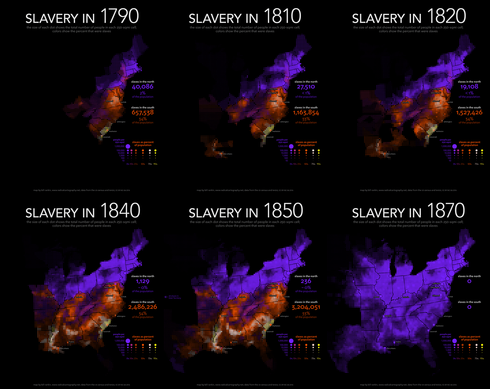
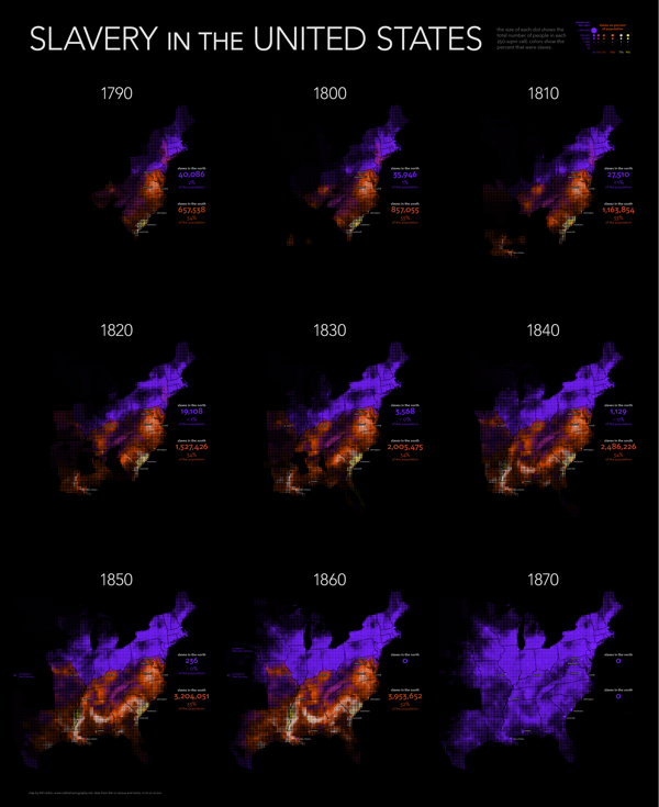
Bill Rankin at Radical Cartography has created nine uniform grid maps of American Slavery covering each decade from 1790 to 1870. I've combined them into the animated GIF you see above. Bill took a new approach in analyzing the historical data by 250 square mile units instead of the traditional data by county.
The gradual decline of slavery in the north was matched by its explosive expansion in the south, especially with the transition from the longstanding slave areas along the Atlantic coast to the new cotton plantations of the Lower South. And although the Civil War by no means ended the struggle for racial equality, it marked a dramatic turning point; antebellum slavery was a robust institution that showed no signs of decline.
Mapping slavery presents a number of difficult problems. The vast majority of maps — both old and new — use the county as the unit of analysis. But visually, it is tough to compare small and large counties; the constant reorganization of boundaries in the west means that comparisons across decades are tricky, too. And like all maps that shade large areas using a single color, typical maps of slavery make it impossible to see population density and demographic breakdown at the same time. (Should a county with 10,000 people and 1,000 slaves appear the same as one that has 100 people and 10 slaves?)
My maps confront these problems in two ways. First, I smash the visual tyranny of county boundaries by using a uniform grid of dots. The size of each dot shows the total population in each 250-sqmi cell, and the color shows the percent that were slaves. But just as important, I've also combined the usual county data with historical data for more than 150 cities and towns. Cities usually had fewer slaves, proportionally, than their surrounding counties, but this is invisible on standard maps. Adding this data shows the overwhelming predominance of slaves along the South Carolina coast, in contrast to Charleston; it also shows how distinctive New Orleans was from other southern cities. These techniques don't solve all problems (especially in sparsely populated areas), but they substantially refocus the visual argument of the maps — away from arbitrary jurisdictions and toward human beings.
For a graphic explanation of this technique, see here.
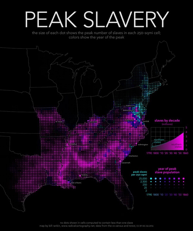
I appreciate him explaining his map technique! Each decade is a separate high-resolution map image, but Bill also created a fantastic combined map showing the highest Peak Slavery levels of slavery throughout the entire time period.
The bottom map shows the peak number of slaves in each area, along with the year when slavery peaked. Except in Delaware, Maryland, and eastern Virginia, slavery in the south was only headed in one direction: up. Cartographically, this map offers a temporal analysis without relying on a series of snapshots (either a slideshow or an animation), and it makes it clear that a static map is perfectly capable of representing a dynamic historical process.
Additionally, you can download a high-resolution poster version showing all nine decades:
Found on FlowingData and CityLab


 Randy
Randy


