About
Randy Krum
President of InfoNewt.
Data Visualization and Infographic Design

Infographic Design

Infographics Design | Presentations
Consulting | Data Visualizations

DFW DataViz Meetup

Join the DFW Data Visualization and Infographics Meetup Group if you're in the Dallas/Fort Worth area!

Search the Cool Infographics site

Custom Search

Subscriptions:


Feedburner

The Cool Infographics® Gallery:

How to add the
Cool Infographics button to your:

Cool Infographics iOS icon

- iPhone
- iPad
- iPod Touch


Read on Flipboard for iPad and iPhone

Featured in the Tech & Science category

Flipboard icon

Twitter Feed
From the Bookstore

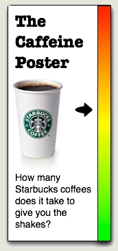
Caffeine Poster

The Caffeine Poster infographic

Entries in percentages (2)

Thursday
Jul052012

A Woman's Place: Best and Worst Places To Be A Woman

National Post A Woman's Place infographic

An informative infographic called A Woman’s Place by Richard Johnson at the National Post.  Very interesting analysis of some different ways to measure the best and worst places in the world to be a woman.

Canada ranked 17th on a list of the best and worst places to be a woman in the world. In the report, researchers from Save the Children looked at the health, education and economic status of women in 165 countries to develop the ranking, with Norway claiming the top spot and Somalia the bottom. The National Post graphics department analyzes the data:

I like this use of circles to visualize the scores, numbers and percentages because it’s easy for the viewer to compare values on the page.  Circles are usually tough to differentiate when the values are close together, but there’s enough range in the values here to make the circles effective.

A high-resolution PDF of the infographic is also available.

Found on HolyKaw

Monday
May022011

The Real Cost of Dating

This is a pretty simple one, but I appreciate when companies are willing to experiment with infographics and even design their own.  The Real Cost of Dating is from Match.com and based on a survey they performed in March of 2011.  So here, the company is putting their own, proprietary data out on the web to inform readers and draw them into the match.com blog.

First, I like the talk bubble used as a pie chart.  It really helps reinforce the data as “Men say…”, “Women say…”.  Although I think the design is too subtle.  It took me a minute to even see that there were too colors in the bubbles.

Persoanlly, I think this design is very text-heavy, and much of the text is redundant.  For example, each statistic includes the text “…of women” when they are already in a section of the infographic of just statistics from women.

Overall, good first swing at using infographics in your marketing strategy, and I hope they do more.

Thanks to Colin for sending in the link!