January Roundup of DataViz News
I sent this out to the Cool Infographics Mailing list previously, but I wanted to share on the blog as well. This will be a regular feature sent out to email subscribers, but I haven't decided if I will always post these on the blog as well. Thoughts?
If you're not a subscriber, you can join the email list HERE. I try to send only a few emails per month, and load with them valuable information on dataviz news, design tools, tips, upcoming dataviz events, giveaways, discounts, discussions and other valuable links.
Please tweet links to any DataViz news that should be included in future emails to @rtkrum
Roundup of DataViz Insights, Tools, Tips and News
- Can a love of abstract art and infographic design be combined? They have more in common than we originally thought! This article by Giorgia Lupi delves into how this type of infographic was applied in explaining the "global brain drain."
- A woman of many talents, Dona Wong, author of Wall Street Journal Guide to Information Graphics, tells all when it comes to creating infographics that have a purpose. With infographics, data needs to be more than just design. It should provide real insight into the findings, that are easily digestible for its viewers. Read more here if you’d like to apply her wisdom to the marketing world. She will also be speaking at the AMA Analytics with Purpose Conference next week.
- The New York Times has announced that Amanda Cox has been named has been named editor of The Upshot.
- Visually has now been acquired by Scribble Live, a leading content marketing platform, in the hopes of uniting data and creativity to reach target audiences more effectively.
- Don’t be making these design mistakes! If you’re a designer, or if you’re just getting your foot in the door, use tips from Visme to ensure that each design you make is a hit. Use discount code COOL30 for a lifetime discount 30% off your subscription.
- Are you a Prezi user? If so, they’ve updated a new feature to create charts using your data. Check out their tutorial.
- Your business can benefit from telling stories by visualizing data. Data Storytelling: Big Data's Next Frontier from James Kerr on Inc. provided 5 Tips to establish a necessary data storytelling environment for your business.
- IBM's free online dataviz site, manyeyes, was shuttered on Dec 31st, and the visualization tools are being rolled into IBM Watson Analytics over time. To learn more about what they’re offering see, click here.
- KANTAR and Information Is Beautiful have announced the 2015 Information is Beautiful award winners! Check out the whole gallery.
- Malofiej 24: Infographic World Summit registration is now open, with an impressive lineup of speakers coming March 6-11 in Pamplona, Spain.
- The O'Reilly Strata+Hadoop World Conference will be taking place from March 29-31 in San Jose, CA. Use code AFF20 for 20% off tickets you can purchase here.
- has opened for the OpenVis Conference in April, which will be held in Boston.
- If you're in San Francisco, there will be a public workshop detailing storytelling using data with Cole Knaflic on February 8th.
- A FREE one-day event in Miami, FL will be held on February 20 in celebration of World Information Architecture Day.
New DataViz Books:
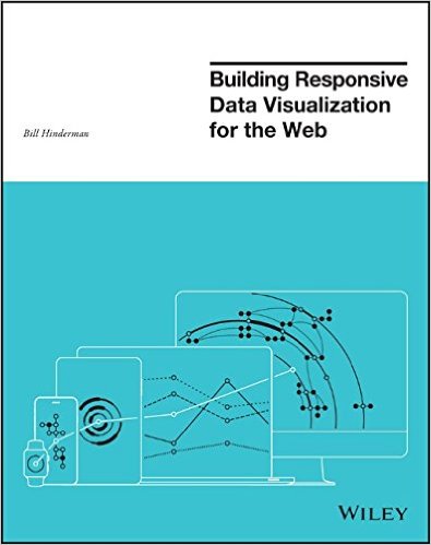 Building Responsive Data Visualization for the Web, by Bill Hinderman
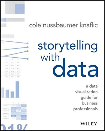 Storytelling with Data: A Data Visualization Guide for Business Professionals, by Cole Nussbaumer Knaflic
 DataViz,
  Prezi,
  book,
book,  conference,
  data visualization,
  news
news 


