The Evolution of Reddit
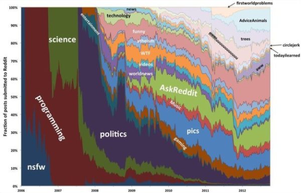
The Evolution of Reddit Through Time infographic from Randal Olson.com covers the history of Reddit for the past 7 years. With thousands of active subreddits, the visual above displays the 24 most active. Track the popularity of each subreddit through the years!
The graph below shows how 24 of the most active subreddits have changed over time. I ordered the subreddits by the time that they first appeared on Reddit. I recommend zooming in so you can see it better.
(I should note that I purposely excluded /r/reddit.com from this graph because it dominates the entire graph until about 2008, then screws things up again when it got closed down in late 2011.)
The biggest thing that you may notice is that there were very few subreddits from 2006-2008. In fact, there was only one subreddit before 2006 (/r/reddit.com). The majority of the content in 2006-2008 was focused on more techie-friendly subjects: programming, science, politics, entertainment, and gaming. Major subreddits dedicated to solely picture and video content started becoming popular in mid-2008, and even then their posts only comprised less than 1/4 of Reddit’s content. It wasn’t until 2011 did the picture-related subreddits really start taking over, and Reddit never looked back after that.
This graph covers so many changes in the Reddit community that it can’t explain what happened by itself. In the following sections, I will take a closer look at how the Reddit community evolved on a year-by-year basis.
Love these data visualizations of the reddit’s evolution over time from Randy, a 3rd year Computer Science graduate research assistant at Michigan State University. In his original post, he actually visualizes each year separately, and you can see some major milestones and clear changes in the reddit universe.
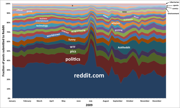
 The Great /r/reddit.com Spike of 2009
The total growth of reddit over the years is lost in the 100% Stacked Area chart; however, you can clearly see the growth of subreddit content as a portion of the whole.
Found on Flowing Data!


 Randy
Randy
