About
Randy Krum
President of InfoNewt.
Data Visualization and Infographic Design

Infographic Design

Infographics Design | Presentations
Consulting | Data Visualizations

DFW DataViz Meetup

Join the DFW Data Visualization and Infographics Meetup Group if you're in the Dallas/Fort Worth area!

Search the Cool Infographics site

Custom Search

Subscriptions:


Feedburner

The Cool Infographics® Gallery:

How to add the
Cool Infographics button to your:

Cool Infographics iOS icon

- iPhone
- iPad
- iPod Touch


Read on Flipboard for iPad and iPhone

Featured in the Tech & Science category

Flipboard icon

Twitter Feed
From the Bookstore

Caffeine Poster

The Caffeine Poster infographic

Entries in scale (154)

Wednesday
Dec092009

Bill Nye Videos on the Scale of the Solar System

Two videos from Bill Nye the Science Guy showing the size and scale of the planets and the Sun.  He may have done similar examples, but these are the two I know about.  The one above (Planets & Moon) starts at about 4:00 into the video, and the one below (Outer Space) starts at about 2:00.  "Outer Space is HUGE!"

Thanks to @DannyDougherty on Twitter for sharing!

Monday
Dec072009

Scale Model of the Solar System


The Scale Model of the Solar System (from phrenopolis.com) shows both the relative sizes of the planets and the Sun as well as representing the distances from the Sun on the same scale.  This image is huge (just over half a mile wide), and as you can imagine mostly black.
This page shows a scale model of the solar system, shrunken down to the point where the Sun, normally more than eight hundred thousand miles across, is the size you see it here. The planets are shown in corresponding scale. Unlike most models, which are compressed for viewing convenience, the planets here are also shown at their true-to-scale average distances from the Sun. That makes this page rather large - on an ordinary 72 dpi monitor it's just over half a mile wide, making it possibly one of the largest pages on the web. This means you'll have to do a bit of scrolling if you want to find the planets, but don't despair. They are reasonably bright and labeled, so you can probably catch them flashing by in the blackness even if you are scrolling fairly fast.
Found on Information Aesthetics.

Monday
Nov232009

Probes in the Universe - cool interactive infographic


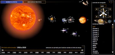
Space Probes is a very well-done interactive graphic about all of the space probes we have launched, visually placing the probes in orbit around the object they are observing.  You can move around the 3-D space with the keyboard controls, change the date range with the sliders on the bottom or go directly to a particular probe from the list on the right that is group by planet or object they are around.  When you mouse-over a particular probe you get more details and an image.


The article and the infographic are in Portuguese from Brazil, so I took the liberty of using the Google Translator for a little help.
The infographic "Space Probes" Super, produced by the team of Internet Editora Abril Jovem, took the silver medal in the category Online Malofiej, top prize in the world of computer graphics.
Thanks to Daniel for the link and a little more information:
It won Malofiej's silver medal (first place, no gold medal) this year. 
It's an infographic about all space probes launched until the date it was published (except Earth probes, which are too many). The info has information about each probe, including the organization(s) that sent it, the target planet(s) (or moons, asteroids, comets and the sun), launch date and mission details, as well as pictures for most of them. User can navigate through our Solar System using the mouse and/or keyboard. It's also possible to know the details of Mars Science Laboratory, the next NASA probe to visit the red planet. The info is in Portuguese, but anyone can understand it's features and learn a little bit about space exploration so far.

Monday
Nov092009

ANC Spending infographic


Diaan Minhardt created this simple infographic for his blog, Dreamfoundry, to show how money being spend on new cars for government officials could have been spent differently to build houses.
I’ve been keeping an eye on the rivers of money haemorrhaging out of the government coffers for idiotic reasons for some time now. What I saw inspired me to create this very simple infographic.
Thanks Diaan!

Thursday
Oct292009

Visualizing American 2009 TV Season Ratings


Rachel Cunliffe has created a great infographic for the new 2009 US TV shows showing how their viewer numbers are fairing compared to each other and their own premiere episodes.  I only see three shows that have a higher average viewers than their premiere.  Others are not doing well at all, and they probably won't be around for much longer...
Here's a summary of how the new season TV shows are faring in the US based on episodes screened to date.
For comparison purposes, this year's American Idol premiere ratings have been included.
TBL, aka The Beautiful Life, has already been canned by the CW.


Great work Rachel!  You can follow Rachel on Twitter at @cre8d

Monday
Oct052009

The Billion Dollar Gram


This is one of those simple, but great infographics.  Once the news starts talking about "billions" of dollars, the brain goes numb and it all runs together because the numbers are too big for us to comprehend.

David McCandless, from Information Is Beautiful, created this tree map to show the relative size of the different billion dollar spending and budgets in the news.

Great job David, keep them coming!


Monday
Sep282009

Running The Numbers, New Book from Chris Jordan!


After finding the video last week, I also found that Chris Jordan has published a book of his work called "Running The Numbers".  I couldn't help myself, I had to buy a copy.  It's available on Amazon.com and directly from Chris Jordan's site.

Chris Jordan's photography is focused on visualizing the huge numbers and statistics from life in America.  His photos put the large quantities into a visual scale that our brains can understand.

Here's a link that will help support Cool Infographics too.

Thursday
Sep242009

Chris Jordan's TEDTalk 2008 - Visualizing Our World [video]

I've posted some of Chris Jordan's images here before, but here is a video of him talking about his work at TED in February 2008.

Artist Chris Jordan shows us an arresting view of what Western culture looks like. His supersized images picture some almost unimaginable statistics -- like the astonishing number of paper cups we use every single day.
Chris Jordan runs the numbers on modern American life -- making large-format, long-zoom artwork from the most mindblowing data about our stuff.
Thanks to Ben Fry for posting this on his site.

Here's a glimpse of Chris Jordan's current project in-progress on the island of Midway Atoll (http://www.midwayjourney.com/).

Wednesday
Sep022009

Surface Area Required to Power the World with Solar Power


From LandArtGenerator.org, a world map visualizing the surface area required to power the world's electricity requirements using solar power alone in 2030, using current solar panel technology.  It's getting a lot of traffic on digg, reddit and Twitter too.

Also, check out the same idea, but for off shore wind power.

Wednesday
Aug262009

What is the GDP per Capita for Every Country?


Cool interactive chart on Snippets.com that shows the GDP per Capita of every country (so it claims).  It has a number of predefined groupings like Continent, UN Members, OPEC, Communist, Largest Area, etc to show comparisons.
The interactive chart below represents the GDP per capita for each country. Click on any of the buttons to view the data for that particular group of nations. You can highlight a particular country by selecting it in the dropdown box.  The data was compiled from the 2008 CIA World Factbook.

Thanks for the link Jerry!

Page 1 ... 6 7 8 9 10 ... 16 Next 10 Entries »