About
Randy Krum
President of InfoNewt.
Data Visualization and Infographic Design

Infographic Design

Infographics Design | Presentations
Consulting | Data Visualizations

DFW DataViz Meetup

Join the DFW Data Visualization and Infographics Meetup Group if you're in the Dallas/Fort Worth area!

Search the Cool Infographics site

Custom Search

Subscriptions:


Feedburner

The Cool Infographics® Gallery:

How to add the
Cool Infographics button to your:

Cool Infographics iOS icon

- iPhone
- iPad
- iPod Touch


Read on Flipboard for iPad and iPhone

Featured in the Tech & Science category

Flipboard icon

Twitter Feed
From the Bookstore

Caffeine Poster

The Caffeine Poster infographic

Entries in scale (154)

Tuesday
Aug042009

NEW Death and Taxes 2010 poster!!

First, Jess from WallStats.com has released the 2010 Death & Taxes poster.  This is one of the best infographic examples today.  It's extremely informative, and the topic has a very wide reach.  The Death & Taxes poster from 2007 was my initial post on Cool Infographics, so I'm very excited to see this update.   Now the 2010 version is available to purchase as a poster here. Great job Jess!

Second, I'm really impressed by the viewer code for the poster. It's from Zoomorama.com, and lets me embed the interactive viewer.  The built-in zoom is pretty nice, but the Quick Find index on the left side is the best part.

Monday
Jul272009

Amazon Acquisitions infographic


Found on meettheboss.com, a decent infographic of the acquisitions that Amazon.com has made over the years.  Drawn like an org chart, I like that each branch represents another year, so it becomes a timeline.

Friday
Jul242009

One Trillion Dollars Visualized [infographic video]

New video based on the infographics from our friend, Jess Bachman, from WallStats.com!  Created by/for Mint.com.

Trillion is the new Billion!

Saturday
Jul112009

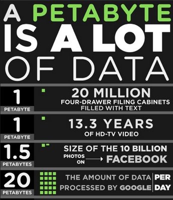
How Much is a Petabyte?


From Mozy.com, a pretty large infographic (as you might expect from the name).
We store a lot of data here at Mozy (15+ petabytes, in fact), but how much is that really? We put together this series of stats to help you understand just how much data that really is. Enjoy!
Thanks Matthew!

Wednesday
Jun242009

Disney: Inside the Matterhorn Infographic


From the OC Register, an infographic with an inside look at the Matterhorn at Disneyland in Anaheim, CA.  Celebrating its 50th anniversary, this is a rare inside look behind the scenes of a Disney ride.

Thursday
Jun112009

Sugar Stacks: How Much Sugar is in your Food?


SugarStacks.com is a website dedicated to showing you how much sugar is in the food we eat.  Using a simple visual of stacked sugar cubes, you can see the sugar content of many different types of food.  I love that it's simple and visually gets one point across really well.  There are words on website, but you really don't need them.

We've used regular sugar cubes (4 grams of sugar each) to show how the sugars in your favorite foods literally stack up, gram for gram.  Compare foods, find out where sugar is hiding, and see how much of the sweet stuff you're really eating.


Found on Infosthetics.com, and as they note, the website doesn't differentiate between types of sugars, the white sugar cubes are used to represent them all.

Thursday
May142009

Who is Coming to America?


From GOOD magazine.  If you look closely, this is essentially a bar chart dressed up, but it's the dressing up into the shape of the U.S. flag that catches your eye.  I love it!
Immigration may have taken a back seat during the financial crisis, but the issue still needs resolving. While illegal immigrants sneaking over the border is still a primary concern, it’s good to know who came to our country legally, and from where. Our latest Transparency is a look at the 20 countries from which the most people came to America in 2008, how many immigrants already had family here, and how many received asylum when they arrived on our shores.
Found on SimpleComplexity.net, thanks Nathan!

Wednesday
May062009

Bestselling Movies are Not the Most Pirated Ones Online

Posted by metrobest on Flickr, a cool infographic showing that the most pirated movies on the web are not the bestselling, blockbusters you might expect.  Not sure who the author is, but it may be "5W Infographics España"

Check out the other posted infographics while you're there.

Wednesday
Apr292009

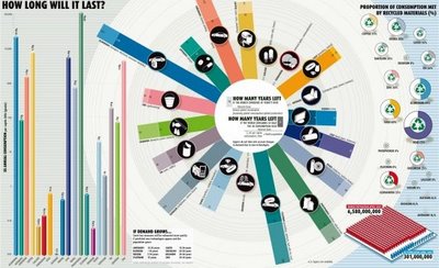
How Long Will It Last?


Good infographic from the New Scientist showing how many years we have left of our key natural resources.  Essentially these are basic bar and pie charts, but dressed up to make the overall graphic more compelling.  The message is still clear though, and the author gets his point across very strongly.

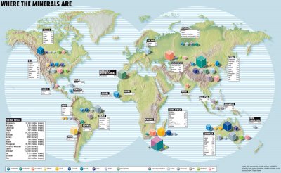
This comes from a 2007 article in the New Scientist called "Earth's Natural Wealth: an Audit" that include two more infographics as well.  The first is a map of where in the world are these natural resources are.


The next is a bubble graphic showing the scale of how much of each resource an average American will consume during their lifetime.


The Source listed on the first infographic: Armin Reller, University of Augsburg, Tom Graedel, Yale University

Found on FlowingData.com and numerous Twitter references.  Thanks Nathan.

Monday
Apr272009

The AlloSphere: Step inside your visual data!

Awesome sphere that you step into and become completely immersed in visual data!  I can't wait for one of these to be available for the public to experience.  Great TEDTalks video.

JoAnn Kuchera-Morin demos the AlloSphere, a new way to see, hear and interpret scientific data. Dive into the brain, feel electron spin, hear the music of the elements ... and detect previously unseen patterns that could lead to new discoveries.

Page 1 ... 7 8 9 10 11 ... 16 Next 10 Entries »