About
Randy Krum
President of InfoNewt.
Data Visualization and Infographic Design

Infographic Design

Infographics Design | Presentations
Consulting | Data Visualizations

DFW DataViz Meetup

Join the DFW Data Visualization and Infographics Meetup Group if you're in the Dallas/Fort Worth area!

Search the Cool Infographics site

Custom Search

Subscriptions:


Feedburner

The Cool Infographics® Gallery:

How to add the
Cool Infographics button to your:

Cool Infographics iOS icon

- iPhone
- iPad
- iPod Touch


Read on Flipboard for iPad and iPhone

Featured in the Tech & Science category

Flipboard icon

Twitter Feed
From the Bookstore

Caffeine Poster

The Caffeine Poster infographic

Entries in USA (24)

Thursday
May022013

The United States of Energy

The United States of Energy infographic poster

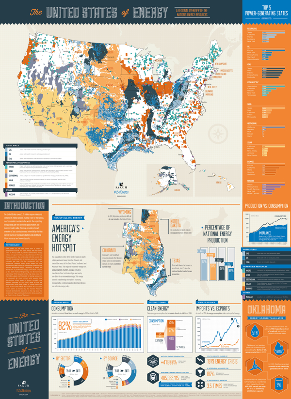
The United States of Energy from Saxum, is a huge project to map domestic energy sources.  

Finally… After almost 50 years of dependence on foreign sources to meet our growing energy needs, our country is finally in a position to begin reversing the trend. Through advances in drilling technology, discoveries of new oil and natural gas reserves and swift progress in the renewables sector, the United States is setting a course for energy self-sufficiency.

What began as a simple graphic showcasing America’s energy riches quickly grew into a two-sided, folded map concept displaying thousands of individual data points.

The #USofEnergy map visualizes our country’s energy potential by charting current sources of energy production and identifying future resources and known deposits. Energy resources surveyed include: natural gas, oil, coal, nuclear, hydroelectric, wind, geothermal, solar and biomass.

This is actually designed as two landscape posters as the front and back, but when put together, they make one very detailed portrait orientation poster.  I love the main U.S. map that is the primary focus, and the designers took on the challenge to visualize the many different energy sources as represented with the overlapping colors.  You’ll notice that the smaller area coverage shapes are always on top, so the small circles aren’t completely hidden by the larger area shapes.  I would have attempted making the colored areas slightly transparent to let the underlying shapes show through, and removing the text names of all the states might have helped to reduce the visual noise.

My power contract for InfoNewt here in Texas is 100% Wind Power, but I had no idea that Texas is the national leader in wind power production!

I’m not sure what to call them, but I like the paired 180° doughnut charts showing how the sectors and sources of energy have changed from 1949-2011.  However, I don’t like the chart legends that makes them hard for the reader to figure out what each color represents.  Legends are evil!  It would have been nice for the nine types of energy to be shown with icons (along with the color-coding), and the icons or text could have been shown along with the larger 2011 doughnut segments.

The statistics shown at the bottom are shown as just text numbers.  In contrast to all of the data visualizations throughout the rest of the design, this makes these numbers seem unimportant to the reader.

Found on Visual.ly

Friday
Jan042013

Cancer in the U.S.A.

Cancer in the USA infographic


The Cancer in the US infographic addresses the current state of the country with its fight against cancer. MesotheliomaHelp.net created this infographic to inspire people to donate to help find the cure of cancer. Find an organization you would like to donate to here.
MesotheliomaHelp.net is dedicated to fighting cancer and providing helpful resources to mesothelioma patients and their caregivers. The purpose of this infographic is to share importance of us focusing on a cure for cancer and asking people to support the organizations that are working hard to find one. Please go to http://www.mesotheliomahelp.net/beat-cancer to donate to your favorite cancer charity today! 

I really like this design style and color scheme.  It keeps a serious tone overall to go with the serious topic, the visuals are simple and clear, and the story path is easy to read from top-to-bottom.  The light gray paper backgound texture also provides clear boundaries to the infographic when displayed on a white background (like this blog).  The lined up person icons to represent “1,500 people die each day” would be easier to understand with ten icons in each row.  

I like idea behind the icons and the stacked grids of squares in “Cases of Cancer by Type”, but I’m unclear as to the values being visualized.  It appears to be the percentage of deaths of of the total cases of each type of cancer, but that percentage value isn’t shown anywhere.  The rows of squares should also be ten squares across to make the visualization easier to understand.

The “Mortality from Cancer” visualization is a basic line chart, but that visual does such a great job of telling the story of the overall trend over time.  I think this particular section should have been bigger, since that data is so impressive.

The footer should include a copyright statement, and the URL to the original, full-size infographic on the MesotheliomaHelp.net site.

Thanks to Oakes for sending in the link! 

Thursday
Dec132012

The New Christmas Tradition...Artificial Christmas Trees!

The New Christmas Tradition...Artificial Christmas Trees! infographic

Wow!  Apparently the U.S. has completely converted over to artificial Christmas trees while no one was looking!  The Redefining Christmas Traditions infographic from Tree Classics is a summary of findings from two Nielsen studies in both 2011 and 2012 and information from the American Christmas Tree Association.

Every Christmas tradition begins somewhere, and those of us who follow Christmas tree trends know that more and more families are building their holiday traditions around artificial Christmas trees. Find out who’s buying artificial, where they live, and why more and more people are choosing artificial in our infographic of real vs fake artificial Christmas tree facts. If you’re thinking of starting a family tradition of your own, consider buying a Pre Lit Christmas Tree from Tree Classics and start making holiday memories that will last year after year!

The design does a great job of jumping to the main point right away.  A huge majority of homes in the U.S. use artificial Christmas trees for the holidays.  This is the Key Message of the design, and it communicates that fact in less than 5 seconds to the readers.  So even if they don’t read the rest of the design, they still understand the main point.  Also, what makes a popular infographic is bringing to light some surprising, unexpected information to the readers.

The shear magnitude of the number was surprising to me, and I think it will be to a lot of readers.  We see real live Christmas trees being the symbol of home and family traditions in the media, but the reality is that 3.5x more homes display artificial trees than live ones.

All of the important design elements are there.  Focused topic, clear data visualizations to support the Key Message, respectable sources cited, copyright statement and the URL to the original infographic so readers can find the full-size version.

Designed by InfoNewt with designer Jeremy Yingling

Tuesday
Oct232012

Tracking American Poverty - interactive infographic

Tracking American Poverty - interactive infographic

Tracking American Poverty & Policy is an interactive infographic visualization site that breaks down the data about…you guessed it…poverty in America.

The site provides a sequence of interactive pages that start with the overall poverty numbers, and then break them down in more detail by race, gender, education, age and family type.  In addition to the initial pie charts for the official poverty rate, the visualizations change to show details for Near Poverty, In Poverty and Deep Poverty numbers when you hover your pointer over each chart.


Tracking American Poverty - interactive infographic

You also have the option on each page to change the year to see how the number have changed from 1967 - 2010.

Good visualization design by Two-N 

Page 1 2 3