Google PageRank Explained

Another good infographic from Elliance.com.
Google assigns a numeric weighting from 0-10 for each webpage on the Internet; this PageRank denotes your site’s importance in the eyes of Google.
Join the DFW Data Visualization and Infographics Meetup Group if you're in the Dallas/Fort Worth area!

The Cool Infographics® Gallery:
How to add the
Cool Infographics button to your:
- iPhone
- iPad
- iPod Touch
Read on Flipboard for iPad and iPhone
Featured in the Tech & Science category

Another good infographic from Elliance.com.
Google assigns a numeric weighting from 0-10 for each webpage on the Internet; this PageRank denotes your site’s importance in the eyes of Google.

From readwriteweb.com, an area chart showing the decline of Tech stories made popular on digg.com. Although initially the front page of digg.com was totally dominated by Tech stories and the primary users were tech geeks, the World & Business category is now the reigning king with the most stories made popular.
To put this into context, on 1 January 2006 tech stories made up 78% of the total popular stories (i.e. stories that made it onto the digg frontpage). By end of March 2008, that percentage had dropped to 18-20%.

Here you can see the same information charted as total number of stories made popular instead of percentages.
 From Wikipedia, the Quake Family Tree shows the history of the Quake computer game engine and all of the other games that were built from each version using a mind map.
Found on digg.com
Cool infographic video about (you guessed it) bridesmaids. Created by Yaniv Fridman, Nicolas Alexander and Amber MacKay for Motion Design Class at Vancouver Film School. Here's a link to the High Quality version of the video.
Their blog discusses the creative process and the tools they used to create the video.
Found on infosthetics.com

Josh Budich has created the website My Star Wars Collection to share his personal collection of over 600 Star Wars figures. He has created a pixel image of each figure in his collection. Moving you mouse over the image brings up the name of the character, and clicking brings up a photo of the figure still in its packaging. The are a number of ways to narrow down the assortment by figure series, movie the character appeared in or year the figure was released.
Thanks Torquil for sending this one in.


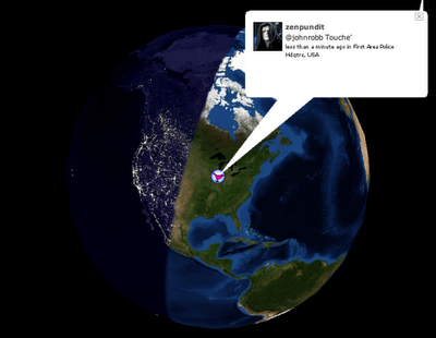
Also from FlowingData.com, this post about the many ways to visualize the Twitter universe is really cool. Twitter has really been gaining some momentum lately, but I keep looking for better ways to follow the posts.


FlowingData.com has an entry on the 21 Ways to Visualize and Explore Your Email Inbox, which has some really cool visualizations.
Found on SimpleComplexity.net, thanks guys. I hadn't come across FlowingData.com before.

Check out the Map of Creativity from the Next Generation Foundation.
The Map of Creativity is a user-friendly, interactive database of innovative educational projects throughout the world.
 From blog.doloreslabs.com, they showed 1,300 different colors to people on Mechanical Turk, and asked them to name the color.
The above picture contains about 1,300 colors and the names for them that Turkers gave. Each is printed in its color and positioned on a color wheel. Just looking around, there sure seem to be different regions for different names. But there are also rich sets of modifiers (”light”, “dark”, “sea”), multiword names (”army green”), and fun obscure ones (”cerulean”).They also created a Color Label Explorer tool to only show those color names that match your search term, but still keep them in place on the color wheel graphic.

Currently on exhibition at MOMA, The Museum of Modern Art, from Feb 24th - May 12th is an exhibit called "Design and Elastic Mind". New York Talk Exchange is included as part of the exhibition.
New York Talk Exchange illustrates the global exchange of information in real time by visualizing volumes of long distance telephone and IP (Internet Protocol) data flowing between New York and cities around the world.Thanks Oliver!