About
Randy Krum
President of InfoNewt.
Data Visualization and Infographic Design

Infographic Design

Infographics Design | Presentations
Consulting | Data Visualizations

DFW DataViz Meetup

Join the DFW Data Visualization and Infographics Meetup Group if you're in the Dallas/Fort Worth area!

Search the Cool Infographics site

Custom Search

Subscriptions:


Feedburner

The Cool Infographics® Gallery:

How to add the
Cool Infographics button to your:

Cool Infographics iOS icon

- iPhone
- iPad
- iPod Touch


Read on Flipboard for iPad and iPhone

Featured in the Tech & Science category

Flipboard icon

Twitter Feed
From the Bookstore

Caffeine Poster

The Caffeine Poster infographic

« The Caffeine Poster, How Much Caffeine Are You Drinking? [new infographic] | Main | Population of the Dead - infographic »
Friday
Jan082010

16 Infographic Resumes, A Visual Trend

(It’s actually up to 18 now.)
A number of designers have attempted to design a visual, infographic resume, and while this is certainly not mainstream (yet), it is gaining some momentum.  I wanted to highlight some of the great examples available on the web, but the line between an infographic resume and a designer resume is tough not to cross.  I’ve tried to stay true to only infographic versions here, and didn’t include many good illustrated resumes that didn’t include any visualizations.


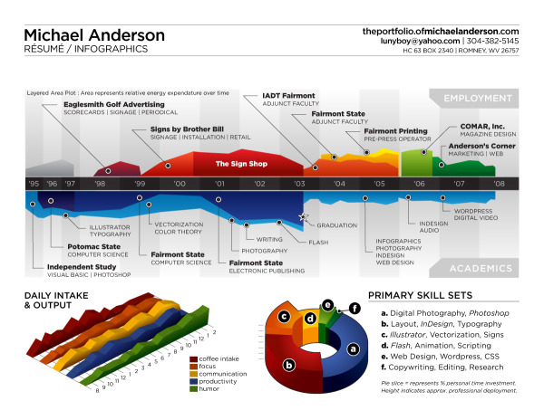
Michael Anderson’s 2008 concept on an infographic resume (above) is probably the most well known.  It’s been tweeted, dugg, reddit-ed and featured on FastCompany.com.

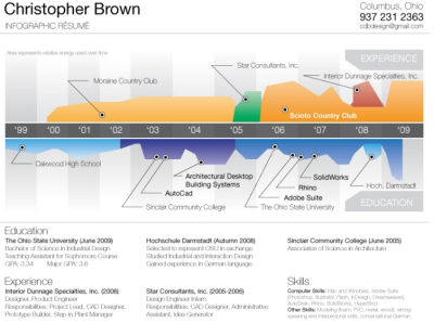
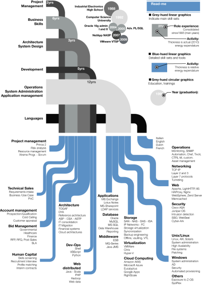
I decided to update my résumé with a different perspective on the typical time-line theme. This is just concept art, as there are almost no real metrics represented except for time. There is no energy expenditure unit of measure, nor tics to delineate percentage or otherwise.

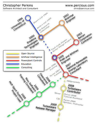
Christopher Perkins’ resume, using the subway map metaphor.
I do agree it’s more of an overview and less of a project-experience-oriented resume, but I’ve been thinking a lot about (and looking at) resumes lately, and I feel like what you really need to do is grasp someone’s attention first. This is whyhttp://www.percious.com is listed at the top, and that’s about all listed (no address, phone number, etc.) The other thing I was thinking about doing was to add an image map with links to provide more information about the things I have worked on.


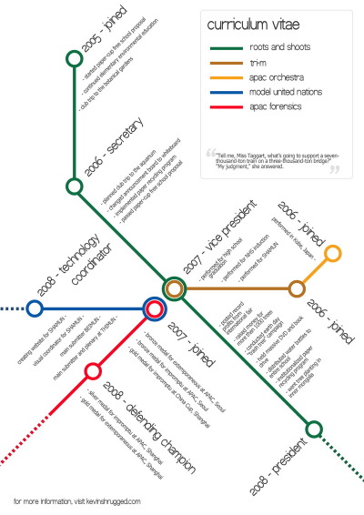
Also using the subway map metaphor, Kevin Wang plots out his activities during his school years.


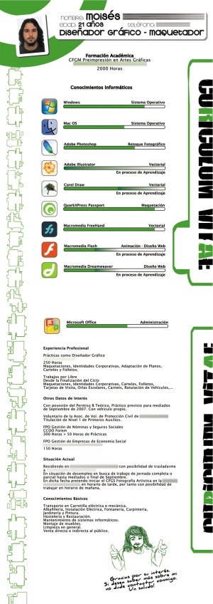
Curriculum Vitae, by Uito2 in 2007, shows his experience level in different software packages as progress bars.


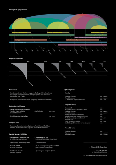
Chester, Lau Cheuk Hang, does a great job utilizing a timeline at the top of his resume with spanning arcs to highlight time spent in different activities.

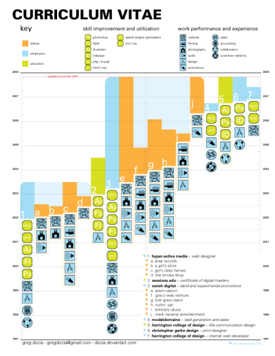
Greg Dizzia also creates a Curriculum Vitae showing vertical bars spanning a timeline for each company, and adds an additional element of icons to represent different experiences during each project.

This lists my history in the design world (some lesser clients have been left out) - Designed using univers exclusively. This is an appendage to a traditional resume, to be included as a forward page in my portfolio.

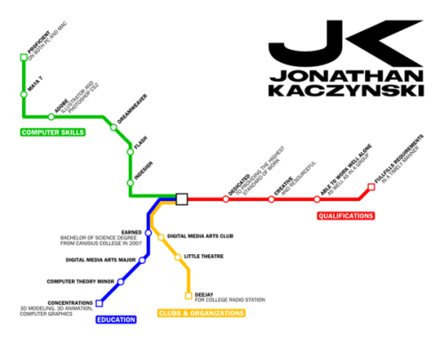
Jonathan Kaczynski, also tries a subway map style using the different lines as categories instead of attempting a timeline.  I actually think this approach works a little bit better, the timeline versions appear difficult to translate into a subway map.

I am currently in the process of remaking my portfolio. It will have the appearance of a mass transit system’s website. This is the resumé that I’m working on to go along with the portfolio. It still needs a bit of clean-up and and logo needs some work.


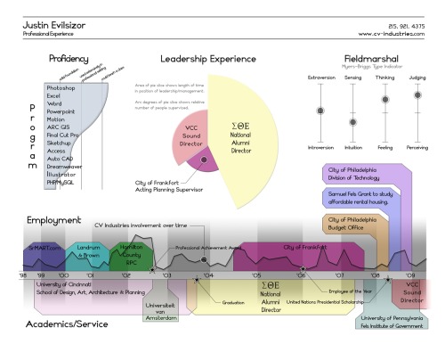
Justin Evilsizor’s version incorporates a timeline, a level-of-skill chart and I personally love the addition of the Meyer’s-Briggs Type Indicator.


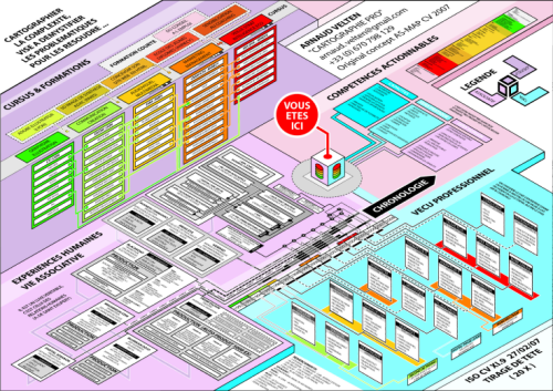
Arnaud Velten, Cartographer of Complexity, created this isometric resume.  At its heart is a timeline, but he has added an incredible amount of detail to each of his skills.  Seems like too much detail for me, but that may be what he wants to convey.


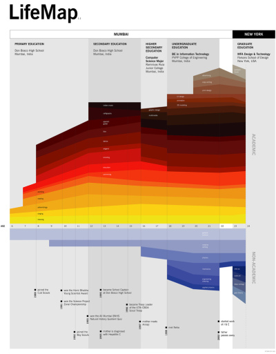
Maybe not technically a resume, Ritwik Dey’s Life Map is an impressive timeline of his education and activities.

This information design piece maps out my interests between ages 6 and 24 and the context in which they were born and nurtured. It also brings to surface how these interests influenced and were in turn influenced by milestones in my personal journey.


Stephen Gates’ resume is very clean a take on the timeline.

Why did no one try something new? Why wasn’t there one designer who took on their resume as design challenge to do something visual and different? I also realized that I was just as guilty as everyone else so I set out to design something different. So after some work in my spare time I have the design shown above (click on it to see it full sized). It is just a start and it feels like it is heading in an interesting direction but let me know what you think.


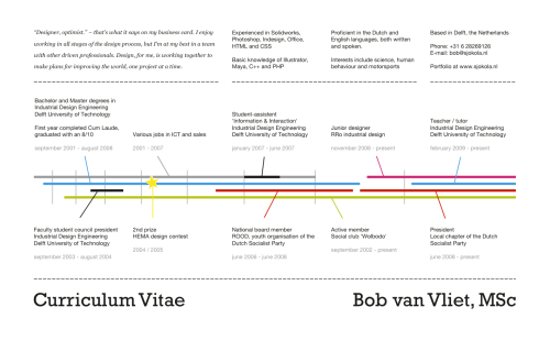
Bob van Vliet also created a very clean timeline resume.

I thought I’d try something different from the standard A4 with a dull summary of positions.  Four timelines represent the most important parts of my life so far: Work, Education, Activism and Fun. The years get wider towards the present as those say more about who I am now than when I just started university.


Christopher Brown’s colorful infographic timeline inspired by Michael Anderson’s concept.


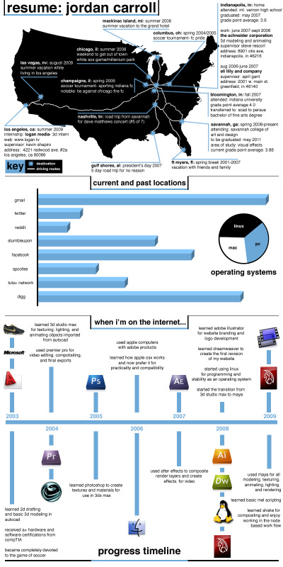
Jordan Carroll’s resume includes a few different elements.  Timeline, map and charts combine into one overall resume.


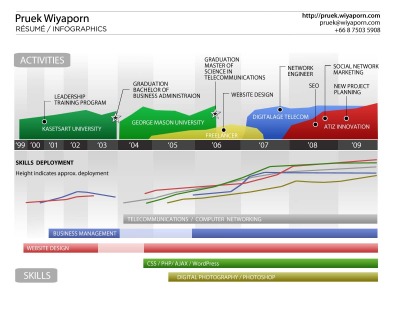
Another colorful timeline resume, this one by Pruek Wiyaporn, also appears inspired by Michael Anderson’s concept.


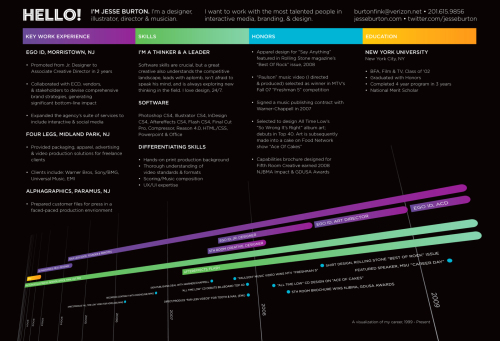
Jesse Burton also has a very nice stylized timeline resume.


Which ones do you like?  Have I missed any other good ones out there?

Thanks to links found on VisualThinkMap, FastCompanyPatrick Debois


EDIT: Here are a few more that I missed when I originally wrote the post:


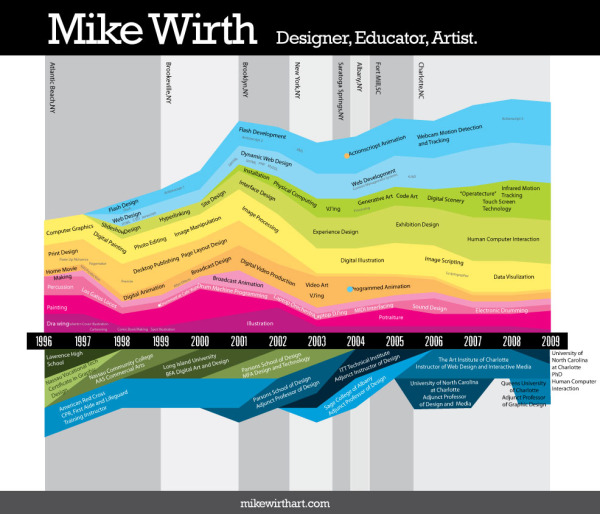
Mike Wirth is a freelance infographic designer.  His colorful timeline has experiences above the X-axis, education is below and his geographic locations are the shaded bars in the background.  When he learned specific software packages is also identified in the colored area, which shows how long he has been using the different software packages.


Gabriele Bozzi designed this resume concept that focuses totally on skills and experience.  Education is identified in the small bubbles, and the skills are connected to specific examples of her experience.  She is working on a separate timeline graphic.

PrintView Printer Friendly Version

EmailEmail Article to Friend

References (4)

References allow you to track sources for this article, as well as articles that were written in response to this article.
  • Response
    Response: ???? ??
    ????! ? ???? ??????. falnlov? 16?? ???? Resume? http://bit.ly/5GRTmn
  • Response
    Your approach to this topic is unique and informative. I am writing an article for our school paper and this post has helped me a lot. Cheers
  • Response
    Response: here
    Cool Infographics - Blog - 16 Infographic Resumes, A Visual Trend
  • Response
    Cool Infographics - Blog - 16 Infographic Resumes, A Visual Trend

Reader Comments (74)

Very very soon everybody will be able to create infographic resume. We now working hard to make it happen. Check facebook.com/resumup or one of the templates: http://bit.ly/qnB9AU
August 11, 2011 | Unregistered CommenterEugene
Wow! Some of these are extremely elaborate. I appreciate the creativity. :)
September 7, 2011 | Unregistered CommenterRebecca
Have to provide a new URL to my custom designed resume visualization, as my previous one is now outdated:

http://bit.ly/jNWsHx

Also, here's another version that anyone can create, that is powered by Visualize.Me - this service extracts information from your LinkedIn account and enables you to customize the features and UI against a few different templates. They are still in beta mode and have some more coding to do in order to tighten what they've released thus far,but overall, worth checking out:

http://bit.ly/occ0xR

AaronW.
September 7, 2011 | Unregistered CommenterAaron Wester
Most of the Infographic resumes are created with some sort of graphic design in mind but not necessarily a meaningful visualization. When you design an Infographic, you need to pay attention to the information you are projecting, shapes that you are using etc. Most of the Infographic resumes you find on a Google search miss all these points. Visual resume is not a graphic blob. It is a dashboard of your personality. People should not spend lot of time in understanding the information you are trying to share and it defeats the whole purpose behind this concept.
September 7, 2011 | Unregistered CommenterMicahel
this is really awesome information i would develop my resume. can you help me.?
September 8, 2011 | Unregistered CommenterJason
Wow!! I have never seen before this types of resumes which is a most attractive by visuals design.

Regards
October 3, 2011 | Unregistered Commentercv templates 
looks like you've done a great job, I'm really impressed with a number and quality of this infographics, lots of people found the solution if their problems in such information pictures. But the resume writing is another thing, you could not become a professional writer just looking through this, the best way is to check ask.com for better resume solutions, or visit this site - http://www.resumesplanet.com/ , this guys are gods of the resume writing.

thanks!
November 15, 2011 | Unregistered CommenterMichael Vankirk
They are all looking great!
I would like to share my own visual resume as well:
http://freekgerritsen.files.wordpress.com/2011/11/cvfreekfinal.jpg
December 13, 2011 | Unregistered CommenterFreek Gerritsen
I really like the design work. Makes me want to get back at it.
March 7, 2012 | Unregistered Commentertattoo design
April 1, 2012 | Unregistered CommenterMark Rojas
Great examples and creativity in visual resumes , i came across another site which is not launched yet but check it out www.pixsume.com
September 15, 2012 | Unregistered Commenterss
great, very nice post.
September 24, 2012 | Unregistered Commenterresume formats
This blog is so useful for fresher to build their resume and cv .
Thanks for sharing.
September 28, 2012 | Unregistered Commenterfree resume download
When we will use these info graphic resumes ?
Good examples.A well structured resume is best way to make you standout as a unique candet.
July 11, 2013 | Unregistered CommenterSample Cvs
Visual Resume recruiters generally spend 5-6 seconds screening a resume, making your resume visual will highlight your key achievements and make you stand out from the crowd.
October 19, 2013 | Unregistered Commenterteampixume
recently i was introduced to http://www.pictocv.com and it is very promising in creating visual resumes. it is a freemium service for now and they have about 5 designs.
October 19, 2013 | Unregistered CommenterBob
Apply for a job there are some formalities, among them CV is one of them, so we are here to give you some tips how to write a sample resume. You can download some sample from here without charge.
June 22, 2015 | Unregistered CommenterRebecca E. Williamson
I guess I could use some critiques from fellow professional designers, here is my infographic resume: http://fav.me/d90q27c
July 11, 2015 | Unregistered CommenterC. Onur
Writing an excellent resume does not actually mean you should adhere to the guidelines you listen to through the grape vine. It does not have to be one web page or adhere to a particular resume structure. Every resume is a one-of-a-kind promotion interaction. It should be appropriate to your scenario and do exactly what you want it to do.
July 25, 2015 | Unregistered Commenterresume infographics
Nice post. Please also check out http://www.paango.com infographic resume builder.
February 24, 2016 | Unregistered CommenterSri Anand
I needed to post you that little bit of word so as to thank you very much the moment again for all the pleasing opinions you've posted here.
March 18, 2017 | Unregistered CommenterKiara advani hot
A very interesting article :)
I recommend icons for CV - http://www.coolfreecv.com/resume-icon-free
April 25, 2018 | Unregistered CommenterJoan
detexumuzo
April 26, 2018 | Unregistered Commenterdetexumuzo
Editor Permission Required
While we are migrating to a new site design, you must have editing permission for this entry in order to post comments.