


16 Infographic Resumes, A Visual Trend
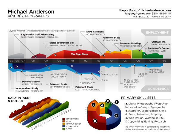
Michael Anderson’s 2008 concept on an infographic resume (above) is probably the most well known. It’s been tweeted, dugg, reddit-ed and featured on FastCompany.com.
I decided to update my résumé with a different perspective on the typical time-line theme. This is just concept art, as there are almost no real metrics represented except for time. There is no energy expenditure unit of measure, nor tics to delineate percentage or otherwise.
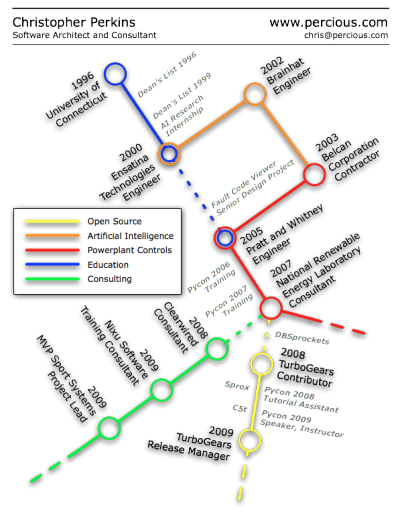
I do agree it’s more of an overview and less of a project-experience-oriented resume, but I’ve been thinking a lot about (and looking at) resumes lately, and I feel like what you really need to do is grasp someone’s attention first. This is whyhttp://www.percious.com is listed at the top, and that’s about all listed (no address, phone number, etc.) The other thing I was thinking about doing was to add an image map with links to provide more information about the things I have worked on.
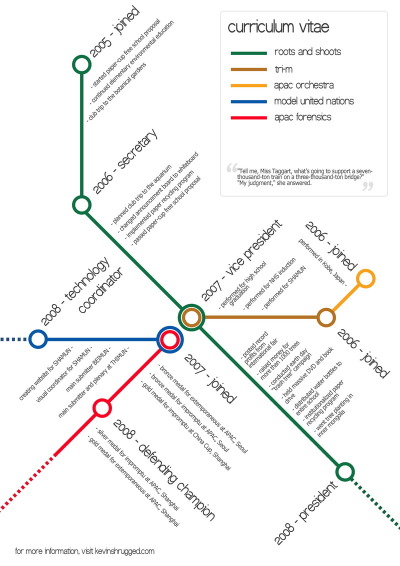
Also using the subway map metaphor, Kevin Wang plots out his activities during his school years.
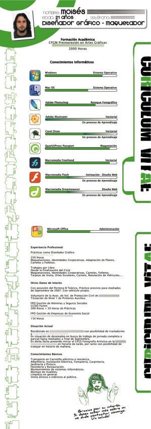
Curriculum Vitae, by Uito2 in 2007, shows his experience level in different software packages as progress bars.
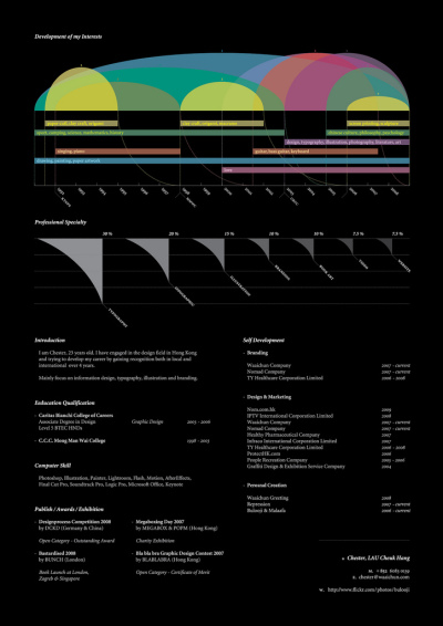
Chester, Lau Cheuk Hang, does a great job utilizing a timeline at the top of his resume with spanning arcs to highlight time spent in different activities.
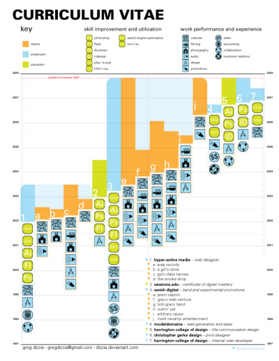
Greg Dizzia also creates a Curriculum Vitae showing vertical bars spanning a timeline for each company, and adds an additional element of icons to represent different experiences during each project.
This lists my history in the design world (some lesser clients have been left out) - Designed using univers exclusively. This is an appendage to a traditional resume, to be included as a forward page in my portfolio.
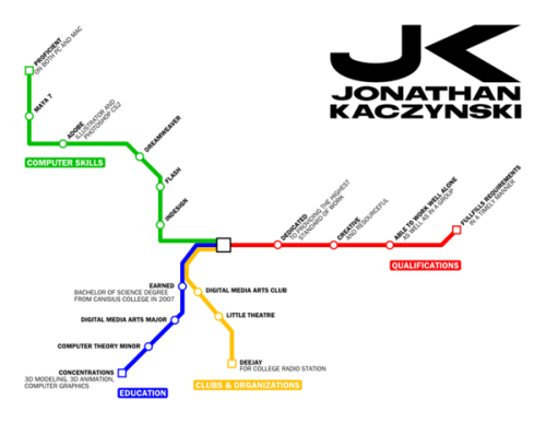
Jonathan Kaczynski, also tries a subway map style using the different lines as categories instead of attempting a timeline. I actually think this approach works a little bit better, the timeline versions appear difficult to translate into a subway map.
I am currently in the process of remaking my portfolio. It will have the appearance of a mass transit system’s website. This is the resumé that I’m working on to go along with the portfolio. It still needs a bit of clean-up and and logo needs some work.
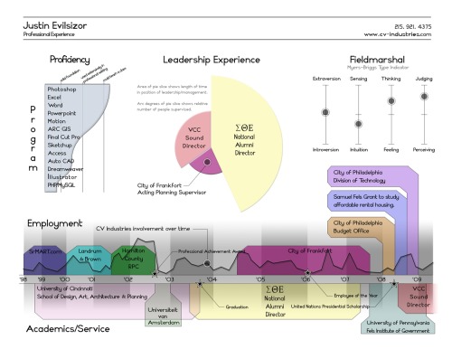
Justin Evilsizor’s version incorporates a timeline, a level-of-skill chart and I personally love the addition of the Meyer’s-Briggs Type Indicator.

Arnaud Velten, Cartographer of Complexity, created this isometric resume. At its heart is a timeline, but he has added an incredible amount of detail to each of his skills. Seems like too much detail for me, but that may be what he wants to convey.
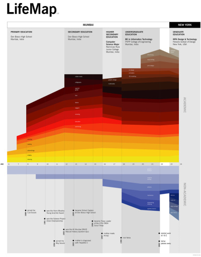
Maybe not technically a resume, Ritwik Dey’s Life Map is an impressive timeline of his education and activities.
This information design piece maps out my interests between ages 6 and 24 and the context in which they were born and nurtured. It also brings to surface how these interests influenced and were in turn influenced by milestones in my personal journey.
Stephen Gates’ resume is very clean a take on the timeline.
Why did no one try something new? Why wasn’t there one designer who took on their resume as design challenge to do something visual and different? I also realized that I was just as guilty as everyone else so I set out to design something different. So after some work in my spare time I have the design shown above (click on it to see it full sized). It is just a start and it feels like it is heading in an interesting direction but let me know what you think.
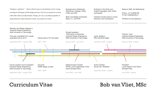
Bob van Vliet also created a very clean timeline resume.
I thought I’d try something different from the standard A4 with a dull summary of positions. Four timelines represent the most important parts of my life so far: Work, Education, Activism and Fun. The years get wider towards the present as those say more about who I am now than when I just started university.
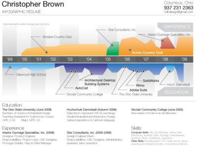
Christopher Brown’s colorful infographic timeline inspired by Michael Anderson’s concept.
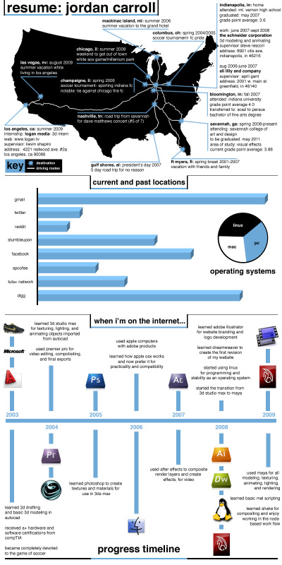
Jordan Carroll’s resume includes a few different elements. Timeline, map and charts combine into one overall resume.

Another colorful timeline resume, this one by Pruek Wiyaporn, also appears inspired by Michael Anderson’s concept.
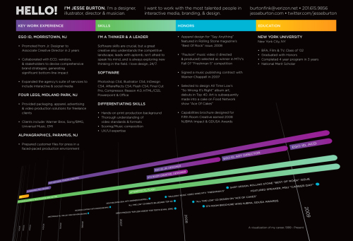
Jesse Burton also has a very nice stylized timeline resume.
Which ones do you like? Have I missed any other good ones out there?
Thanks to links found on VisualThinkMap, FastCompany, Patrick Debois
EDIT: Here are a few more that I missed when I originally wrote the post:
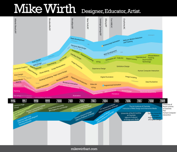
Mike Wirth is a freelance infographic designer. His colorful timeline has experiences above the X-axis, education is below and his geographic locations are the shaded bars in the background. When he learned specific software packages is also identified in the colored area, which shows how long he has been using the different software packages.
Gabriele Bozzi designed this resume concept that focuses totally on skills and experience. Education is identified in the small bubbles, and the skills are connected to specific examples of her experience. She is working on a separate timeline graphic.
 Randy
Randy
There are so many new examples of visual infographic resumes, I have started a dedicated board on Pinterest to share all of the cool designs I come across: http://pinterest.com/rtkrum/infographic-visual-resumes/

Reader Comments (74)
Me too!!! I did not know it was a trend, after I have seen the great IG of M. Anderson I thought I could have done something for my CV.
I posted my skills overview on my Blog:
http://www.kaukana.be/wp/?p=430
I took inspiration from an IG I have seen some time ago in a newspaper and refactored it for my purposes, I don't remember neither the newspaper nor the author, otherwise credit would be due.
Keep posting interesting things like these!
Gabriele Bozzi
Randy, Great post. Thanks very much for all the examples.
Thanks Gabriele! Sorry I didn't catch yours when I wrote the post, but I've now added your concept image.
I've tried to sketch up a visual code system to enable automatic generation http://www.flickr.com/photos/b2men/90218144/
Cool. I knew if I posted my resume to my blog, it would eventually find an audience. Now if only I could land a job in Philadelphia :-)
Just wanted to say my inspiration came from the first infographic on the list, Michael Anderson's. I made it using Illustrator, Excel, Sketchup and touched up in Photoshop. The Meyers-Briggs was just to fill in the leftover white space, although it gets lots of comments and I have found it very useful for conveying graphically what is hard to explain on a standard resume.
I can attest that the infographic has gotten me additional interviews - I've just been runner-up 3 times now. As someone who is looking to use a masters degree in government administration, my hobby in graphic design isn't the most important skill they're looking for...
I've used infographic resumes for the past 5 years, and this is the experience that I've had...
Infographic resumes are fantastic when you're direct dealing with potential employers. They're also a good way of filtering whether they get what you do or not. They also tend to work better in organizations that have more than an ounce of creativity (of course, if you have an infographic resume, why would you want to work for a bunch of uncreative drones anyways).
If you do primarily deal with HRBots and headhunters, however, I've found that having a more text-oriented resume in your back pocket is more effective with them. HRBots and headhunters seem to struggle conceptually with anything outside of the box.
^^ Thanks ...
Note the original Resume is a A3 Printed ;)
You can try it :
http://fr.calameo.com/read/000000241b5b228efc0d8
Nota : My Name is Velten :)))
Thanks Arnaud. I corrected your name in the post. Sorry, that was my mistake.
great post randy, quite a few not seen before there. i am tempted to have ago when i find the time ;o)
theres this but not as creative, free service i think:
http://www.visualcv.com/www/indexc.html
superbe idée des cv en heuristique .. sompteurx
I loved the look of Michael Anderson's infographic, but as he has stated "there are almost no real metrics represented except for time." In my adaptation I have added the percentage of time spent on a given discipline to the Y-axis. This creates a visual arc that explains my career at a glance.
http://resume.michaelpetersen.org
Enjoy,
-M
Although these are all very nicely styled, I think that as a resume, they tend to be a little too difficult to read. Especially in today's market, employers aren't willing to study a resume for more than a few minutes (if you're lucky). Unfortunately, the focus for a resume (or any graphic, for that matter) should be focused more on the information, not the presentation. I do, however, think that these would be an excellent addition to a resume as an attachment to show what you're capable of.
Great post, Thank Slickhound for letting me know of this site. I might even consider making my cv this way - very cool.
These are really great. It's definitely a good way to stand out from the crowd & make a lasting impression if executed in way that makes the info relevant, memorable & easy to digest. I'd maybe still include a regular format as a backup.
Great stuff!
What software program does one use when creating a document like this? Particularly the first one (Michael Anderson) or second to last (Mike Wirth)?
Illustrator? Is everything custom designed or are there plug-ins and tools out there to create the 3D pie charts, timelines, etc?
Just curious :)
I would tend to agree with the comments that said that you'll still need a standard text resume for the job sites and recruiters. BUT, I think the infographic resume as an additional piece is a great idea to have on your website or leave behind at the interview.
Looking for an answer to my question above still. Thanks for the help :)
Tim, I think a resume that is presented as these are will gain you the extra minutes of reading time. If the person reading it doesn't take an extra glance, then there are good chances you don't want to work there anyway.
The resume gets you in the door, and thats the only goal. After that, you'll have to take over and close the door.
Kris, there's no easy answer to your question. There isn't any software designed for this, so I would assume that every one of these is a combination of charting, illustration and vector graphics.
I like Mike Wirth sample. Look somehow similar to Ritwik's LifeMap, but a different approach in colors and positioning. Great list! Some of them are listed here www.vizualresume.com
I suspect the 2010's are going to be the most incredible decade for all artists.
Design is certainly starting to become much more important.
I suspect we've barely scratched the surface.
Text resumes will be around for a long time. Because everyone can type.
But everyone cannot write a story or a poem.
So, there will also be a demand for expert / professional resume – writers, for a long time to come.
But an ever-increasing number of recruiters feel that graphical / visual / audio resumes have an edge over plain text resumes – prompting emergence of job-portals such as
www.VisualCV.com
which inspired me to come-up with my own
www.CustomizeResume.com
( it is easy to be inspired, but , at the age of 77 , difficult to implement ! )
With regards
hemen parekh
hcp@RecruitGuru.com
Mumbai -- India
http://www.wardshelley.com/paintings/pages/fullpics/autobiography-v2%20copy.jpg
Its good to see some more infographic CV's tha Michael Anderson's. That one is EVERYWHERE. I particularly like Justin Evilsizor’s for the same reason as you: the personality chart!
Many thanks for sharing this little piece of Resume Heaven.
Very nice post. I wrote a little bit about infographic résumés myself recently and I mentioned this article: http://bit.ly/bs87ph
As compared to a jobseeker writing her own resume, a resume written by a professional expert resume-writer would any day prove better.
But
Before sending that well-written resume to a recruiter, can a jobseeker figure-out in advance what would happen if that resume
gets " rated / ranked / scored " by recruiter ?
gets compared automatically with resumes of other applicants ?
Will she get an interview-call ?
To know what is likely to happen , she has to just type "Resume Rater" in Google / Yahoo / Bing , and download this software tool ( free and without even login ) from any of the 35+ websites. Then rate her resume.
Resume Rater mimics the " resume-evaluation " process of recruiters’ minds but does it in an unbiased / objective way.
Resume Rater is absolutely non – discriminatory.
Regards
hemen parekh
Jobs for All = Peace on Earth
________________________________________
O. K. So, let's get creaitve with the company where they want and expect you to. Not all companies would receive this well.
So, make sure you know your audience before you get passed by.
great! very, very great!
Thanks for your tips, I am really Impressed
Excellent inspiration. In fact, it made me create my own.
http://www.ukjobsguide.co.uk/CV-Help/
I use this as the cover for my text resume and work samples package. It is a great way to stand out from the hundreds of other architecture graduates out of work! I am really glad I found this website and the examples here to give me the idea to create this!
http://dustinthorlaksondesign.com/wp-content/uploads/2010/07/Infographic-Resume.jpg
Hope people enjoy the read. Michael’s a genuinely nice guy.
I just finished my infoviz resume. Here's a link to it: http://svish.com/vis-res
Steven
Angie
Community Manager
http://www.circuscommunications.ca
Bobby
BobbyBluford.com
http://www.diamondsandcodeine.com/storage/resume.jpg
http://austraat.com/bjorn_austraat_resume_infographic_full_size.htm
As time permits, please check it out and let me know what you think:
http://t.co/zsrTRLg
AaronW.
thank you for sharing. Hope you can publish more articles.