About
Randy Krum
President of InfoNewt.
Data Visualization and Infographic Design

Infographic Design

Infographics Design | Presentations
Consulting | Data Visualizations

DFW DataViz Meetup

Join the DFW Data Visualization and Infographics Meetup Group if you're in the Dallas/Fort Worth area!

Search the Cool Infographics site

Custom Search

Subscriptions:


Feedburner

The Cool Infographics® Gallery:

How to add the
Cool Infographics button to your:

Cool Infographics iOS icon

- iPhone
- iPad
- iPod Touch


Read on Flipboard for iPad and iPhone

Featured in the Tech & Science category

Flipboard icon

Twitter Feed
From the Bookstore

Caffeine Poster

The Caffeine Poster infographic

« Who’s Suing Whom: Lawsuits In The Telecoms Trade infographic | Main | SoTech Infographic v1.0 - your feedback requested »
Tuesday
Oct052010

The Darwinian Evolution of Microsoft Windows


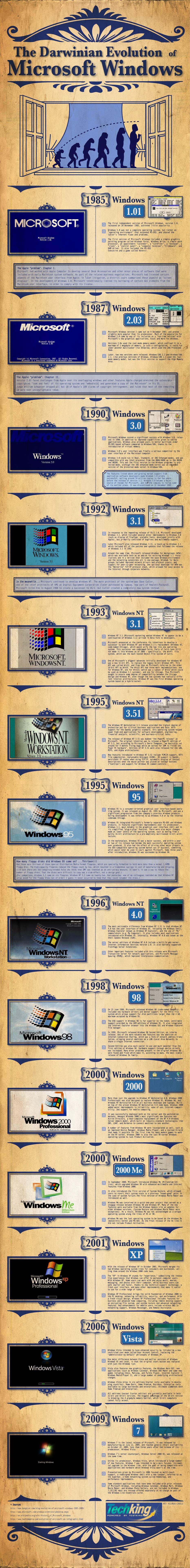
This is a cool infographic timeline, showing the Darwinian Evolution of Microsoft Windows from version 1.0 in 1985 up through the current Windows 7 in 2009.  Although it makes for a really tall infographic, I love seeing the visuals of the startup screens and the desktops.

Art is credited to Richard Cavolo, and the project is from TestKing.com (even though I can find no mention of it on their site).  It was posted on BitsandPieces.us

PrintView Printer Friendly Version

EmailEmail Article to Friend

Reader Comments (8)

The look of this graphic is very pleasant, but there's no trail of data, numbers, you have there just technical facts, some screenshots and the version number. No comparisons, no satellite facts... this is definitely not an infographic
October 5, 2010 | Unregistered Commentermarco
Hello Randy...

dropped by this morning and found this wonderful infographic -- nice catch! and I wrote yesterday on my own blog about SEO and infographics and yes, I did mention this site as one of my own "authority" sites where I go daily to see what you've found!

so muchly appreciated!!

:-)

Jim
October 5, 2010 | Unregistered CommenterJim Rudnick
Marco, I would disagree (of course, since I posted it). The timeline is a visual representation of data, and the screenshots add additional context to each version of Windows. This could have been a boring White Paper analysis of the history of Windows, with all text and no graphics. Formatting the information along a timeline and adding visual references to make comprehension by the readers faster and easier makes it an infographic in my book.
October 5, 2010 | Registered CommenterRandy
Hi Jim,

Thanks for your kind words, and the link in your article. It's much appreciated! ;)

All of my posts link to the original designer or article if I can find it, and they are all DOFOLLOW links. Part of my purpose is to help provide infographic inspiration to designers and help drive traffic to their sites.
October 5, 2010 | Registered CommenterRandy
This is an evolution alright, but not Darwinian. I also second that there's very little data visualization in the graphics, e.g. pattern or trend.
October 5, 2010 | Unregistered CommenterChangz
I'd say that it looks more like someone pasted a bunch of (admittedly pretty) Powerpoint slides together. The end result is what marco noted: disjointed factoids without flow, or connections, between them. What about default file systems? CPU/RAM/disk requirements?

Why in dog's name are the bootup screens in widescreen, which requires some horrible cropping in some cases, and unused space on the sides of the logos? NONE of those images require 16:9 or 16:10 ARs, and there's plenty of vertical real estate in the graphic to accommodate the 4:3 ratio that the vast majority of those screens were created for.

In short: some form, but little function. IMHO :)
October 5, 2010 | Unregistered Commentercurby
I'm with Marco and Curby. How about a little critical analysis of these graphics past whether they are pretty or not. The Jess3 one is a great example. Very impressive on the surface, but so many arbitrary and useless segmentation makes it quite annoying. It's a shame so many users, and client pick up on this stuff and find value in it. Not very discerning,

My recommendation is to be less concerned about your blogs advertising numbers and focus instead on critiquing things from a user centered perspective.
October 18, 2010 | Unregistered CommenterRichard
well that is nice
i heard that Microsoft's next project on which they are working right now is WINDOWS 8
which will be released in 2012 or 2014
anybody know about this????
________________________
Launching new R PAD TOUCH
November 22, 2010 | Unregistered Commentererwin
Comments for this entry have been disabled. Additional comments may not be added to this entry at this time.