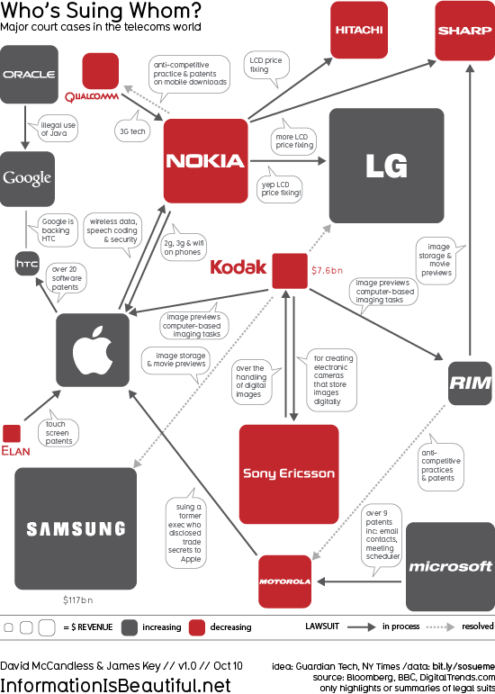
Who’s Suing Whom: Lawsuits In The Telecoms Trade infographic
Who’s Suing Whom is a great infographic design improvement by David McCandless from InformationIsBeautiful.net. David took existing diagrams (which were pretty poor) from The Guardian and the NY Times, and created a much more compelling and information-rich infographic. My feeling from the news is that there are many more lawsuits that these, but I don’t know the data.
Based on these diagrams from Guardian Tech and the NY Times.
I thought those charts generated more questions than they answered. So, as ever, I tried to answer the obvious questions and convey various contexts simultaneously.
I wondered, too, if I could design the connections so the lines didn’t cross. Almost managed it!
And see if there was a relationship between dropping revenues and litigiousness. What do you think? Is there?
Data: http://bit.ly/sosueme
Great job David!
 Legal,
  Patent,
  Phone,
  connections,
  corporations,
  design


Reader Comments (1)
http://news.designlanguage.com/post/1252039209