


The Feltron Annual Report 2009 and an Online Class April 29th
 Randy
Randy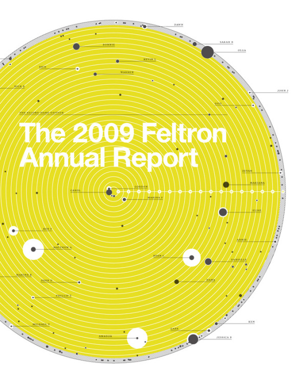
I’m not sure how it slipped off the radar, but I haven’t posted a link to the Feltron Annual Report 2009 here on the blog yet. Nicholas Feltron has done infographics for Time, CNN, Wired, New York Times, Fast Company and more, but probably his most popular infographics are his annual reports. The print version of the Feltron Annual Report 2009 is available for pre-order for $30 from the Feltron Store.
Mike Aruz interviewed Nicholas Feltron when the 2009 Annual Report was released on mikearauz.com
The reason this came up today is that Nicholas is going to be the host of Live DesignCast: Nicholas Felton, A Master Class on Information Design. This is an online class from PRINT Magazine on April 29, 2010 at 4pm EST. The class costs $69 and is one hour long.
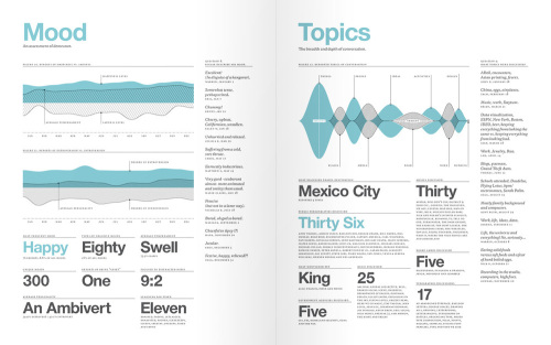
Our current information age has produced an inevitable crush of complicated data to sort through. Thankfully, there is a rising group of designers who present all this data in a way that we can understand and use. And for the last several years, no one has done it better than Nicholas Felton.
In this Master Class, Felton explains how detailed data leads to better stories, offers a few guidelines for displaying complicated data sets, and challenges you to use all five senses through the process.
In this Master Class DesignCast, you’ll learn:
• How to visualize large data sets
• How to go from an initial question to gathering, comparison, and display
• How to use sensors, whether hardware or software, to gather data
• How data helps satisfy curiosity, provides insight, and entertains
• How better data leads to better stories

Reader Comments (3)
Great blog post. Have you read Do Good Design by David Berman? Great read... ethics of graphic design. Here is my infographic explanatory video inspiried by that book. Cheers! http://www.vimeo.com/10262772
Why do infographics always have such miniscule text. I understand the premium on space but should data or text be minute like the one above? What's your take on that? Anyway the graphic is very striking.
Since you asked, I'll give my own opinion. The best infographics minimize the use of text as much as possible. No lengthy descriptions and no chart legends. The graphics should tell the story, and then if the readers want to dig deeper for more detail, they can read the smaller text. The smaller text offers more information, but also tries to stay out of the way of the main graphic.