About
Randy Krum
President of InfoNewt.
Data Visualization and Infographic Design

Infographic Design

Infographics Design | Presentations
Consulting | Data Visualizations

DFW DataViz Meetup

Join the DFW Data Visualization and Infographics Meetup Group if you're in the Dallas/Fort Worth area!

Search the Cool Infographics site

Custom Search

Subscriptions:


Feedburner

The Cool Infographics® Gallery:

How to add the
Cool Infographics button to your:

Cool Infographics iOS icon

- iPhone
- iPad
- iPod Touch


Read on Flipboard for iPad and iPhone

Featured in the Tech & Science category

Flipboard icon

Twitter Feed
From the Bookstore

Caffeine Poster

The Caffeine Poster infographic

« 15 Things You Didn't Know About Star Trek [infographic] | Main | Linux Kernel Zoomable Map »
Friday
May212010

Visualizing Alcohol Use

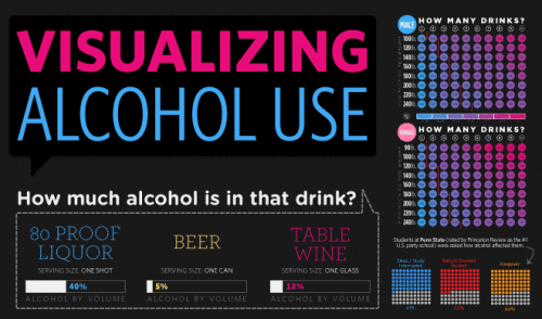
From phlebotomist.net (a website all about blood!), the highly-colorful Visualizing Alcohol Use infographic explores the effect of alcohol 

How much alcohol can your bloodstream handle? Take a look at the graphic to check out everything from blood alcohol averages to the highest blood alcohol content ever survived (you won’t want to try this at home).

There’s no designer credited, but if this wasn’t designed by EJ Fox (@pseudoplacebo) then it was heavily influenced by his work.

Thanks to Cate for the link!

PrintView Printer Friendly Version

EmailEmail Article to Friend

Reader Comments (3)

This is totally EJ Fox. Well done.

May 21, 2010 | Unregistered CommenterKnox

The smaller set of square pie charts are 11 x 10 instead of 10x10. Just a tad misleading, no?

May 27, 2010 | Unregistered CommenterRob Shell

Nice visualization, but the data are obviously wrong: 50% of adults have less than 1 drink per month? No way! 61% of teenagers have never had a drink in their lives? Never ever!

June 9, 2010 | Unregistered CommenterSascha
Comments for this entry have been disabled. Additional comments may not be added to this entry at this time.