A Cool Interview with Nathaniel Pearlman (infographic designer)
With the release of the Visual History of the American Presidency last week, I asked Nathaniel Pearlman, infographic designer and President of Timeplots, LLC, if he would be willing to do a short interview. Nathaniel was nice enough to answer a few questions about his infographic design process and his projects.
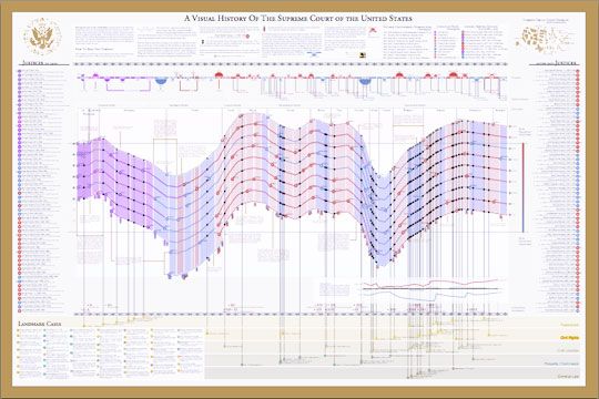
Nathaniel started the company in May 2009 and released the Visual History of the Supreme Court of the United States (SCOTUS) (which you see above) as their first infographic poster.
Here’s the interview with Nathaniel:
Cool Infographics: What software applications do you use for the Timeplots posters?
Nathaniel Pearlman: So far we have programmed our graphics in the R language and done some final design work in Illustrator. I’m interested in hearing about other platforms to use for complex data and layout — especially other software applications that would allow us to create interactive and print versions from the same code base.
Cool Infographics: Can you describe your design process?
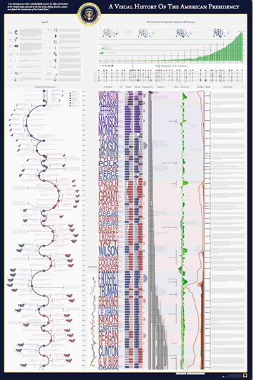
Nathaniel Pearlman: We start by asking ourselves what an informed audience would want to know about the subject we’re tackling. For example, for the presidential print, we asked ourselves, “Why is each president important? Why should people care about these guys? What is measurable about the context in which they served, and how could we show that?”
Then we go through a data collection phase: we take some time to see what data has already been collected on the subject, we catalog sources, and then we obtain data (and rights, if necessary) for the information we need. We wait until we have the hard data and have examined it and visualized it in several ways before we settle on what stories we can pull out of it.
The primary phase of the design process is iterative – there is a lot of trial and error. For example, we programmed (and scrapped) several major design ideas for our Senate print before settling on the current version. It turns out that our process is longer and more involved than I expected. Each print thus far has taken many months of data collection, design, and review. We also included quite a number of reviewers into our design process, folks with substantive expertise and designers as well.
Cool Infographics: What’s the most interesting thing you learned from the data?
Nathaniel Pearlman: I like the big picture: for me, the presidential print shows a historical view into the sweep of U.S. history — a marked contrast with the more journalistic, and immediate, take on the political and economic state of the nation that we are used to seeing in the news. It lengthened my perspective on current events, and I hope that it does so for those who purchase the print.
When you see the entire span of U.S. history visualized in just a few feet of space, you see the economy bouncing up and down, the parties jockeying back and forth, the budget bumping along. The ups and downs then seem fairly routine from this perspective, especially when compared to the sensationalism of our daily headlines. The other thing that really stands out is the growth of the country since 1789, both economically (in real GDP) and in population. As to the small picture: I love seeing details of each election — what percentage of the vote did Strom Thurmond get in 1948, for example, and which states did he win — so we tried to put each election into context with a scoreboard and electoral cartogram wrapped around the curve of party control of the executive.
Cool Infographics: What was the hardest part behind designing the Presidential poster?
Nathaniel Pearlman: When you see a finished product like ours, what you miss are the hundreds of decisions that were labored over as it was created. For me, the most difficult thing is deciding when I’m done. Every time I look at a new draft, I have ideas for changes that could be made. At some point I have to say “enough is enough; we are done.” The other hard part is writing the text that’s included on the print.. just crafting short explications of each presidency is difficult.
Cool Infographics: Where are some of your favorite places that have the SCOTUS poster on display?
Nathaniel Pearlman: We are happy that the U.S. Supreme Court library displays a framed print, and the gift shop in the Supreme Court building itself carries the print. We’ve also seen many purchases by legal luminaries — we’re not legal experts ourselves, so it’s nice to see that the experts appreciate our work. A son of a current justice bought one. Also, many high school teachers from across the country have purchased prints for their classrooms (we offer discounts for educators); it’s great to see teachers showing interest in using data visualization as an educational tool.
Cool Infographics: Where do you have the posters printed, what are the printing specs and why?
Nathaniel Pearlman: We shopped around quite a bit for a printer, because we are fussy about the results – we wanted the quality of the paper to top-notch, we needed relatively fast turnaround and reliable fulfillment, and we wanted the printing process to be environmentally friendly — all of this, of course, at an affordable cost. We currently offset-print the posters in Maryland, at Whitmore printing, and they also do our fulfillment. (Ideally, we would like to find an affordable on-demand printer who can handle our large-scale posters and fulfillment. If we found this, we would be able to sell shorter-run prints; please send me any suggestions!)
Cool Infographics: Would you share some thoughts on running a business selling infographic posters?
Nathaniel Pearlman: I am enjoying Timeplots. As a profit-generating business, it is not for the faint-of-heart. I am lucky to have some time and space to try it, but it is unlikely to run in the black for quite some time. My first company, NGP Software, Inc. (www.ngpsoftware.com) is doing well and allows me to do this on the side.
Cool Infographics: How has the Timeplots On Demand side of the business been going with private clients?
Nathaniel Pearlman: We’ve really enjoyed working with people who aren’t necessarily familiar with data visualization — everyone who we’ve worked with has been more than happy with the results. So — if anyone reading this has a project in mind, or if you want us to create a visualization for you or your institution — let us know!
Cool Infographics: How did the process of using Amazon Mechanical Turk for proofreading work for you?
Nathaniel Pearlman: Mechanical Turk is a good method for crowd-sourcing some kinds of work. We’ve used it for three separate projects now — twice for proofreading, and once for fact-checking research. We have gotten more hits than misses, so it’s been worthwhile. Eliza manages that process and has been impressed by the level of work she has received. The Mechanical Turk worker community (“turkers,” as they call themselves) are serious about their work, and it shows. In a couple cases, a “turker” found an error that we all missed: for example, when we posted the presidential print for proofreading, one turker pointed out that we listed Vice President John C. Breckinridge as “Breckenridge,” clearly misspelling his name. Another turker noted that we had described President Taylor as dying “halfway” through his term, when in fact it was a few months prior to “halfway.”
Cool Infographics: What should we expect in the future from Timeplots?
Nathaniel Pearlman: We have a rough list of fifty or sixty more projects we would love to do. After we launch the Senate print, we will decide what is next. I would love to hear from your audience what they would like to see, and we are always looking for collaborators, if someone would like to work with us on a project that they care about. We’re always open to new ideas!
 corporations,
  design,
  interview,
  presidential,
  visual


