About
Randy Krum
President of InfoNewt.
Data Visualization and Infographic Design

Infographic Design

Infographics Design | Presentations
Consulting | Data Visualizations

DFW DataViz Meetup

Join the DFW Data Visualization and Infographics Meetup Group if you're in the Dallas/Fort Worth area!

Search the Cool Infographics site

Custom Search

Subscriptions:


Feedburner

The Cool Infographics® Gallery:

How to add the
Cool Infographics button to your:

Cool Infographics iOS icon

- iPhone
- iPad
- iPod Touch


Read on Flipboard for iPad and iPhone

Featured in the Tech & Science category

Flipboard icon

Twitter Feed
From the Bookstore

Caffeine Poster

The Caffeine Poster infographic

« World GHG (Green House Gasses) Emissions Flow Chart | Main | Homeschooling: By The Numbers infographic »
Wednesday
Sep292010

The World Without Apple


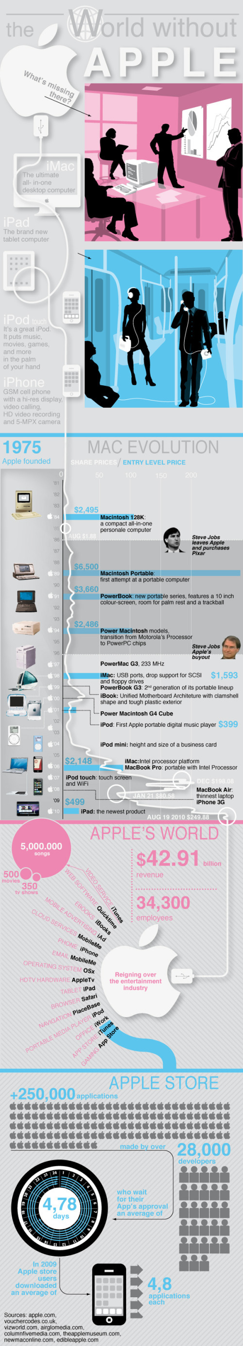
The World Without Apple, from Infographic Labs is a great design.  The main feature combines the history of Apple’s products in a timeline with its stock prices and new product introduction prices.  Also included are some statistics about the app store and all of the different aspects to Apple’s business.

The AppleGazette team asked us to analyse the complete product timeline and stock value of the Cupertino based company. The result is another stunning graphic, first published at AppleGazette.


PrintView Printer Friendly Version

EmailEmail Article to Friend

Reader Comments (4)

I am not sure why the graphic uses the apples, the arrows and the people graphics in the bottom section - that type of display is only useful when comparing quantities and none of the three numbers is being compared to anything - therefore, the use of those graphics is not called for. That section does not seem to "fit in" with the rest of the poster. Also, the entire top section is not very useful and merely repeats information in the pink "Apple's World" section near the bottom.

The graphics themselves are slick and clean and the color scheme is very Apple-like.
September 29, 2010 | Unregistered CommenterMarc
To previous reader.
I totally agree with you about the bottom section, but the very first two illustrations actually show what would be the world without the top-selling objects on the left. I argue you're saying that the iMac, iPod, iPhone and iPad descriptions are a bit futile.... but this graphic do not focus on Apple numbers, it just search for some not previously expressed concept about Apple

- another reader -
September 30, 2010 | Unregistered Commentermarco
Mark (first comment),

Although we did have to change the numbers last minute as the graphic went live the same day as the keynote, if you do count the arrows, people and even apples (the number almost doubled so one could argued it still makes sense), there is a logic in our use of these. Agreed that it is a switch in style and other focus but most of our infographics consist of rather large amounts of data rather than 'flow'. It's a direction (style) we chose for.
October 6, 2010 | Unregistered Commenterfranky
The Apple is very improving technology for many company.The apple advantages is new technology
2,50,000 applications and 5,000 songs.The blog explain is very interesting.Thank....
October 13, 2010 | Unregistered CommenterTrade Show Displays
Comments for this entry have been disabled. Additional comments may not be added to this entry at this time.