About
Randy Krum
President of InfoNewt.
Data Visualization and Infographic Design

Infographic Design

Infographics Design | Presentations
Consulting | Data Visualizations

DFW DataViz Meetup

Join the DFW Data Visualization and Infographics Meetup Group if you're in the Dallas/Fort Worth area!

Search the Cool Infographics site

Custom Search

Subscriptions:


Feedburner

The Cool Infographics® Gallery:

How to add the
Cool Infographics button to your:

Cool Infographics iOS icon

- iPhone
- iPad
- iPod Touch


Read on Flipboard for iPad and iPhone

Featured in the Tech & Science category

Flipboard icon

Twitter Feed
From the Bookstore

Caffeine Poster

The Caffeine Poster infographic

« "How Do I Become President?" Infographic Contest for Kids | Main | The World Without Apple »
Thursday
Sep302010

World GHG (Green House Gasses) Emissions Flow Chart

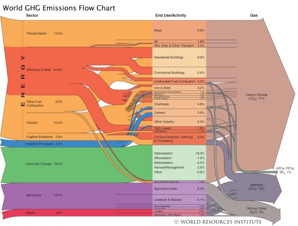
From the World Resources Institute, the World GHG Emissions Flow Chart needs a new name, but shows the composition of GHG (Green House Gasses) emissions and where they come from.

Sources & Notes: All data is for 2000. All calculations are based on CO2 equivalents, using 100-year global warming potentials from the IPCC (1996), based on a total global estimate of 41,755 MtCO2 equivalent. Land use change includes both emissions and absorptions; see Chapter 16. See Appendix 2 for detailed description of sector and end use/activity definitions, as well as data sources. Dotted lines represent flows of less than 0.1% percent of total GHG emissions.

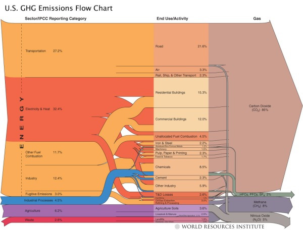
They also have this one for just U.S. GHG emissions:

Found on Data Mining: Text Mining, Visualization and Social Media

PrintView Printer Friendly Version

EmailEmail Article to Friend

Reader Comments (2)

That is an incredible infographic - thanks for posting it. It's really what infographics are all about - although I've been interested in this issue for a long time and even toying with the idea of trying to represent it graphically, I must admit I never had a picture of what the situation really looks like. Until now.
If we have to reduce all of this by half or three quarters (whatever the actual total reduction we need is) this shows that it's a real challenge. Riding bikes and fitting energy efficient light bulbs won't quite do it then.
Again, this is the power of a well-sorted and relevant infographic.
September 30, 2010 | Unregistered Commenterrichdesign
This is a specific type of flow diagram known as a "Sankey diagram". There is a highly informative web site devoted to them specifically. http://www.sankey-diagrams.com/
September 30, 2010 | Unregistered CommenterPatrick
Comments for this entry have been disabled. Additional comments may not be added to this entry at this time.