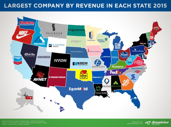
Largest Company by Revenue in Each State 2015
The Largest Company by Revenue in Each State 2015 map was created by Broadview Networks by using Hoover’s, a D&B Company's data. Even though there might be "bigger" companies in each state than the ones represented, the map is specifically looking at the greatest amount of revenue from the 2015 financial year.
You may have seen the Largest Companies by Revenue map we put together in June of last year, well we’re back with an updated version using Hoover’s 2015 data. Last year’s map created so much buzz and insightful conversation that we deemed it essential to find out how it’s changed over the past year. Using Hoover’s, a D&B Company, we searched through each state’s list of companies to find which had the largest revenue in the last fiscal year. It was interesting to see how each company’s revenues have changed over the year (for better or worse) and to see if a new largest company had emerged.
At first glance, you may ask, “Where are Apple and Microsoft?” Yes, these are huge companies but this map is specifically looking at total revenue from the last fiscal year. If we look at California with Apple vs. Chevron, there is a large discrepancy between market value and total revenues. Apple’s market value as of March 31, 2015 was $724 billion while Chevron’s was only (and we use “only” lightly) $197 billion. In terms of revenue, Chevron comes out on top with $203 billion in the last fiscal year while Apple had revenues of $182 billion.
Please note: We used Hoover’s company database as our source, not the most recent Fortune 500 list. Location and state are based on the corporate headquarters of that company, no branches or foreign offices. Lastly, we decided not to include any subsidiaries or government entities for the sake of staying consistent.
I liked how they didn't manipulate the US map. Manipulation would have taken the focus away from the company's logos. If you click on the infographic, the original allows you to zoom in close enough to comfortably see small states, like CVS is Rhode Island's largest company of 2015. This infographic could of easily been overworked but instead they kept it simple.
The company post inspired a lot of discussion about the data, and I think that was part of the purpose behind the design. Is this the best data to show? Where are some of the more recognizable companies? There's even at least one error in the map.
Found on Broadview Networks VoIP Blog


 Randy
Randy

Reader Comments (1)